|
|
|
Showing 871 - 880 of ~2866 |
| Image |
Comment |
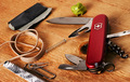
| 03/01/2006 05:11:21 AM | MacGyver - 80's TVby moonwellComment: from the back of the room of the Critique Club
NB: all of your comments on this image are from people who know what your reference is. I'd be surprised if many of us Europeans, or of the far east brigade, let alone the Icelanders have the first clue. I have to approach this simply as an image, without knowing the refernces ...
... and as such, it's just too damn busy, I think. Too much stuff, and in a not particularly pleasant arrangement. Almost always, certainly in terms of dpc and this kind of still life shot, the old adage 'less is more' is absolutely true. I'm sure there are reasons for including everything here - but the chewing gum looks likema brussels sprout, half the objects are cropped slightly by the frame (why? what does that communicate?), and the duct tape could almost be any old piece of paper. I'd have tried to reduce the number of objects - there isn't a rule, but I'd want no more than three, and then work on the lighting and the arrangement of those objects. Use the shapes of the rubberbands to make distorted circles that could lead the eye to the other items, but make them have some reference to one another, make the shapes help the composition ... have a good look at all the various still lifes around this site, and see how the successful ones work.
And while you're there, I'd have a good look at the lighting of them too. There's no actual problem here, as such - everything is nicely lit, focussed, there is detail, texture and so on ... it's just a bit bland, isn't it? I'd want to produce a bit more shadow - like the way the shaping of that thicker rubber band is defined by the light, use that across everything in this shot, to really give a sense of shape to the objects, and to allow you to lead your viewer's eye through your composition.
That's all reflected in this score, I think. Whilst those who 'got it' will have scored you one way, the rest - the majority - will have seen a pretty average still life and have moved on pretty quickly. In short too much information here, and not enough organisation of that information. And never forget that this comes from someone who loathes most of the most-favourited photographs on this site, and so should be read wioth the understanding that my suggestions are not guaranteed crowd-pleasers - although i've managed a couple of popular still lifes in my time ;-)
All the best
ed |  Photographer found comment helpful. Photographer found comment helpful. |
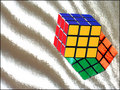
| 03/01/2006 04:23:51 AM | A Reflection on the 80'sby MeeraComment: from behind the freezer of the Critique Club
I find the range of hyper-picky historico-pedantic comments rather hard to take, even as a disinterested dearder of someone else's comments. What the hell is the point of that? And it's made especially pointless when a bunch of supposedly 'punk' images dominate the ribbons in this challenge.
Well, I'm afraid there's no defense against the small-minded other than to go along one's way, without letting such things get under one's skin, but it can be hard: it seems there's almost a desperation to find some way, any way to dismiss an image from proper consideration in a challenge.
There are a couple of things I do like here, and a couple I think may prove to have been optimistic ideas. The brightness, almost the brashness of the image seems to me very fitting to the period we were asked to imitate - and of course the subject and your treatment of it is absolutely OK. Your shiny material - and the sand-like quality that you've noticed, causes problems though: precisely because it does look so much like sand, I suspect many people will have actually taken it for sand, and decided that you've over-exposed your background - despite the evidence of the reflection of the cube. Unravelling that, however small, visual puzzle is asking for more time from the punters than a first shoot through is going to get you, though.
| | Photographer found comment helpful. |
| 03/01/2006 04:08:14 AM | Privetby senojComment: some kind of 0900 server error here; my critique is posted below but the fact hasn't registered with the site. Not only are you dead last yet again, you get another comment simply to get this image off my screen! | | Photographer found comment helpful. |
| 03/01/2006 04:00:23 AM | Privetby senojComment: from the smallest room of the Critique Club
What is there to say? You have evidently achieved pretty much what you set out to here, with the added masterstroke of making the cyrillic script just recognisable enough through the haze of the focus to put off even those english monoglots that might have hung around long enough to find anything in the image.
I don't think though that this one was oarticularly challenging - it's easy enough, simplky by taking an out of focus shot with nothing to do with the challenge, to achieve last place, no? I'd be more intrigued to see if it can be done with a shot that 'meets the challenge', as the saying has it.
All the best
e | | Photographer found comment helpful. |
| 02/28/2006 05:56:02 PM | | | Photographer found comment helpful. |
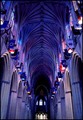
| 02/28/2006 05:28:01 PM | God Is Closer to My Heartby cfischlComment: from the tail-end of the Critique Club
Although the challenge has the clear instruction to follow your - that is, your own, personal, interpretation of the word 'heart', nevertheless, in the eyes of the mass of voters here, that instruction is not to be followed too loosely. This a number of the comments you recieved - especially those referring to your title. Many people are enormously presumtious, not realising that some don't obsess about this place, aren't consumed with a sense of personal achievement from their average vote recieved and so on. I would advise that you don't be disheartened by it: those voices are usually not the ones that remain for the long haul.
However, there is the valid point that if this image is a good entry for this challenge, the exactly what kind of image is not? It's difficult ground, and perhaps not worth digging into too deeply. nevertheless, it is surely that element of things that has hurt your score here.
presuming that cosre isn't very interesting to you ... your main problem with this shot is, i think, either a function of your depth of field or the hand-held nature of it (if it isn't hand-held, why shoot at ISO 800?). It just isn't particularly detailed - not a sense of being out of focus, but rather of a slight motion blurring of most details. I'm sure your colour process hasn't helped, but equally sure that that isn't the only problem. There's also a slight sense pof distortion to the image: on closer examination, everything seeems to be parallel, and centred appropriate to such a graphic image, and yet something is certainly astray, and gives a sense of distortion to those supposedly staight lines.
Personally, the image holds little interest for me: if it's an examination of the visula structure of the cathedral, then it has little new to offer, and if it's more than that then I fail to percieve the point. Fundamanetally, whatever processes have produced whatever interesting colours (not that I agree with that assessment), I don't finmd anything here to be very far removed from decent, technicaqlly assured architectural photography - but tath can be so much more than this presentation.
e | | Photographer found comment helpful. |
| 02/28/2006 04:48:37 PM | some Hearts aren't meant to be Brokenby seebrownComment: I think the properly controversial has less of a sense of deliberate provocation and more of a genuine alternative world-view than this shot has. I don't find it to be particularly enlightening - yet it has that quality of photography that shouts out that 'this has a message for you'.
It's easy as anything to have a go at the technicalitites, certainlny for this dpc community - it doesn't have the technicolour pop, the tidiness of design, the clean presentation (look at all that unneccasry dust around the edges of heart, for heaven's sake). Most other technical stuff is fine here - you know, the old DOF, focus, detail and all that.
But hell, the most distressing thing about it is that your non-dairy creamer just doesn't look the slightest bit like cocaine. More like wood shavings.
Now why is that? One, large, part of that is the granularity of that material. This stuff is just too flakey, rather than the almost impossibly small grains of the 'real thing'. It's also, as someone has observed, an impossibly white stuff, and in this photo it just doesn't have that clarity of whiteness; that's some function of levels/curves and processing - even though your white points are there, it would be possible to even out the movement towards the mid-tones - here, I think that process is too quick - thus the oddness of the highlights on that rolled paper. Also, arguably, the social perception of the drug, and the usual presentation of it, and the lifestyle associations of it, perhaps require something a touch more considered that this approach?
e | | Photographer found comment helpful. |
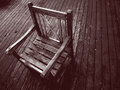
| 02/24/2006 03:08:20 PM | Garden Chairby jonrComment: The way the lines work across and against one another is interesting, and I like the contrast work also. Carefully thought out comspotion, and a good moment of light to catch also. | | Photographer found comment helpful. |
| 02/24/2006 03:06:55 PM | Back in black.by RisingSunComment: Lacks a certain amount of clarity on this screen - whether it's the exposure, or what is hartd to tell, but it is difficult to look at - I wonder if you've taken the contrast on the figure too far in order to get the background that way? | | Photographer found comment helpful. |
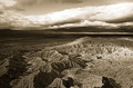
| 02/24/2006 03:04:24 PM | Lost Worldby edmengComment: Neat processing, and certainly a landscape that lends itself to the treatment. | | Photographer found comment helpful. |
|
Showing 871 - 880 of ~2866 |
Home -
Challenges -
Community -
League -
Photos -
Cameras -
Lenses -
Learn -
Help -
Terms of Use -
Privacy -
Top ^
DPChallenge, and website content and design, Copyright © 2001-2025 Challenging Technologies, LLC.
All digital photo copyrights belong to the photographers and may not be used without permission.
Current Server Time: 08/20/2025 02:37:04 PM EDT.
|