| Image |
Comment |
| 03/07/2006 02:28:57 PM |
Memorial Arch - Valley Forgeby panynjComment: decent enough detail, and focus, and so on, but to me simply an architectural portrait - telling me very little, affecting me likewise very little. Whilst the exposure is 'correct' in the sense of nothing is over- and nothing is under-exposed, the overall brightness of this is taken too far: you'd get more impact, more sense of the true depth of colour of the stone, more drama to the shot if you were to lower the overall brightness level - just try adjusting with levels and moving the slider to the right a bit, just to give it some punch. A perfectly fine, ut an unexciting entry. |
 Photographer found comment helpful. Photographer found comment helpful. |
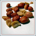
| 03/07/2006 02:25:29 PM |
Just Nutsby sfarrell23Comment: Not bad. The depth of field is possibly a bit arbitrary - somehere in that region between deep and shallow, and might happily have been a bit more in either direction. I think I get your point with the composition, but I don't think the thirds rule applies so strongly to a square crop, and the space a bottom of frame seems left there only to make the image square, rather than this set-up requiring a square crop to work, if you follow me. |
| Photographer found comment helpful. |
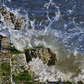
| 03/07/2006 02:22:55 PM |
Restless Tide...by dolphnz8Comment: Too much detail lacking to my eye - perhaps processing to keep control of the highlights in the stone, or maybe just more shutter speed needed, I think. The diagonal makes for a strong composition for the required crop, however, which shows good vision. |
| Photographer found comment helpful. |
| 03/07/2006 02:21:35 PM |
Softby shankswareComment: I'm no fan of this kind of portrait - simply too gooey for my taste. hiowever, this is a very professionally done version. Bringing the hands more into frame would have suited this crop more, I think. The 'rules' pertaining to square frames are a bit different from otherwise, favouring the symmetrical and diagonal compositions - which you nearly get to, but not quite. More of a parallel between the line of her face and shoulder, and the lines of her hands and arms, set diagonally across frame would make a very strong composition. |
| Photographer found comment helpful. |
| 03/07/2006 02:18:29 PM |
Windmill at Duskby NigelComment: The sharpening artefacts around the sails are a shame - really quite eye-catching. Might I recommend that you not shoot against the bright part of the sky in this instance? That's left you with an enormous brightness gap to bridge between keeping detail in the windmill and the sky - the opposing angle, shooting from the right of this frame, would have allowed you to keep the entire shot within the dynamic range of your camera more easily. Obviously, there may be other factors preventing such a shot - but that very bright area of sky has certainly caused problems. |
| Photographer found comment helpful. |
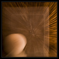
| 03/07/2006 02:15:46 PM |
A Safe Subjectby GeneralEComment: Interesting idea, pretty neatly executed - almost pulls off that effect of seeming to be sunk into the screen - however there's a slight tilt to things - whether real or the result of some illusion, it's enough to disturb the impact of this shot for me - the more disturbing perhaps, for being so slight? |
| Photographer found comment helpful. |
| 03/07/2006 02:14:12 PM |
Speedby tcmartinComment: Works compositionally for the square frame, and has a sense of motion of course. Lacks some permanent part of image against which to judge that motion, maybe? Something to bring it away slightly from the pure abstract and really give it a bit of impact? |
| Photographer found comment helpful. |
| 03/07/2006 02:12:26 PM |
Mine!by quiet_observationComment: I think we need the cat also in focus; without that, there doesn't seem to be a connection between the two elements. i quite like the framing, cropping both elements to crowd the image slightly. |
| Photographer found comment helpful. |
| 03/07/2006 02:10:55 PM |
Emergenceby toffleComment: Good tones and colour, and an interesting sense of season. Falls down a bit on the indistinctness of the snow, and slightly overdone highlights - some of which are in focus, some of which aren't. |
| Photographer found comment helpful. |
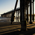
| 03/07/2006 02:09:18 PM |
Pier at Sundownby RolandBComment: Enromously high contrast possibly lets this down a little - it would have been great to see atouch more detail in those nearer legs. Alternatively, to really make use of those shadows a wider field of view ... I think this perhaps falls between two approaches. |
| Photographer found comment helpful. |
Home -
Challenges -
Community -
League -
Photos -
Cameras -
Lenses -
Learn -
Help -
Terms of Use -
Privacy -
Top ^
DPChallenge, and website content and design, Copyright © 2001-2025 Challenging Technologies, LLC.
All digital photo copyrights belong to the photographers and may not be used without permission.
Current Server Time: 08/20/2025 09:50:42 AM EDT.