| Image |
Comment |
| 03/08/2006 08:01:06 AM |
Cream of the Square Cropby GeocideComment: Amusing, and slightly intriguing, and certainly different. There's a slightly mad children's cartoon sense to it, yet somehow slightly sinister. Don't quite get that sense of real detail, and the light seems off, the colour balance I mean - lacking a bit of warmth, I think. Fun though. |
 Photographer found comment helpful. Photographer found comment helpful. |
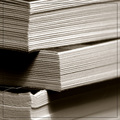
| 03/08/2006 07:59:18 AM |
and now doth time waste meby arlanbartComment: Interesting textures, though perhaps your depth of field is just too shallow, and your processing or control of light also lets things down a touch - the topmost edges seem to drift into overdone highlights. The composition looks promising however, and you evidently have a sense of light - just needs that touch more control either in set-up or in post-processing. I'm really not a fan of that border thing - pushes the image too far towards a simple graphic and away from photography for me. |
| Photographer found comment helpful. |
| 03/08/2006 07:56:30 AM |
Square cranesby ArnarHComment: Very poor I'm afraid. Detail, control of the light, processing are all letting this down. The actual colour is OK, and the sense of composition works pretty well for the frame, but becomes very confused at the bottom of the image, taking impact away from the good strong shapes of the main subject cranes. |
| Photographer found comment helpful. |
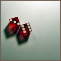
| 03/08/2006 07:55:11 AM |
Sparkling Diceby tfarrell23Comment: Excellent detailing and focus, even a sense of texture in that background, which works. Your handling of the variable light across the frame could have been a little better I think - just at that point where it becomes too bright in the top of frame; some work with selection tools rather than just processing the entire image, perhaps - it has that feel about it. |
| Photographer found comment helpful. |
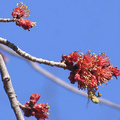
| 03/08/2006 07:53:26 AM |
Spring Arrivalsby deanaComment: Quite punchy colour-wise, but just too lacking in detail and a sense of real sharpness to di justice to your vision. Sharpening is at too high a radius, contrast is pushed quite heavily without being controlled, so that small areas have become simple blocks rather than keeping any distinction - it has the look of coming from a very cheap camera, actually, so i don't know if it's poor processing or just over-ambitious for your tools. |
| Photographer found comment helpful. |
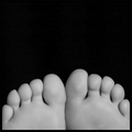
| 03/08/2006 07:51:12 AM |
My Little Piggiesby RockBruiseComment: Seems unbelievably smooth - real or fake? I quite like it however, for the simplicity. I would have more texture to really be excited about the image, a less porcelain look to the feet, and I'm not compleely sure that it really works in the square. |
| Photographer found comment helpful. |
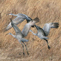
| 03/08/2006 07:49:39 AM |
Sandhill Cranesby MarjoComment: A nice study, particularly on the ends of the wings, where the feathers give you more contrast to work with. Not completely sure that your focus is spot-on (close though), and I wonder if the image couldn't just use more contrast overall, more punch. Perhaps there are too many angles nad crossings of the birds to make for a very easy look - they eye is constantly forced to move around, never to rest. |
| Photographer found comment helpful. |
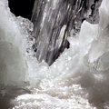
| 03/08/2006 07:47:24 AM |
Thawby eckoeComment: Whilst this composition certainly works for the required aspect ratio, the image itself comes across as a bit muddled - the combination of over exposed elements, the motionblur of the water, and a lack of really clear fous on the ice makes it hard to find a point to hold the eye. A pity - with clearer details and more careful exposure this might have been very effective. |
| Photographer found comment helpful. |
| 03/08/2006 07:14:53 AM |
Square Crop Circleby error99Comment: Beautiful detail, sharpness, focus, colour. Overall an absolutely competent shot. Has a certain near-rendered quality to it. |
| Photographer found comment helpful. |
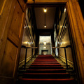
| 03/08/2006 07:13:51 AM |
The room upstairsby nico_blueComment: This is an oddly familiar scene - I don't suppose it's the Trafalgar Tavern, is it? Whatever. neat work - especially with the depth of field. It feels just slightly uncentred, which just puts the eye off slightly; square crop works well for a really symmetrical image I think, and the slight non-centring, even if an optical illusion, disturbs here. |
| Photographer found comment helpful. |
Home -
Challenges -
Community -
League -
Photos -
Cameras -
Lenses -
Learn -
Help -
Terms of Use -
Privacy -
Top ^
DPChallenge, and website content and design, Copyright © 2001-2025 Challenging Technologies, LLC.
All digital photo copyrights belong to the photographers and may not be used without permission.
Current Server Time: 08/20/2025 01:52:44 AM EDT.