| Image |
Comment |
| 06/06/2006 06:54:01 PM |
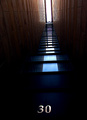
Welcomeby jjbeguinComment: Now I think everyone misunderstood here: the first impression is of an opening of light at the end of the tunnel - the cliche is perhaps doubly apt because of the use of it photographically - and the alighting of the eye on the number causes a wonderful disorienting shift in perspective, and does indeed produce the more ironic effect in the title. Fun image. |
 Photographer found comment helpful. Photographer found comment helpful. |
| 06/06/2006 06:31:39 AM |
|
| Photographer found comment helpful. |
| 06/06/2006 06:21:51 AM |
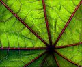
Castor Leafby pointandshootComment: Good tonality, good display of the near-abstract natural world. Colour combination is interesting, but it's not absolutely grabbing me I'm afraid. |
| Photographer found comment helpful. |
| 06/06/2006 06:18:46 AM |
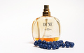
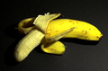
Baby I'd Love You to Want Meby GeneralComment: There's a certain technical achievement to this kind of product shot, which you've achieved pretty well. It would be more seductive, perhaps, if you paid a little more attention to the reflection of your light-source - the most effective of such shots use a big soft-light not only for the diffuse nature of the light, but also for the glossy quality that is lent to the product by the large area of the direct reflection - removing some of the 'cheap'-looking effect of a single spot of light appearing, as here, on those beads for instance. |
| Photographer found comment helpful. |
| 06/06/2006 06:15:42 AM |
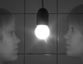
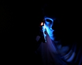
Ghostby ErnirComment: Given the advanced rule-set's lack of restrictions, I think some work to increase the general contrast of this shot might have helped you: the transparency of those faces is made by the lines appearing through them, not the washed-out quality, and anyway the image is just too generally grey for big impact. |
| Photographer found comment helpful. |
| 06/06/2006 06:12:27 AM |
~by ArcanistComment: A fine, detailed portrait; everything is as it should be here. The clasped hands, I think, bring s sense of determination to a pose that might have spoken of contemplation or exhaustion without that. |
| Photographer found comment helpful. |
| 06/05/2006 04:35:21 PM |
CONTACTby mandyturnerComment: This place has never been kind to blurry photographs, however meaningful they might be; when the composition of them is as apparently random as this - given the drift of colour into the bottom right corner, what is the point of the negative space in the rest of the image? - the voters are likely to be harder on you. There is good stuff here, although it may be better in your own eyes than it is a communication with an audience: for instance, again, that (lack of) cropping. Are we certain that this is the best possible way to present this capture? My answer would be 'no'. |
| Photographer found comment helpful. |
| 06/05/2006 04:27:57 PM |
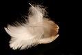
Light as a Featherby KatmystiryComment: Lacking composition, really, I'm afraid. Has the feel of un-cropped full frame image which badly needs at least a judicious crop. I don't see what the immediate appeal is supposed to be, nor do I feel that my eye is guided through the image, and both those elements, I think, have to be strongly present to make such a simple image work. |
| Photographer found comment helpful. |
| 06/05/2006 04:25:51 PM |
In the darkness of liesby TUBORGComment: I'm no fan of such portentous titles, especially when accompanying a portrait, but let that pass. I have a real problem with that small section of her right cheekbone showing - it's a between-two-stools moment, I think; I get your point, to emphasise the bone structure, but you've not completed the job really. Good detail and so on, but that should be a given I think, and the more nebulous and complex elements of an intriguing image aren't here, for me - almost, perhaps, but that small problem can make a large difference. |
| Photographer found comment helpful. |
| 06/05/2006 03:24:30 PM |
Yellow mellowby alpharichComment: Culturally, I think the inevitable priapic comparison is begged here; i'm not sure i want to go into that though. However technically, there's the sense of slight channel clipping in some of the solid yellow areas, and of a fake element to the light intensity to image left. That channel clipping is what gives the more solid yellow areas a sense of missing detail, when the focus is definitely spot-on. |
| Photographer found comment helpful. |
Home -
Challenges -
Community -
League -
Photos -
Cameras -
Lenses -
Learn -
Help -
Terms of Use -
Privacy -
Top ^
DPChallenge, and website content and design, Copyright © 2001-2025 Challenging Technologies, LLC.
All digital photo copyrights belong to the photographers and may not be used without permission.
Current Server Time: 08/18/2025 09:22:42 AM EDT.