| Image |
Comment |
| 07/23/2006 12:17:33 PM |
Cleanlinessby perotyComment: Next to Godliness ... well. In such a regular, clean composition, it is fo course the breaking of the regularity that forces the attention, that draws the eye, and that becomes in effect the point. Here that is the blue basket and that open door: there's a parallel of elements there, the cicrcular objects from different angles.
Also, I think in such a simple situation the regularity of the framing also matters - and I think you fall down a little on that: there's a small tilt to the right it seems, and wide-angle distortion affects the verticals to each side, which removes some of the effect of the sqaureness of so much of this - and it's that squareness which serves to make those two circular points so much more outstanding.
The blue basket functions as a strong element because of it's colour in this white world, and is given added weight by that parallel with the door - the only genuinely curved major element in this composition.
Overall, this shows I think a top eye for a composition, and a strong sense of balance of elements within frame: whether that be an instinctive thing, or from much thought doesn't really matter - it works. However, when I come to look for a sense of the meaningful in here - a sense of emotion, or of pertinence, I find I'm struggling. Photography can, I think, do that more than any other 'art'form - and GCI, painting, drawing and the like seem more apt to this kinb of composition. And that is, of course, a personal opinion. |
 Photographer found comment helpful. Photographer found comment helpful. |
| 07/23/2006 07:29:56 AM |
---by ElaineComment: Actually this is more interesting than at first sight: the negative quality of it tends to overpower that I think: the fact that an almost believeable 'real' definition still exists in the poles just brings that extra element to it. The tiny bit of wire bottom left is a shame, but presumably just a little oversight. |
| Photographer found comment helpful. |
| 07/22/2006 02:36:47 PM |
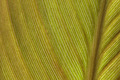
Glucose Highwayby LactobeezorComment: Might be impressive as a really enormous print, especially if detail were retained - might have a suggestion of Andreas Gursky's work. |
| Photographer found comment helpful. |
| 07/22/2006 02:29:31 PM |
Line of Trianglesby andrea22_alsComment: An interesting place, though I think this image lacks some sophistication really: careful use of curves or levels might have brought out those triangles more clearly, differentiated one from another more - they all tend to the same shade of grey here. The shot feels slightly tilted, which may only be some kind of illusion, but nevertheless is definitely present and without a point that I can find. The writing a bottom of frame draws the eye, but seems annoyingly cut off. |
| Photographer found comment helpful. |
| 07/20/2006 05:59:57 PM |
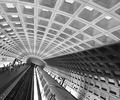
Station Stopby levyj413Comment: I quite like this, and it's cleverly composed also. I wonder if your contrast wasn't higher it wouldn't give a bit more impact to the image. Compositionally, placing the end point of the leading lines right on the classic thirds point is perhaps a touch blatant for me - though it's a very good starting point. |
| Photographer found comment helpful. |
| 07/19/2006 06:58:50 PM |
converging linesby smccComment: This would have rocked in many a challenge - the light is wonderfully controlled, and the sense of shape and definition is first class - but I suspect many will see it as being a shoe-horn into the challenge: arguably, it's no more about lines than is all photography, and I suspect people will want a more obvious sense of the subject. For me, this is about light and shade, and about progression of light, and about handling of colour more than it is about lines. Still a lovely shot. |
| Photographer found comment helpful. |
| 07/19/2006 06:53:31 PM |
Supportive Linesby benhurComment: Strong composition, and nice tonality. It lacks, perhaps, a certain subtleness of light - maybe a slightly more gradul progression from black into the visible tones might have lent it more grace, given the limits of basic editing. |
| Photographer found comment helpful. |
| 07/19/2006 06:50:58 PM |
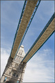
Tower Bridgeby howardjComment: An interesting and different approach to one of the Old Ladies of photography; I think you could have pulled a bit more punch out of the image, especially for DPC, with a stronger contrast - which would, i think, have added to the impact of those improbable angles you've found. |
| Photographer found comment helpful. |
| 07/17/2006 04:14:55 PM |
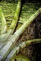
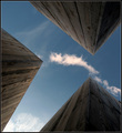
skies of blueby arngrimurComment: Certainly works for the challenge, and I like the POV a lot. Could perhaps have used a stronger sense of the colour in the sky - this is a touch muddy, rather than a strong blue. the wood adds texture, and is well captured. I wonder if a less rigidly symmetrical composition (I realise it isn't perfectly symmetrical, but its so close ...) might hold the interest more, or perhaps simply an element to break up that rigidity. |
| Photographer found comment helpful. |
| 07/17/2006 04:12:22 PM |
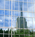
manhattan reflectedby tomzinhoComment: perhaps for real impact, losing the greenery would have been an advantage - it would also give a stronger sense of the illusion of reflection and division by those lines. It's a nicely done image though; just probably a touch too obvious in the end. Good post work. |
| Photographer found comment helpful. |
Home -
Challenges -
Community -
League -
Photos -
Cameras -
Lenses -
Learn -
Help -
Terms of Use -
Privacy -
Top ^
DPChallenge, and website content and design, Copyright © 2001-2025 Challenging Technologies, LLC.
All digital photo copyrights belong to the photographers and may not be used without permission.
Current Server Time: 08/18/2025 02:21:07 AM EDT.