| Image |
Comment |
| 09/20/2006 05:01:20 PM |
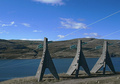
Transportingby LjonComment: Interesting structures - but that isn't enough by itself to make an impactful photograph. There's no sense of scale here - these things could be five foot high, or fifty. Compositionally, you have two sets of lines working against each other - hte parallels of the background, and the diagonals of the power lines. The natural tendency is to follow converging lines to the vanishing point, but you've placed that out of frame, which leads the eye out of your image. The interest, I would say, is in the crazy shapes of those pylons, but your chosen point of view hasn't made the most of that impact. |
 Photographer found comment helpful. Photographer found comment helpful. |
| 09/20/2006 04:54:05 PM |
|
| Photographer found comment helpful. |
| 09/20/2006 04:51:59 PM |
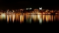
Light in the Nightby rileyComment: This verges on the feeling that there are two frames in one here - the regression of light in the road, and the cityscape alongside it seem almost completely disconnected - an intersting dynamic, though one senses that its more by chance here. A few things make it too complex an image for DPC - the strong vertical black thing, the slightly out of ordinary composition - the dynamic pulls us both to the top right and the bottom left where htat amber streetlight echoes the regression of others along the road - leaving the skyline and the other lighted window to almost simple clutter up the picture. It might work as a large print - but it pays never to forget that the medium you're presenting in here is a really quite small web image - as a 2x1.4 inch print, would you expect this to work? |
| Photographer found comment helpful. |
| 09/20/2006 04:45:25 PM |
electricityby ShrinkComment: For me this lacks any great impact; it's composed to accentuate the sign - fair enough - but there's no suprise there, nor visual parallel to the scene, just a quite straightforward and not very interesting warning. The fencing stops the strange structures of the sub-station making much impact in the image. I don't really understand the point of it, I'm afraid. |
| Photographer found comment helpful. |
| 09/20/2006 04:39:23 PM |
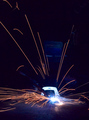
Electric Sunby jrtoddComment: Spark trails are always fun, but there are a couple of points I'd make about this shot; whilst you've done well in capturing the trails, you're perhaps a bit under-exposed as far as the overall scene is concerned - a little extra light somewhere perhaps, give us more of an idea of context? And I'm unsure of your overall compositional sense here - the real centre of attention is the bright spot, but that seems slightly uncomfortably placed in frame to me, and without enough balancing interest in complementary areas. But it's nicely done, despite those reservations. |
| Photographer found comment helpful. |
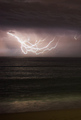
| 09/20/2006 04:30:09 PM |
Midnight Light Shows, Hurricane Season in Floridaby behindthescenesComment: Marvellous stuff. I don't find lighting shots particularly interesting personally, but can appreciate that this is as good as they get - or almost so. Maintaining some interest in the clouds and water shows careful exposure, and a thoughtful approach. Just one thought: presuming that this is one of a number of shots (after all, you don't just turn up and take one in this situation, do you?), I wonder if you haven't taken the one with the most lightning in it as the best - was there something a touch simpler, and perhaps the more impactful for it? The sheer quantity here makes it perhaps less dramatic than a more coherent, simpler structure of lines might be. |
| Photographer found comment helpful. |
| 09/20/2006 04:21:29 PM |
Fire Hazardby MongooseDoggieComment: This has a certain something to it - though your crop pretty quickly begins to seem rather arbitrary. The toning is well done, but your subject, as is apparent from your depth of field, doesn't quite tie in with your title from where I'm sitting. |
| Photographer found comment helpful. |
| 09/20/2006 12:52:29 PM |
The Creation of Atomby Keith ManiacComment: A brief glance at the first page of thumbnails shows about five shots of these things - I rather think you're going to suffer from voter 'seen-it-before' syndrome with this. That said, it's well done and you've had the patience or luck to wait for a good shape from the beam thing. The hand just lacks a touch of sharpness - a little motion perhaps? Nothing for it to rest on? It's nice work - just, as I said, a really very obvious kind of thing to enter in this challenge. |
| Photographer found comment helpful. |
| 09/18/2006 07:06:35 AM |
Can't miss itby jjbeguinComment: I don't understand why the voting public at large can't see that this is so much more interesting than the obvious images that have won this challenge. Perhaps it's a self-perpetuating thing, concentric circles. |
| Photographer found comment helpful. |
| 09/08/2006 06:33:33 PM |
Grow Old With Me - The Best is Yet to Beby SammieComment: Nice work; the erlative positioning of the two privileges him, which is possibly a shame, although one understands the desire to keep the stonework in shot. It has an almost classical feel, and would maybe have been even more arresting in black and white. It's compassionate, and I like that. |
| Photographer found comment helpful. |
Home -
Challenges -
Community -
League -
Photos -
Cameras -
Lenses -
Learn -
Help -
Terms of Use -
Privacy -
Top ^
DPChallenge, and website content and design, Copyright © 2001-2025 Challenging Technologies, LLC.
All digital photo copyrights belong to the photographers and may not be used without permission.
Current Server Time: 08/17/2025 09:13:40 PM EDT.