| Image |
Comment |
| 10/07/2006 07:02:30 PM |
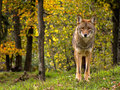
Coyote Prettyby ronnytComment: A nice natural portrait, good detail, light etc.; I'd have done something about the sheer brightness of the background - the yellow moments in the trees are really very bright, and could easily have been calmed down a touch to stay as just background. |
 Photographer found comment helpful. Photographer found comment helpful. |
| 10/04/2006 07:04:59 PM |
Statureby shutterflyComment: Something of a classic - a touch boring for being so common, and a shame you didn't find one with more grace to it's neck shape, but it's basically a well taken shot. I might have taken some trouble to lighten the head, just to keep it in the same brightness space as the body, but it's your shot. |
| Photographer found comment helpful. |
| 10/04/2006 07:02:15 PM |
Right-hand corner king.by TNCameronComment: Interesting at least - can't quite decide whether I actually like it or not at the moment. Compositionally - yes. But whether i can sense any artistic justification for that I'm not sure. |
| Photographer found comment helpful. |
| 10/04/2006 07:00:41 PM |
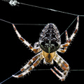
Stringsby silverscreenComment: Strong nature shot - I would wish for just a little deeper DOF - it would be more interesting to me with that sharpness of all those threads fully realised. Detail and light are good. |
| Photographer found comment helpful. |
| 10/04/2006 06:57:57 PM |
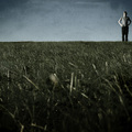
My storyby cabaComment: Black and white - surely this cries out for a black and white treatment? You'd lose the rather toneless background colour (no loss), the bland colours of his clothes (no loss), and emphasise the the textures of his head, the white of his beard, and the highlight of that tear (all win). |
| Photographer found comment helpful. |
| 10/04/2006 06:50:51 PM |
Peaceful Surrenderby cools98Comment: I never understand why people seem to like infra-red so much. Seems to me just another trick in a world of tricks. |
| Photographer found comment helpful. |
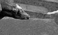
| 10/04/2006 06:49:34 PM |
Synapseby posthumousComment: Interesting; My first reaction is that the exposure lacks some control - has the impression of being brought back too far from over-exposed, or something, and I find the visibility of the cow's shoulder unsettles the composition a bit - my eye can't help but be pulled there - a slightly tighter crop might have made that balance more comfortable. background is something of a problem, not working with your subjects very happily; but the idea, overall, I like, and it's been a lot more fun to look at than most. |
| Photographer found comment helpful. |
| 10/04/2006 06:45:47 PM |
Sheby fotomann_foreverComment: This is really really unpleasant - all the worst things about glossy magazine portraiture over done to extremes. The bizarre bordering, the soft-focus, the smoothing (or whatever it is), the weird shadows around her knees, the slightly peculiar expression. It's just got no connection with any kind of world, real or imagined, that holds any appeal for me. Damn, you've even got a soft-focus effect on your border! Maybe it isn't soft focus. Maybe it's some other kind of glow effect or something.
Beyond my personal distaste for it (I'm not just being rude, I think it's important that opinion is heard), i guess it's pretty well executed. I wonder if that glow might be too much even for fans of this stuff - it is, I think, perhaps just too strong - giving a feel of odd focus rather than a simple effect. The glow on the border likewise perhaps just draws the eye too much - especially on the left of frame, where the unmade bed (or whatever) is sliding quite nicely into darkness otherwise. And her expression is a touch uncomfortable - she doesn't seem at ease with this world you've made for her. I'll be intrigued to see how the site rates it though. |
| Photographer found comment helpful. |
| 10/04/2006 11:56:26 AM |
View from Ecola Point, Sunsetby Bear_MusicComment: Good clean work. processing and sense of composition are spot on, and it's really nice to see a landscape not overblown and wiped out in processing in an attempt at 'drama'. This is good stuff. |
| Photographer found comment helpful. |
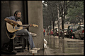
| 10/04/2006 11:53:08 AM |
Milk Crates Hold A Legacyby Vapor63Comment: I can't see good reason for the verticals not being, well, vertical. Nor for the half-eclipsed background figure, come to that. In fact, one suspects you could keep the word 'art' in the top left corner, straighten the verticals, and frma eyour subject more strongly. Still, nice at least to see some 'found' photography. |
| Photographer found comment helpful. |
Home -
Challenges -
Community -
League -
Photos -
Cameras -
Lenses -
Learn -
Help -
Terms of Use -
Privacy -
Top ^
DPChallenge, and website content and design, Copyright © 2001-2025 Challenging Technologies, LLC.
All digital photo copyrights belong to the photographers and may not be used without permission.
Current Server Time: 08/17/2025 04:17:02 AM EDT.