| Image |
Comment |
| 01/04/2007 03:04:05 PM |
Luringby pinbokeshattaComment: I like. Not wholly sold on the metal tonality, as i think it might have been interesting enough in simple black and white: likewise I wonder if you might not have made more of the shapes and patterns within the water. A fine contemplative study nevertheless. |
 Photographer found comment helpful. Photographer found comment helpful. |
| 01/04/2007 02:59:43 PM |
Christmas Dayby elru21Comment: A bit twee for my taste, but excellently done for what it is. The foreground bokeh is nice too - though that's a bugbear for many, as I expect some will have commented. |
| Photographer found comment helpful. |
| 01/04/2007 02:58:57 PM |
A Study in Light and Shadowby tfarrell23Comment: My first challenge here was 'The Egg' - some 200 later, I still have the feeling that it makes for a far more difficult subject than most would admit of. Strong sense of texture here, well handled lighting, good composition. |
| Photographer found comment helpful. |
| 01/04/2007 02:56:45 PM |
William Turner Goes Modernby remboComment: I quite like this - it has a degree of photographic integrity that is missing from many images around here - that is, you've kept it feeling like a photograph rather than an illustration. I'm not totally sold on this composition - perhaps the sun is too far right in frame, perhaps the car doesn't intrude enough to feel like a genuine element ... not sure. |
| Photographer found comment helpful. |
| 01/04/2007 02:54:35 PM |
Ruapehu by the Lakeby rayz1Comment: Good groove and colours - the foreground seems to have been knocked a bit by (presumably) the increase of contrast elsewhere. |
| Photographer found comment helpful. |
| 01/04/2007 02:52:33 PM |
Sitting Prettyby whiteroomComment: There's an odd sensation of her being slightly disconnected from her environment; like she's floating, almost. I think the location - the shapes given to this image by the stairs and so on, might have been handled slightly better, making them a stronger contributor to the composition rather than simply a background, which is how they seem here. |
| Photographer found comment helpful. |
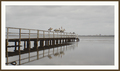
| 01/04/2007 01:24:05 PM |
Jetty on Tuggerah Lakeby CammacComment: Given the smallness of those birds in frame anyway, I think you'd have been well advised to use the full available size limit - and from a purely graphic design point of view I think the brown outer border is a mistake. It might have had a nice even winter groove to it, but it's hard to get past those elements really. Strong use of leading lines to make the centred composition comfortable though. |
| Photographer found comment helpful. |
| 01/04/2007 01:21:34 PM |
Ringling's sunsetby illoosi0nComment: Gosh, looks odd - some kind of over-smoothing thing going on? Funny selections and all that? Don't like that feel much. |
| Photographer found comment helpful. |
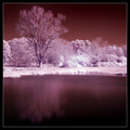
| 01/04/2007 01:20:15 PM |
Martian Winterby esdarbyComment: Difficult to get away from the trick aspect of infra-red, without which I suspect this isn't up to much. And if it were, why impose the funny look on it? I suppose I just don't get the IR thing, but then I'm still part of your audience ... |
| Photographer found comment helpful. |
| 01/04/2007 01:17:46 PM |
Feeling Proudby RgarciaComment: Lacks more than a little punch - especially for this place. Have a look at the histogram and I'm sure you'll find there was more dynamic range available. The detail is good, and most of the obvious technicals, but one thing that nearly always fails such photographs is attention to background ... |
| Photographer found comment helpful. |
Home -
Challenges -
Community -
League -
Photos -
Cameras -
Lenses -
Learn -
Help -
Terms of Use -
Privacy -
Top ^
DPChallenge, and website content and design, Copyright © 2001-2025 Challenging Technologies, LLC.
All digital photo copyrights belong to the photographers and may not be used without permission.
Current Server Time: 08/10/2025 09:18:09 AM EDT.