| Image |
Comment |
| 03/01/2007 06:28:52 AM |
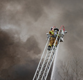
Taking the High Groundby darthsnComment: Strong detail and tones, eye-catching composition - although if i were getting arty I'd moan about the tree-tops. Would a higher contrast processing not have worked better? made more of the organic nature of the smoke versus the clean technical lines of the ladder? |
 Photographer found comment helpful. Photographer found comment helpful. |
| 03/01/2007 06:25:38 AM |
I have to stop this, every morningby rrwhaleyComment: Fine way to start the day, presuming there's coffee in that mug. There's a sense of desperation about this, given the title - both as an honest self-assessment and as an entry, which makes it interesting despite its lack of photographic quality.
You've taken enough care of the background to suggest more than a simple snapshot here - and yet, with all that care you've paid almost no attention to the light. I would urge you to take a good look at some other still lifes, some of the higher rated ones here would do, and see how they're lit - look at the reflections of the light sources in shiny objects, and of the graduations of shadow across objects, and look at the simplicity of the composition - as few elements as can put the message across usually. Because that's what this image lacks. The light is flat - it's shadows that let us know the shapes of things, and if someone told me that aspirin bottle was a cardboard cut-out I'd almost believe them. You could lose the other pill bottle, the top of the aspirin bottle, the three pills and it wouldn't change a thing about the impact of this image - in fact, it would make it simpler, easier to view. More successful. |
| Photographer found comment helpful. |
| 03/01/2007 06:16:39 AM |
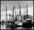
The Three Amigosby Jaded_HousewifeComment: A reasonably ordinary scene like this requires some special moment of light or situation to make it stand out as worth presenting I think; this just doesn't quite have it. The house, trees and other boats confuse a potentially simple composition, the light seems quite flat, making the shapes of the boats - those curves should be a gift - difficult to distinguish. The confusion of the masts/outriggers/whatever-they're-called could be an advantage in a simpler situation, here they just continue the complication of the treee silhouettes behind them. |
| Photographer found comment helpful. |
| 03/01/2007 06:12:51 AM |
MUNIby Sting11165Comment: I don't find any real interest in this image. Simply visually, its a confusing and not everso well composed picture. The slight motion-blur of the background somehow isn't enough to impart a sense of much motion to the tram - perhaps because of the inevitable blurs and streaks one would expect from a near-night-time urban shot. I also don't see anything in the figures in the tram, nor relation to the outside of it. I'd be interested to know what you see in it yourself - I just have the feeling I might be missing something here. |
| Photographer found comment helpful. |
| 03/01/2007 06:07:07 AM |
affectionby arsenalComment: Good detail, and finally some decent light in an image. Good tonality too. |
| Photographer found comment helpful. |
| 03/01/2007 06:06:12 AM |
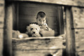
An Inner Glowby taterbugComment: An interestingly old-fashioned feel to this. For me the light is simply too flat, the entire thing lacking in a feel of contrast, and making it difficult to engage with. I appreciate that you have strong black and white points to deal with, but I think the tonal range of the greys of the image are too centred around on - quite dark - level, and some careful adjustment of that range would work wonders for it. |
| Photographer found comment helpful. |
| 03/01/2007 06:03:23 AM |
Corollaby DelRioPhotoComment: The light seems good, but in the interesting part of frame - where the focus is, on the right-hand side, that curve of the bigger petals, your shadows are very washed out, which makes a sense of real detail impossible to see, and makes the entire thing seem washed out. |
| Photographer found comment helpful. |
| 03/01/2007 06:01:41 AM |
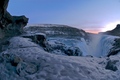
Gullfoss - In shiny white armorby bippiComment: Confusing, I think, compositionally. A difficult exposure anyhow, for sure, but some more play with the levels of the majority of the image might have helped - you seem to have relegated most of the interest in the image - the detail of pattern and light in the snow and rocks, to a very narrow dynamic range - perhaps simply to maintain control of the lightness in the sky, which has anyway drifted out of control at the very brightest point. |
| Photographer found comment helpful. |
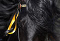
| 03/01/2007 05:59:07 AM |
Flash of Black & Yellowby BaldurTComment: Very difficult, technically - those colours and motion against the black of the hide. Don't think you've quite pulled it off - simple compositionally the framing is a bit awkward, and there just isn't enough 'horse' about the image. Right hand of frame adds little, and makes the framing of the rest - well, uncomfortable. |
| Photographer found comment helpful. |
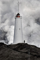
| 03/01/2007 05:56:40 AM |
Stormby DufusComment: Interesting - and arresting - juxtaposition, and the clouds look more like smoke than anything. Foreground tonality is strange, and perhaps the landscape purists would have you clone out the telegraph poles. I guess some sill tell you its underexposed, but I think your choice is quite carefully made, and quite effective. Dealing with whites like this is a tricky decision. |
| Photographer found comment helpful. |
Home -
Challenges -
Community -
League -
Photos -
Cameras -
Lenses -
Learn -
Help -
Terms of Use -
Privacy -
Top ^
DPChallenge, and website content and design, Copyright © 2001-2025 Challenging Technologies, LLC.
All digital photo copyrights belong to the photographers and may not be used without permission.
Current Server Time: 08/06/2025 12:15:13 AM EDT.