| Image |
Comment |
| 02/20/2004 04:48:26 AM |
Circlesby fayenetComment: The first thing that really bothers me with this shot is your cropping so close to the main headlight. Compositionally it should be the strongest thing in the shot, to me: the most contrasty part of the image, the stongest shape, most defined area of frame, and yet you've almost cut some of it out with that crop. Why not let it have it's space, allow it some framing? Good high-tech quality, the refletions are effective, great sense of smoothness. Good work, other than that crop. |
 Photographer found comment helpful. Photographer found comment helpful. |
| 02/20/2004 04:45:43 AM |
Silky Soft Waterby browntComment: I'd never have considered this subject apt for this challenge - and I've seen five or six so far. This is quite good, near abstract (that abstract quality applies to all these shots, and I think tis the conjunction of that and patently real world subjects that makes them so effective). It communicates more a sensation of the rush of water than of an invented texture to me, perhaps. It's a pretty enough shot though - would lookwell on a card, for sure - but mor for its painterly quality than anything else. Nice photo - for this challenge I think you'll get marked down more harshly by others than by me. |
| Photographer found comment helpful. |
| 02/20/2004 04:38:43 AM |
|
| Photographer found comment helpful. |
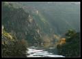
| 02/20/2004 04:36:39 AM |
Painted landscapeby DBoyComment: Very pretty shot - slightly disturbing sensation of tilt from that road and the house, though from the water it appears perfectly level - feels like the world has got a touch twisted. Great quality of light, especially on those rocks to the left, and the edge of the house - just enough highlighting to promote the subject. Lines allow good movement through the image too. A few extraneous elements have crept into the edges of frame - you could be a little harsher with your cropping without really taking much away, surely? Great feeling. |
| Photographer found comment helpful. |
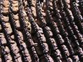
| 02/20/2004 04:33:11 AM |
Weathered Woodby MadMountieComment: Very hard direct light has given you a very high contrast image - losing perhps some of the subtlety of varying texztures in this subject. From its position in frame, and the fact that it's almost the only thing to break that rhythm, that piece of stray grass or whatever has become the subject of this shot perhaps more than the progression of those rings. All of which is criticism - but not to mask the fact that a good quality of texture remains. |
| Photographer found comment helpful. |
| 02/20/2004 04:30:02 AM |
Got Milk?by blackcanada2001Comment: Very competent studio shot - high-key background is perfect, detailing is perfect, lighting is pretty good, though perhaps just a touch harsh, direct. Don't get a sense of the srumbliness of the biscuit, it rather looks harder than that, which I think is a function of the harness of that main light (from the shadow, it looks like a standard shaded desk-light. Subject a mite dull though - just an Oreo, huh? |
| Photographer found comment helpful. |
| 02/20/2004 04:27:04 AM |
Unexpected interruptionby litboltiComment: Must surely have taken some patience to get this - or else pure fluke. Could have been an interesting shot, although I think perhaps you would need to frame things differently for it to be really successful, or at least crop with a more careful eye to what is the main subject of your shot - the impression is that this isn't cropped at all. |
| Photographer found comment helpful. |
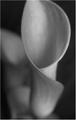
| 02/20/2004 04:24:17 AM |
Calla Lilyby nfesselComment: Gosh, you're going to get a bunch of out-of-focus comments, I guess. There is a kind of 1920's still life photography kind of look to this, though I'd suggest it's about fading of light more than it's about texture. Your cropping lets that feel down though - excluding the top of the flower, and cutting off the other in the background: I think you'd at least score higher if you'd included both, and allowed some progression of focus within the image - this way, the rear flower looks like an accident. |
| Photographer found comment helpful. |
| 02/19/2004 05:09:57 PM |
Watching Television (The Scream)by vonautschComment: Cool image, but I only see this as texture with a real stretch - even a lot of leeway won't get it there. I suppose there''s a sensation of seeing the representation of texture, but that's not really a philosophical place I want to go. |
| Photographer found comment helpful. |
| 02/19/2004 05:08:07 PM |
AstroBlade 5000by GeocideComment: Good. Very high-tech image, the background serves to re-infoce that. Good smoothness, and great feel in all areas. Neat work. |
| Photographer found comment helpful. |
Home -
Challenges -
Community -
League -
Photos -
Cameras -
Lenses -
Learn -
Help -
Terms of Use -
Privacy -
Top ^
DPChallenge, and website content and design, Copyright © 2001-2025 Challenging Technologies, LLC.
All digital photo copyrights belong to the photographers and may not be used without permission.
Current Server Time: 08/16/2025 09:02:01 AM EDT.