| Image |
Comment |
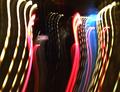
| 02/23/2004 08:25:22 AM |
Luv Da Yanx!by GeneralEComment: I think this perhaps loses out onnlack of any idea of what 'mundane' thing this is exactly. Light trails are good - but I can't find anything that really suggests an idea of contact with reality. |
 Photographer found comment helpful. Photographer found comment helpful. |
| 02/23/2004 08:23:46 AM |
Carolina Pharmaby GordonComment: Highly competent stock photography - with the possible minor exception of the clearly visible windows in the reflections. I don't mean that as a detraction. You should try and sell it to them, they might well use it for an annual report or something. Not quite 'extraordinary' enough for me, but solid shooting. |
| Photographer found comment helpful. |
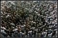
| 02/23/2004 08:16:26 AM |
City of the Lost Locksby PacloComment: Clever stuff indeed - like this very much - your placement of the focal point of those lines is very strong - so many would have tried to put this centrally. |
| Photographer found comment helpful. |
| 02/23/2004 08:15:29 AM |
The Hands of Timeby PaulMdxComment: Delicate, neat, strongly composed. Placement of the hands is clever. Entirely fitting the challenge, though it perhaps doesn't quite make it into the 'extraordinary' class. Strong image though. |
| Photographer found comment helpful. |
| 02/23/2004 08:13:33 AM |
Me, Myself, and Iby jimmyn4Comment: Quite a good idea I think, though your execution, in a challenge that allows the full scope of editing, is poor. You need to bring the white level way up from here, at least. Something disturbs in the composition area too - perhaps that your cropping asks too much of the eye in a very regular shape - and the privileged areas appear to be between the faces, rather than including them. |
| Photographer found comment helpful. |
| 02/23/2004 08:08:41 AM |
Jump For Joyby bjallenComment: Marvellously crazy - but a shame you couldn't quite have stopped the left-hand dog. You score for idea, but for location (and really I probably mean light), and execution you also lose some. There is some good compositional balance - but in the end the brightness of the background undoes your work. |
| Photographer found comment helpful. |
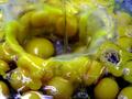
| 02/23/2004 08:04:58 AM |
Eggs for Breakfastby agwrightComment: Technically good work - though those reflections are just a touch strong and single-light source looking - a soft box would have spread them out more and given an overall 'cleaner' appearance. I'm not a big fan of selective de-saturation as a trick - and I don't see a great purpose for it here: you don't quite amange the 'extraordinary' part of the challenge here for me - not beyond that de-saturation anyway. |
| Photographer found comment helpful. |
| 02/23/2004 07:59:28 AM |
Splash Downby scrum8Comment: Very indistinct I'm afraid - and the colours are very muddy for this kind of 'designer' shot. To get that stop motion and brightness into these shots you almost always need good flash work, and this appears to have been pushed towards too long an exposure really, not quite fast enough to stop the motion. |
| Photographer found comment helpful. |
| 02/23/2004 05:14:48 AM |
|
| Photographer found comment helpful. |
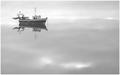
| 02/23/2004 05:09:56 AM |
Sea of tranquillity by geewhyComment: Profoundly good work Gordon: 12 challenges in and then the 15th hoiighest rated shot on the site - bordering on the unfair :-) Very pleased for you - was going to say keep it up, but perhaps I'd rather the rest of us were left with a chance. Intriguing that all your 'averages' are whole numbers, too. |
| Photographer found comment helpful. |
Home -
Challenges -
Community -
League -
Photos -
Cameras -
Lenses -
Learn -
Help -
Terms of Use -
Privacy -
Top ^
DPChallenge, and website content and design, Copyright © 2001-2025 Challenging Technologies, LLC.
All digital photo copyrights belong to the photographers and may not be used without permission.
Current Server Time: 08/18/2025 05:27:51 AM EDT.