| Image |
Comment |
| 02/24/2004 05:15:54 AM |
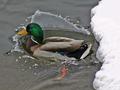
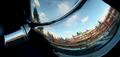
Extraordinary Waveby Dim7Comment: Great moment to capture, fitting for the challenge. Final image lacks a level of detail at least however, which takes away quite a bit of the impact of the shot. |
 Photographer found comment helpful. Photographer found comment helpful. |
| 02/24/2004 05:13:57 AM |
Old-fashioned Terracotta Pot with Mountain Rocksby kayceeComment: What this lacks to my mind, is a moment of light. The illumination across the scene is absolutely even, very little graduation of shade anywhere: that leaves you without much evidence of texture to work with in your shot, and thus a mundane scene produces a mundane photograph. Compositionally the wooden thing really removes the eye from your subjects - without that the shaping of elements within the shot would be fine. |
| Photographer found comment helpful. |
| 02/24/2004 05:10:47 AM |
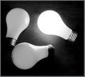
brightest bulbby SeanachaiComment: Like a lot of things about this - the high contrast, grainy effect (actually comes from the background, I think), evenness of light in the 'un-lit' bulbs, the slightly 'off' composition. Has a near-graphic quality to it. Would personally have tried to get a more 'pnotographic' progression of light across those bulbs, but that's just a personal thing. |
| Photographer found comment helpful. |
| 02/23/2004 01:20:14 PM |
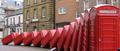
Public Telephone Boxes by redmoonComment: Good photography - but not half as clever as the guy who set that up :-) I'm not sure about the narrow cropping - not sure that it doesn't actually lessen the impact of the shot. I'm sure there's good reason, but it does leave me thinking 'why cut off the bottom of them?'. |
| Photographer found comment helpful. |
| 02/23/2004 01:17:36 PM |
Teapot Reflectionby lizzyc3Comment: Not wholly convinced about this one. Certainly meets the challenge perfectly - but something in the composition, perhaps just that you've excluded so much of the actual form of the tea-pot, takes away from it - perhaps without the tilt it would be more immediately familiar, or perhaps with a slightly less narrow aspect ratio. Good balance of shapes and forms I think, but that one thing lets it down a touch. |
| Photographer found comment helpful. |
| 02/23/2004 01:14:46 PM |
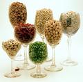
Sevenby dsrayComment: Technically impeccable work. There is a suitable weirdness to the composition, and the subject, without detracting from the 'mundane' thing. I'm in two minds about the single bean - not sure there isn't already enough going on , what with contrasts of size of glass and colours of beans, for that to be over-egging the pudding, but I guess you've already agonised about that. |
| Photographer found comment helpful. |
| 02/23/2004 01:12:43 PM |
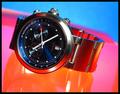
My Watchby tommy_tComment: Good use of colour here - you've managed ot echo the red of that hand's point in the scene without it seemiung overpowering or plain bizarre - and thankyou from the bottom of my heart for not putting a red line in the border :-) Certainly a mundane enough subject - made it look extraordinary? Jury's out for the minute ... |
| Photographer found comment helpful. |
| 02/23/2004 01:08:46 PM |
Mount Lampshadeby MWittComment: Very nice idea, and pretty fine execution of it. I find the composition a bit irritating, however: I think I would have likes the crown of the shade more solidly in frame, allowing the eye a real place to be drawn up to - as it is, I think you draw the eye rather more out of frame than to any particular point. Would have been marvellous for textures, also. |
| Photographer found comment helpful. |
| 02/23/2004 11:20:06 AM |
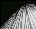
Death Star Tablelampby johnmComment: Reminiscent of a shot from the Matrix challenge. Colouring is good, and puts the image into a non-mundane area, for sure. I'm not sure that you wouldn't really want to make this a very symmetrical composition, given that it's such a pure image, and simple picture: the slight tilt, and placing the pattern of the holes so far up frame works rather against the very abstract quality of it. Certainly meets challenge subject though. |
| Photographer found comment helpful. |
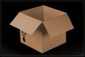
| 02/23/2004 08:28:29 AM |
Boxby tomlewis1980Comment: I think your chosen depth of field actually works against this image: i don't seen the real benefit of stressing those particular angles of the flaps against the rest of the box. Sure, the text is ;egible, but as a point that would stand out against the regularity of the rest of the box, I don't think it neededd to be accentuated this way - for me, it only leaves the rest of the image to seem odd, as opposed to 'extraordinary'. |
| Photographer found comment helpful. |
Home -
Challenges -
Community -
League -
Photos -
Cameras -
Lenses -
Learn -
Help -
Terms of Use -
Privacy -
Top ^
DPChallenge, and website content and design, Copyright © 2001-2025 Challenging Technologies, LLC.
All digital photo copyrights belong to the photographers and may not be used without permission.
Current Server Time: 08/18/2025 10:35:09 AM EDT.