| Image |
Comment |
| 04/12/2004 07:31:29 PM |
|
 Photographer found comment helpful. Photographer found comment helpful. |
| 04/10/2004 08:45:54 PM |
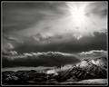
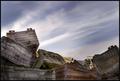
Mountain Light by dsidwellComment: What, I haven't commented yet? Many congratulations on (yet) another ribbon David. Worthy of Brian Kossof, if it weren't for the aspect ratio: obviously your studying has paid off :-) |
| Photographer found comment helpful. |
| 04/10/2004 08:32:38 PM |
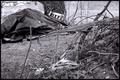
Messyby ewebComment: The fine line between chaos and mess, and I'm not quite convinced you're on the right side of it. Not thhat I think it's possible to vote with that in mind, really. My first reaction is that this is lacking in contrast, both in subject matter and in processing - obviously the tonal range through out the image is very broad, but I think that pile of sticks lacks strong definition, and it would sit more happily in the composition with the tarpaulin covered thing if it were more defined. |
| Photographer found comment helpful. |
| 04/10/2004 08:26:36 PM |
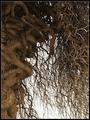
Natural Madnessby frumoazniculComment: Reminiscent of M. Beguin ... not only in the treatment of tone and contrast, but in the slightly unorthodox but yet effective composition. Oh to have this kind of eye ... |
| Photographer found comment helpful. |
| 04/09/2004 09:47:21 PM |
|
| Photographer found comment helpful. |
| 04/09/2004 06:17:33 AM |
Last century fish containersby heidaComment: Technically lovely photograph - keeps the impression of the dynamic range of the scene without resorting to over-exposure. Good work. |
| Photographer found comment helpful. |
| 04/09/2004 06:14:53 AM |
Dyslexiaby robsmithComment: Neatly done - especially the highlighting of that row of letters, whish is kept within the good dynamic range of the rest of the shot. The barrel distortion is still present, though I think you've done well to keep it to a minimum. There isn't in the end enough appeal in the actual shot, for me - it's a touch too bluntly only about those letters. Perhaps you might have experimented with other means of framing this one? |
| Photographer found comment helpful. |
| 04/08/2004 08:11:17 PM |
Rainy Daysby mariomelComment: I have a fondness for this kind of stuff - I find it evocative (perhaps I just have a fondness for this kind of mood, really). I do wish you hadn't done that with the border though - it rather puts it into the faux art greetings-card terrritory, rather than letting the mood stand on its own. Which is not to say I don't think it will be effective here ... I wish, in terms of dpc entries, my visual imagination extended to such things. A very good shot, flawed. 8. |
| Photographer found comment helpful. |
| 04/08/2004 08:04:50 PM |
Out of Controlby jab119Comment: Interesting entry. There's something about it which says 'too obvious' to me - in that it was exactly what I was expecting to see in this challenge. I'm not sure it'll do so well, perhaps bordering on the too abstract for here, and in fact I think I'd have to concur with that - after some thought, it's just not my cup of tea. Unfortunately, voting is subjective ... |
| Photographer found comment helpful. |
| 04/08/2004 08:00:27 PM |
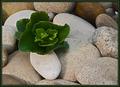
Out of Chaosby rhipsterComment: Highly proficient - good sense of smoothness and weight in the stones - the green has the look of over-sharpening, but that may just be the way it looks (!). A very dpc photo, I would say - so proficient not only in its technique but in its targeting of audience. I'm sure it will do well. |
| Photographer found comment helpful. |
Home -
Challenges -
Community -
League -
Photos -
Cameras -
Lenses -
Learn -
Help -
Terms of Use -
Privacy -
Top ^
DPChallenge, and website content and design, Copyright © 2001-2025 Challenging Technologies, LLC.
All digital photo copyrights belong to the photographers and may not be used without permission.
Current Server Time: 08/18/2025 12:28:09 PM EDT.