| Image |
Comment |
| 05/12/2004 06:03:12 PM |
Freedom of speech.by DufusComment: Shows some of the difficultire of photo-journalism - too many peculiarities in these people (looking at camera, weird cropping, weird expressions). Positioning of the statue is weird. Prominence of the Hotel name almost makes the shot about that, rather than whatever the subject of the demonstration is. Almost weird enough to be about that weirdness itself - but your title, and the concentration of the image suggests otherwise. |
 Photographer found comment helpful. Photographer found comment helpful. |
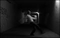
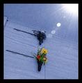
| 05/12/2004 05:55:36 PM |
Rising (soccer) starby litboltiComment: Kind of like this, for its sheer oddness and mood. I like the composition, the fact that it makes the image as much about the location as about the figure - provides a nice balance, a nice dichotomy in the scene. I'm sure a different frmaing would have fared better on dpc - balance the figure with the light on the wall that you've half cropped-out to right, and you'd have a much more orthodoxly composed (and equally, more immediately eye-catching) image. I'm glad you haven't - glad there are people submitting not just for the prizes. |
| Photographer found comment helpful. |
| 05/12/2004 05:51:45 PM |
Mosquito Heavenby ladpupmoeComment: Not quite sure what the problem is (light prbably, it usually is), but there's a lack of detail in the little monster - and even, to a lesser extent in the leaf. Perhaps a sligh camera movement? Cunningly reduced with sharpening perhaps, but there isn't that pop of definition that one would look for. |
| Photographer found comment helpful. |
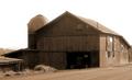
| 05/12/2004 05:49:35 PM |
My First Barnby NeuferlandComment: The burnt-out sky is such an obvious problem here - and seems to be a simple case of dynamic range being unable to cope with the scene you wanted to capture - and the only solution? A different time of day, or different weather ... Also, I'm not completely certain about your framing of the image - those buildings to the left, cutting them off - perhaps you could have afforded to include more of the context here, rather than so blatantly concentrating on the barn alone? The cut off of those sheds unbalances the image a bit, for me. |
| Photographer found comment helpful. |
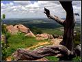
| 05/12/2004 02:51:30 PM |
solitude (my first trip to the mountains)by fstopopenComment: A few things upset what for me would otherwise be a wonderful shot. I think tere's too much going on - tree. stones, sky, and somehow you haven't brought those elements together compositionally. The line of rocks doesn't work with the shape of tree in any harmonious way. The extraneous greenery in the left of frame might confortably have been lost, andd I also think that that dead tree is too closely cropped in shot - I feel that a little more distance would have kept it in the foreground, and used it as a compositional element to draw the middle distance roacks and the far horizon together. In landscape, many of the most useful compositional ideas come from simple geometric patterns - curves, circles, triangles (especially the latter) - shapes that the eye has a natural inclination to follow. |
| Photographer found comment helpful. |
| 05/11/2004 07:56:53 AM |
Shapely Sageby osramComment: Not sure what this is, not that it matters, but those 'extra' lines, the less geometric ones, kind of upset the fluidity of the image for me - it's otherwise so perfectly abstract, and I'm not convinced that they add much. Not that you could just have popped up and removed them of course, but nevertheless ... |
| Photographer found comment helpful. |
| 05/11/2004 07:50:58 AM |
Fire extinguisherby MrAkamaiComment: Like this, like the simplicity of it, and the progression of light across the wall's bricks. On thing I would change would be to sorrect the perspective distortion, or to shoot head-on in the first place - that slight coming together of the lines of bricks across the frame produces an odd feeling of unevenness across the image, and it isn't what i sense this shot is about. |
| Photographer found comment helpful. |
| 05/10/2004 05:31:53 PM |
On Mother's Dayby David.CComment: In terms of simple technical competence this is wonderful. However, there's an element of meaningfulness that I look for in a shot, and I don't find much here - no great absorbtion in the light, and no great attraction in the image as a whole. Still a 6 though. |
| Photographer found comment helpful. |
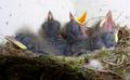
| 05/10/2004 05:15:59 PM |
New Lifeby dagaleaaComment: Staggeringly good wildlife photo - almost beggars belief that you've never shot this before :-) That sense of chaos given by the specks of dirt that appear to be flying (on closer inspection the might well just be on a wall), but nevertheless the imapct is special. Great image. |
| Photographer found comment helpful. |
| 05/10/2004 05:11:07 PM |
Mother’s Dayby thelselComment: That really heavy balck order is I guess appropriate in this case - and I like the intention I percieve here - though i always find selective desturation slightly too blunt an effect to have real emotional impact. Love the rest of the editing work - though the suggestion of the sun in that burnt-out light makes the absence of shadows a touch too weird for my taste. Intriguing shot though - great sense of balance, compositionally. |
| Photographer found comment helpful. |
Home -
Challenges -
Community -
League -
Photos -
Cameras -
Lenses -
Learn -
Help -
Terms of Use -
Privacy -
Top ^
DPChallenge, and website content and design, Copyright © 2001-2025 Challenging Technologies, LLC.
All digital photo copyrights belong to the photographers and may not be used without permission.
Current Server Time: 08/18/2025 06:46:49 PM EDT.