| Image |
Comment |
| 05/18/2004 02:43:02 PM |
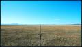
Fence to Nowhereby dhareComment: Nice approach to the challenge - and kind of works. Fence is a touch too insignificant in the image though: perhaps if you'd been able to make more of it's shadow ... Good perspective work, no lens distortion that registers with me, and that helps carry of the regularity of the composition very well. 6 |
 Photographer found comment helpful. Photographer found comment helpful. |
| 05/18/2004 02:41:07 PM |
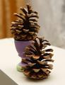
Untitledby oksamitComment: Excellent smoothness and clarity to this macro work. Tooo much of a shoe-in to the theme for me however - sure, as a pair they're arguably centred, though equally validly, as individuals, they're nicely (almost) on the classic thirds lines. Composition could have been simplified to good effect i think - bin the coloured egg-cup, white-out the wood and there'd be a suitably scandinavian feel to this. 4 |
| Photographer found comment helpful. |
| 05/18/2004 02:35:11 PM |
Technicolorby JesuispeureComment: Don't like this I fear. Quite apart from the over-the-top colouring (obfiously, only my opinion), it seems slightly over-exposed (details blowing out in the more saturated areas), and the direct light isn't helping communicate the softness of the flower - which would make a real contrast with the bizarre tones. 4 |
| Photographer found comment helpful. |
| 05/18/2004 02:32:38 PM |
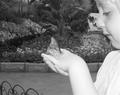
fly away with meby mamabear5612Comment: The blat of that flash is real pity -- murdering the detail in foreground. I guess it would have been near-impossible without it, but that doesn't stop it causing problems. Would it have been impossible to crop in tighter on the hand and the butterfly? Might have made for a much less snap-shot-like composition. |
| Photographer found comment helpful. |
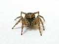
| 05/18/2004 02:30:02 PM |
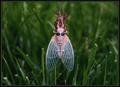
Cicada Emerging From His Shellby instepsComment: Excellent detail - man he loks like a plastic toy - and great light, especially the rich green of the background. suitably regular and symmetrical subject to carry the composition (unlike so many who've just plonked something dead centre without a thought). Hope it does well - has an oddness that I like. 7 |
| Photographer found comment helpful. |
| 05/18/2004 02:14:26 PM |
Here's looking at you, kid!by dsa157Comment: Nice high-key work, DOF effective, the light perhaps just a shade too even on the little critter to give much sense of texture and fine detail. Difficult subject though - especially if (s)he's alive. Think I'd have worked just a little more on taking the background tho white - still some blue noise visible in areas. Close though. 6 |
| Photographer found comment helpful. |
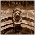
| 05/18/2004 02:11:43 PM |
The Guardianby BeagleboyComment: Something givess the impression of being astray here - it seeems tilted, but it isn't when you look closely - I guess just not taken from directly head on. This does highlight a problem with this challenge though - to me, a centred composition absolutely requires a strong graphical element to an image, which this has with those curved shadows and pointing lines - but those graphical elements have to be very regular. Good detail here, though that direct light has lost you some element of texture and perhaps mystery from the scene. 6 |
| Photographer found comment helpful. |
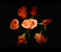
| 05/18/2004 04:45:22 AM |
sevenby slonkoComment: Having gone to the trouble of making that asymettrical border, it might have been an idea to use levels just to take the black in the image all the way to absolute black. Good detail and light, especially the fading away toward edges. One of the better flower portraits here. 6 |
| Photographer found comment helpful. |
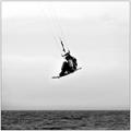
| 05/18/2004 04:42:00 AM |
On Any Windy Sundayby jimmythefishComment: Gentle halo-ing around the subject is effective in drawing and keeping the eye there, cntred composition used efffectively for once: isolating from background, and illustrating the height of this jump. Good work. 6 |
| Photographer found comment helpful. |
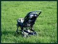
| 05/18/2004 04:39:18 AM |
Lost Childhoodby NeuferlandComment: Difficult balance to achieve between concentration on this old pushchair and a suitable sense of isolation. Seems like quite a lot of sharpening has gone on - has that brittle, fine pixelation. I quite like the shot, but it isn't completely getting through to me. 5 |
| Photographer found comment helpful. |
Home -
Challenges -
Community -
League -
Photos -
Cameras -
Lenses -
Learn -
Help -
Terms of Use -
Privacy -
Top ^
DPChallenge, and website content and design, Copyright © 2001-2025 Challenging Technologies, LLC.
All digital photo copyrights belong to the photographers and may not be used without permission.
Current Server Time: 08/19/2025 02:50:11 AM EDT.