|
|
|
Showing 1821 - 1830 of ~2866 |
| Image |
Comment |
| 06/10/2004 11:40:51 AM | Philadelphia by Nightby jmleliiComment: Er ... slight issue with the 'night' bit from where I'm looking :-) Don't really see this fitting - your subject is in such a flat plane, and so distant, that depth of field, deep or shallow, has little to do with anything. Technically a good cityscape, but had you waited for the sky to darken a bit more it would probably have more impact. As it stands, whilst being a perfectly competent shot technically, it lacks much impact for me. 5 |  Photographer found comment helpful. Photographer found comment helpful. |
| 06/10/2004 11:36:47 AM | Look Outby TimboMacheteComment: Looks like he's throwing the rock - I'm guessing that the intention is that it's heading towards him. Or if it's to do with people below, then why's the rock so high in the air? That confusion is at the heart of what i don't like about this shot. The rest is the awfully flat light, and the odd composition, with that background hill behind him. I don't understand why you haven't profiled him against the sky more. 4 | | Photographer found comment helpful. |
| 06/10/2004 11:31:47 AM | Happy Geese come from Californiaby jbeazellComment: well now, what has happened to that sky? Beyond that, you have apotentially good scene here - the light, especially on those more distant trees, is lovely. A bit hit and miss in the foreground, i think - perhaps if you'd shot from lower you would have a happier composition? Just that change of a couple of feet in point of view can make an extraordinary difference. But that sky colour wrecks this shot for me, I'm afraid. 5 | | Photographer found comment helpful. |
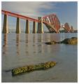
| 06/10/2004 07:03:42 AM | The Forth Rail Bridge@ 5amby agwrightComment: Excellent, simple composition - exactly what I was expecting for this challenge, which is not always a bad thing. Great colour, great detail - I wish more people would simply choose the right time of day to try and take this kind of shot. Not exceptional - would perhaps want more drama in the sky for that, or something - but certainly very good indeed. 8 | | Photographer found comment helpful. |
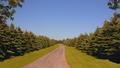
| 06/10/2004 06:47:13 AM | The Wide Blue Yonderby ColeyComment: I've by-passed this one a couple of times - I guess I'd better try and write something about it :-) can't make up my mind, you see. The composition, other than those extra leaves/branches upper left and right about which I'm not sure, is fine, but I would say that perhaps the definition of those trees needs work - dodging/burning perhaps, something just to bring out the depth of light and shade there. The light you've chosen is really quite blank (which suits the compositional idea), but there's so little here to hold the eye in terms of texture, of variety of subject (the grass, the road and the sky are all near solid areas of colour). Perhaps it needs a deeper air of mystery, which at the moment is missing somewhat. 6 | | Photographer found comment helpful. |
| 06/10/2004 06:33:18 AM | Storm Cloudsby flip89Comment: I think, and it's only opinion of course, that those clouds need to be darkened considerably to have the impact your title suggest: this way, it looks just like a bit of cloud cover on a sometimes sunny day. beyond that, this a good solid composition, nicely organised to balance the girl and the buildings. I might wish that there were more drama in it, more impact if you were to threaten the high scores. Given this scene, what would one do to give it that impact? First off, a lot of burning on those clouds, to add drama to them (see Heida's work with the burn tool for an idea), and I'm not sure that a touch of colour temperature correction wouldn't hurt - whole thing comes across as a little blue. 6 | | Photographer found comment helpful. |
| 06/10/2004 06:25:28 AM | Black and Blueby jrs915Comment: Refreshing - though I'm not sure you're going to get away with it in terms of the voters. Like the abstractness of it, though I find the composition of it a touch annoying - tiny bit obvious, if you follow me - and the light kind of blunt: whilst the darkness and the blue are intriguing, I can't help but wonder if a little fill (and only a little) might have added some three-dimensionality, some depth. Slightest feeling of missing details, but that miguth only be that light again. 7 | | Photographer found comment helpful. |
| 06/10/2004 06:18:50 AM | At Any Viewby KylieComment: Good clean shot, good detail, good use of the light. I'm not convinced about the crop - kind of get the sense that you wern't yourself, you know - the cutting off of the trees, the space image left. Certainly meets the challenge, for me - though in a way i think some voters might miss, especially those who don't give it the time. 6 | | Photographer found comment helpful. |
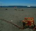
| 06/10/2004 06:15:30 AM | Low tideby cabaComment: Certainly meets the challenge, and follows the 'rules' - main subect not centre-frame, horizon not centre-frame. In simple terms of those rules, however, you've placed the rusted thing too far off-centre - I'd have allowed more room for it to breathe in the composition, brought it if you like onto the conjunction of the thirds lines, rather than in the bottom right box created by those lines.
However, all of that is incidental to the fact that the light is all wrong - very harsh, very contrasty, and giving you little help with the definition of these things, nor of the distance of the composition. There do seem to be textures in the metal plates worthy of interest, but this does little to show the detail of them. There's also a great deal of distracting detail in the shot, at least that adds little to my viewing of it: stones in the sand, other lumps and metal things around, the confusion of posts, people and the boat - which are not necessarily bad things, depending on your intention and organisation of those things, but for dpc they most definitely are. 4 | | Photographer found comment helpful. |
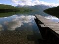
| 06/09/2004 06:12:33 PM | Kintla Lake by jodiecostonComment: Nice shot indeed - especially like the way the cloud reflection blurs into the stony bed of the lake - a phenomenon I really enjoy in photographs. Have you had a look at it cropped to the horizon line, so that the hills, mountains and clouds only exist in reflection? A brief look masking off the top of frame suggests that that would make an exceptional composition (takes notes for future ...) :-)
One of few shots where the heavy summer shadows are used to good effect. 7 | | Photographer found comment helpful. |
|
Showing 1821 - 1830 of ~2866 |
Home -
Challenges -
Community -
League -
Photos -
Cameras -
Lenses -
Learn -
Help -
Terms of Use -
Privacy -
Top ^
DPChallenge, and website content and design, Copyright © 2001-2025 Challenging Technologies, LLC.
All digital photo copyrights belong to the photographers and may not be used without permission.
Current Server Time: 08/19/2025 01:49:24 PM EDT.
|