|
|
|
Showing 1811 - 1820 of ~2866 |
| Image |
Comment |
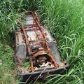
| 06/20/2004 06:06:18 PM | There was a time when it was lovedby scottwilsonComment: My immediate feeling on seeing this, is that somewhere around this subject there's a wonderful shot waiting to get out, but that this looks like the kind of thing taken to remind one of the situation, in order to go back later. The contrast of life and death, rust and green, is tempting, but this for me is too obvious, too straightforward. Get personal with it - get low daown and try and create weird landscapes across the rusted car, with the greenery forming an horizon, or a foreground, or concentrate on the strange angles around that exposed subframe ... there must be magical images here :-)
The composition is what mostly makes this look like a reminder shot: positioning of the car in frame seems arbitrary, from centre bottom to mid centre top - it doesn't lead me anywhere, doesn't point up the contrast of metal and plants. 5 |  Photographer found comment helpful. Photographer found comment helpful. |
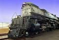
| 06/20/2004 05:56:11 PM | Engine # 3985by jab119Comment: Ah, proper grown-up light - I like this. Brings out the almost scuptural engineering of the beast. Wonderfully well done technically. Cropping bother a touch - why not simply glory in the definition of the metal, and plonk the old thing full frame? The angle of view you've chosen, and the complementary angles of the front of the train and the top would place the front of the engine right on the happy thirds line, and also might rid the shot of the slight feeling that you've cropped to hide something at the back of it. That visible background frame left, for me, adds nothing here - let it impose itself on us! But great work - great detail, great tonality, and great subject - real feeling of power. 8 | | Photographer found comment helpful. |
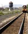
| 06/20/2004 05:49:53 PM | Coming Through Townby drgsoellComment: Focus is really bizarre in this - have you softened it? Like the leading lines effect, though the solidity of the water tower pulls the eye quite strongly too - in fact might form an intersting balance t the primary compositional elements of the rails and the engine. Burnt out sky, and those poles and posts seem cluttered rather than evocative. 4 | | Photographer found comment helpful. |
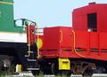
| 06/20/2004 05:47:01 PM | The Colors of Trainsby wetlandComment: Nie and bright, but the composition doesn't work for me: I don't find this particular conjunction of trains terribly interesting - in fact I want to focus on the yellow against the red of the further wagon, and the geometry of those hand rails. The bits of background visible beneath, and the weeds in front also confuse the focus of attention, I think. Rendering of the red and yellow is very strong though. 5 | | Photographer found comment helpful. |
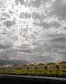
| 06/20/2004 05:44:12 PM | Yellowby RoosterComment: De-sat is effective, and hasn't harmed the effect of light in the sky too much, though perhaps some work to darken the (formerly) blue areas might have paid off? Like the composition very much, but would wish for a little more impact from the yellow of the buses - they all seem a touch muted to me. 6 | | Photographer found comment helpful. |
| 06/20/2004 05:09:17 AM | there is hope.jpgby redmoonComment: The stairs leading up to Waterloo Bridge, South Bank, National Theatre side of the bridge, I believe :-) Nearly shot it myself a few days ago - in reference to John's shot as mentioned. Like the way you've frmed it with the diagonal edge of the staircase. | | Photographer found comment helpful. |
| 06/19/2004 06:08:49 PM | Waiting For His Turnby NeuferlandComment: Damn, I can't believe some the voting on this challenge: it seems to be a feature of these challenges where the subject title is entirely a matter of personal opinion, that the group dynamic seems to rest on a very very tight, very very obvious interpretation. I think perhaps that is to do with folks wanting to be able to carve out only a very few shots from the mass, it being much easier to simply score a shot low for misinterpretation than to have to think about what score it actually merits. But I'm guessing - and you'll see from my entry to this challenge that I have no more idea than you how to follow their rules.
But I like this shot: particularly the exposure. Again, it works against the 'accepted' strictures of the site (something along the lines of there must be a white point, and a black point, and your colours must be vibrant, not muted). what you've shown here is a real sensitivity to tone, and to the way those tones make up this composition. None of these colours jump and scream at us, no high drama in the treeline, nor whay sky is visible; no eye-catching effect of light, or clever post-processing. In short, a scene that many would percieve as a simple, ordinary snapshot ... but I see a great deal of care in this: in the framing of the child against the grass, and in the balance of the dirt and the cages, but most particularly in your capture and use of that late evening light - a delicate thing to handle, and mostly overplayed, but here just balanced correctly. There's nothing to really place it at that time of day, other than a sense I get from the shot - so I suppose I might be making it up. But I like that feel.
It doesn't yell out waiting, however, not to me, and despite your title, and will have suffered a lot for that reason, and for it being a shot of a child. That care and depth of tonality will be lost on most voters who won't give your image more than around 5 seconds (as applies to most of us, I believe - just a part of the format), and many will have passed it by simply as a family snapshot, and dismissed it with a 5, or less.
I think they're missing a little gem, but I've spent a fair bit of time looking at it.
Oh, and I fear the horizon line isn't straight - and that will have hurt the shot another bit more.
Some of the reasons why i think it scored where it did, anyway. | | Photographer found comment helpful. |
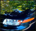
| 06/19/2004 07:31:59 AM | Reflectionsby jmritzComment: I spent some time working on a very similar shot for this challenge, and I didn't submit it for pretty much the same reason I don't think this works that well (don't misunderstand - it's a lot more interesting than many). I couldn't find a cohesion between the reflections and the evident shape of the car - despite liking the way the light clusters break the lines of relections, effectively all you have to work with is the distortion of an image to reveal the shape of the metal - and there simply isn't enough drama in the car's shape here to make that effective. You end up with an incoherent organisation of bits of a scene, interrupted by those lights. If I were to try this again, I think I would try to shoot from lower, to use simpler, more easily grasped shapes (like the curves over a wheel arch), rather than the complex planes and surfaces of the hood (this is a US car right?) and the fender (?bumper to us UK folks). 6, for interest, and good thinking. | | Photographer found comment helpful. |
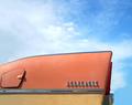
| 06/18/2004 01:00:43 PM | Summer Lovin', Had Me A Blast!by sherComment: Composition of this kind of shot is so tricky, and I'm not wholly convinced you've got it exactly: having looked at it a while, I wonder if the two focal points of the car - the fuel cap and the name badge, are perhaps unbalanced within the frame: perhaps using those as the twin focal points of the image would give a happier mix of car and sky - this way, I feel, its too even a division, not asking us to consider one or the other primarily, and thus leading to a divided sense of subject. 6 | | Photographer found comment helpful. |
| 06/14/2004 08:03:34 AM | Listening for the Rainby crabappl3Comment: I was almost convinced this was a jjbeguin shot - to the extent of being surprised it isn't. It has his trick with colours, and the shaping and shading of those foreground leaves. Also this composition is very typical of some of his work from a little while ago. Interesting stuff Dan; and it remains (as my previous comment meant to emphasise more) an abject lesson in how only a very small thing can have a disproportionate effect on an image - that tree can take up no more than about 3% of this image. | | Photographer found comment helpful. |
|
Showing 1811 - 1820 of ~2866 |
Home -
Challenges -
Community -
League -
Photos -
Cameras -
Lenses -
Learn -
Help -
Terms of Use -
Privacy -
Top ^
DPChallenge, and website content and design, Copyright © 2001-2025 Challenging Technologies, LLC.
All digital photo copyrights belong to the photographers and may not be used without permission.
Current Server Time: 08/19/2025 01:49:11 PM EDT.
|