| Image |
Comment |
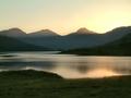
| 10/08/2004 05:20:23 AM |
Soft evening light on Loch Arkletby geewhyComment: I really thought this would be a contender, Gordon. To finish below half-way is a poor reflection on the homogenisation of the voting public these days - and your refusal to pander to them is appreciated in this quarter at least. |
 Photographer found comment helpful. Photographer found comment helpful. |
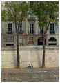
| 10/05/2004 08:10:47 PM |
On the river bankby jjbeguinComment: Subtle, graceful, and half-way between your recognisable style and something different - smoother, more 'digital', if you like. I think other versions of you would have tried to bring out more depth in the stone, and relied less on the simple conjunction of elements to produce effect. This has a more universal graduation of light, and thus a more real-world feel; it is none the worse for it, either. |
| Photographer found comment helpful. |
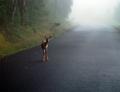
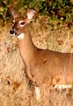
| 10/05/2004 07:14:18 PM |
Fawn in Fogby ubiquitousComment: Beautiful - great sense of dpeth, light, fragility of the animal. And that little array of debris from the forest gives the impression that it was caught playing. I would personally have cropped the shot more than this - foreground space seems meaningless to me, and I'd certainly have lost a touch left of frame to privilege the subject some. It has the feeling of an out-of-camera original, rather than a considered presentation. A great original, but it's very rare that a shot can't be improved by judicious editing. |
| Photographer found comment helpful. |
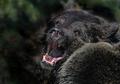
| 10/05/2004 07:07:50 PM |
Grizzly Warningby ccraftComment: I don't understand this crop for this shot ... that dead background space image left. It's only effect seems to have been to place the real dynamic elements of the shot dead centre, which simply pull attention away from them toward that dead space - the eye is constantly drawn there, and there is nothing there to add impact. Cropped almost square to the edge of those water drops and you'd have a fabulous image. Your white point seems a touch bright, also - a touch more graduation through the tonal range would have brought out the depth that you have captured I think. Great moment, but let down by your editing I fear. |
| Photographer found comment helpful. |
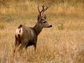
| 10/05/2004 12:14:09 PM |
Mule Deer Buck at Duskby SammieComment: Some tongue-twister, your title :-) neat shot, though positioning the things head - the natural first point of attention with all animals (and people) - dead centre is in my view weakening the impact considerably. You've allowed some location, which is a good thing, but perhaps a little more attention to the overall impact of the composition would have altered the way in which you've done that. Gppd sense of detail and texture though. |
| Photographer found comment helpful. |
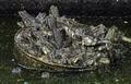
| 10/05/2004 12:11:40 PM |
Frog Soup, Anyone?by RobCourseyComment: I can't see this properly - but I'm in a very bright room. I'll come back to it. If the definition is as good as I hope it is then it's a sure winner. |
| Photographer found comment helpful. |
| 10/05/2004 12:10:47 PM |
1of 4by Rando D300Comment: Pretty good work - I like the sense of location especially. Either your post-processing or your camera has let you down somewhat though: those stems of grass have turned into badly fractured lines, and there is a tight white halo-ing around the animal's neck that seems like over-sharpening. It has the effect of losing detail for you, and thus that sense of closeness so important to shots like this. |
| Photographer found comment helpful. |
| 09/24/2004 07:11:57 PM |
We call em "Bush Rangers" round 'ere mate & he's a biggen!by NodeComment: i'm going to stress again - just give this the simple addition of context, just something to indicate how damn big the thing is, and you could add a whole point to your score. It'd still be slightly underrated for the challenge, but it'd be closer, at least. |
| Photographer found comment helpful. |
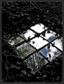
| 09/24/2004 09:17:35 AM |
Skylight by jjbeguinComment: Really good to see you back on the front page, JJ. Like the confusion of this - the non-squareness of it.
E |
| Photographer found comment helpful. |
| 09/22/2004 04:43:19 AM |
Competitionby GabrielComment: Posted this in the forums; think I'll leave a copy here too.
"Having looked through the votes and comments now, I think the complainers are wrong. As a shot of it's type, 'competition' is very very effectively done. Think of this: it isn't a standard 4x3 aspect ratio; the grey has been perfectly matched to the site background; it is a photograph of nothing - rather than any old shot darkened completely and then lightened to the right shade. It shows imagination, thought, and care in execution.
It deals with ideas and concepts that are almost completely out of place here - and a challenge is the only sensible way to display it on the site. Had it been put into a portfolio and a thread linked to it I think it could only have struggled to 100 views or so - as of right now it has 1400 or so.
I can't believe that those who commented along the lines of 'stop wasting my time' actually spent any time at all thinking about it - whilst it was obviously going to be voted down massively, there is certainly more to it than the Burt Reynolds blank black 4x3 shot. Intellectually, the ideas it provokes may hold little interest for a vast majority of this site's competitors, but there is equally no need for an outright dismissal of the thought and ideas behind the shot.
I can absolutely agree with any vote it recieved - all the way through the range, from leaving room in one's own scale for other shots to rank above it, to acknowledgment of a little intrigue, to outright dislike, and the sliding scale in between. Interesting to note that it recieved at least one vote at each score.
But what it isn't, is wasting anyone's time." |
| Photographer found comment helpful. |
Home -
Challenges -
Community -
League -
Photos -
Cameras -
Lenses -
Learn -
Help -
Terms of Use -
Privacy -
Top ^
DPChallenge, and website content and design, Copyright © 2001-2025 Challenging Technologies, LLC.
All digital photo copyrights belong to the photographers and may not be used without permission.
Current Server Time: 08/20/2025 06:16:02 AM EDT.