| Image |
Comment |
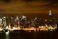
| 11/07/2004 07:04:12 AM |
|
 Photographer found comment helpful. Photographer found comment helpful. |
| 11/07/2004 06:53:15 AM |
No Turning Backby EyesOnlyComment: Good quality of light, though I can't escape the feeling that it would have been more effective without the framing of the wing-mirror - surely the real effect of these shots depends on the contrast between the reflected world and the direct world, and you've allowed us to see none of that 'direct' world. |
| Photographer found comment helpful. |
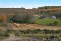
| 11/07/2004 06:46:15 AM |
Jersey farmby graphicfunkComment: I find it difficult here to get a sense of subject, or of what your primary interest in the scene is. I like it as a documentary photograph - I like the juxtaposition of all those elements - the houses, the un-cut whatever in that field, the cows. The tree by the little bridge, the colours in the trees. But it seems disorganised - i get little sense of being directed, it seems just an everyday scene shot in a most naive style. Obviously, that may be deliberate, and there is a certain element of the naive that I like here, in the style, but in the end i don't think it does much for me. |
| Photographer found comment helpful. |
| 11/06/2004 04:56:20 PM |
After The Rainby ColeyComment: Good sense of light here, and strong composition. The very narrow depth of field also helps maintain the attention, i think. Nice work indeed. |
| Photographer found comment helpful. |
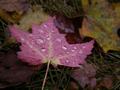
| 11/06/2004 04:48:24 PM |
Fall Leavesby eckoeComment: I kind of get your point, though it seems to me there are a couple of areas that you haven't quite got. Those leaf colours just aren't puncky enough for real impact - they seem prettty bland - I think folks want to see big bright oranges and reda, rather than these quite pale yellows. Also there's quite cleear digital noise n the blue areas of the sky - the blotchiness there. It isn't necessarily a problem in itself, but it is distracting in such an otherwise clean composition - basically, it doesn't fit the type of shot you've taken, in my eyes. |
| Photographer found comment helpful. |
| 11/06/2004 04:43:49 PM |
Autumnal Huesby geewhyComment: Very well done here. Like the pushing of he light to achieve the effect very much, for all there will probably be those who gripe about burnt-out areas - ignore them. This is just an excellent photo. |
| Photographer found comment helpful. |
| 11/06/2004 04:38:59 PM |
Lazy Monkeyby redmoonComment: Excellent stuff. Love the sense of texture, the sense of balance in this. The fact that the tonal range of the wall matches the money's own colouring adds a bizarre edge, something somehow threatening, but I love the use of shadow here too. |
| Photographer found comment helpful. |
| 11/06/2004 04:36:06 PM |
Golfing in Paradiseby JasonComment: Like the spare-ness of this composition, although the palm tree feels a little crowded by the edge of the frame - would have adored it with the leaves placed/cropped just as far from the edge as the flag and the ball - that would add balance in my eyes. Nevertheless, a marvellous image, excellently executed. Bravo. |
| Photographer found comment helpful. |
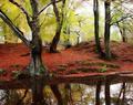
| 11/06/2004 04:34:25 PM |
Fog Boundby duncesComment: Excellent sense of light, a great capture, and all round a well executed shot. If it lacks anything, it may be a sense of real sharpness, which would add just that extra bit of impact, but that is probably a subjective thing. |
| Photographer found comment helpful. |
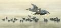
| 11/06/2004 04:27:29 PM |
|
| Photographer found comment helpful. |
Home -
Challenges -
Community -
League -
Photos -
Cameras -
Lenses -
Learn -
Help -
Terms of Use -
Privacy -
Top ^
DPChallenge, and website content and design, Copyright © 2001-2025 Challenging Technologies, LLC.
All digital photo copyrights belong to the photographers and may not be used without permission.
Current Server Time: 08/20/2025 07:34:11 PM EDT.