|
|
|
Showing 1621 - 1630 of ~2866 |
| Image |
Comment |
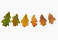
| 11/26/2004 04:41:11 AM | Seasons come, Seasons goby eojedaaComment: I'm no fan of high-key in general, and i can't see a point of it here for sure. Taking the white to this point of absolutel computer white is pretty heavy going on the eye, especially where your subject seems battered by it. Little sense of texture here, little sense of three-dimensionality to the leaves. |  Photographer found comment helpful. Photographer found comment helpful. |
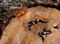
| 11/26/2004 04:38:20 AM | Rings of timeby Dim7Comment: I'm not sure it's necessary to show the entirety of the tree to get your point across here; by doing that you've inevitably included a large amount of background, and that background isn't so strong - the clutter of leaves, trees, sky, grass just feels messy here, and doesn't add to your real point, surely? Also the rings are only really visible in one part of the tree - right beside those interestingly shaped cracks. I wonder that you haven't concentrated on just that area, filling the frame with tree would make it much more effective (much simpler, really). There's little sense of light here also - very blank and ordinary seeming. | | Photographer found comment helpful. |
| 11/26/2004 04:32:11 AM | early morning hoursby t_onlineComment: Good exposure - a tricky blance to achieve between your lighting and tthe brightness of the flames. There's a cold sense to the image, for me - not quite sure from what, it might be the light on the melted wax. | | Photographer found comment helpful. |
| 11/26/2004 04:23:43 AM | Holes In Timeby Rando D300Comment: I think, for this challenge, I'd have wanted to emphasise the rings of the tree somewhat - they're hardly visible here. Compositionally effective. | | Photographer found comment helpful. |
| 11/26/2004 04:22:14 AM | 5 O'Clock Shadowby K-RobComment: I like the fundamental composition - there's a non-glamourous sense of shine to the skin, the bright white lines image left. those and the balance of mouth and curve of jaw make for a engaging photo. | | Photographer found comment helpful. |
| 11/26/2004 04:18:40 AM | TIMEby graphicfunkComment: Interesting approach. The composition is very cluttered - so many different things, and they seem almost haphazardly organised. Light reasonably effective on the digicam, but becomes very weak and flat in the background areas - actually has a feel of the muted tones of an old photograph, which does have an effect. The clock feels forced into the composition (to emphasise meeting the challenge, perhaps?), where something along the lines of a calendar might have been more effective? Your biggest problem in terms of dpc score, however, is certainly the very busy composition, and fairly common idea. Good luck. | | Photographer found comment helpful. |
| 11/26/2004 04:12:52 AM | Rush Hourby blemtComment: Nice idea. I think that just a touch more motion blur would be effective - this could easily be sen as a simple depth of field effect, rather than motion blur. obviously there's a fine line to be found there. Like the B/W, and the composition with the curve of the arch and the balcony; wonder whether having the clock dead centre of frame isn't a little weak, perhaps. | | Photographer found comment helpful. |
| 11/24/2004 04:28:28 PM | Chief Leatherlipsby xtabintunComment: From the Critique Club
Hi James.
I really really like this image, with just a couple f minor points that detract from it for me: those are, quickly, that the blue in the sky has gone i think too far in saturation - it's become too unreal for the rest of the image, and has left the clouds looking more like a PS effect than anything real. The second thing is the half presence of that tree to the left - I'd have either tried to include it completely, or to remove it altogether. I just don't see the benefit of including only half of it, even though the colour is nice - but it isn't worth stretching the composition for, to my mind.
But this, overall, has wonderful, precise, different qualities of composition. I love the balance of elements - the low horizon, the face looking out of frame, the curve of green, the one tree with the last leaves hanging (Oh man, you shoudl have got rid of the red tree: it would make it such a strong, simple, and yet different composition). The light, the sense of highlight and shade on the face is fabulous, and wonderfully controlled.
The hidden messages are strong here too - and that's perhaps what i most like about it. The strange-face turned away from the bright colours and the autumn tree, and your composition placing him so that the sense is a deliberate turning of the back on such obvious and cliched things. 'I will not look for the bland, for the bright blues and greens, and those things that all the others find so comforting and compelling; I must look to my own world, and the important things of that.'. Great sense of message, great, and under-rated message.
you score will most probably have been strongly affected by the blinkered, who will have looked only for images of soldiers, firemen and the like, and either do not possess or cannot spare the brain-time to see this as fitting the challenge. You need, I think (and having looked at other images of yours), to be more blunt and srtaightforward with your choice of subject, if you are to break the six barrier. But who cares, with an image like this?
Ed | | Photographer found comment helpful. |
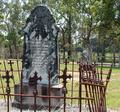
| 11/24/2004 03:59:44 PM | Forgotten Heroesby kirtiebuComment: From the Critique Club
Hi Kirsty
There are some very odd moments of light in this shot, which make it seem most bizarre. The paaterns of greys on the gravestones, together with the obvious fact that the light is falling from behind them, gives me the impression that they have been selected individually and brightened and added contrast quite heavily, with the effect that they've been made to seem completely disconnected from the rest of the image. I'm not completely sure that's the case, but in the absence of any image information from you it's very difficult to do other than guess.
It's generally considered good form to write something about the process of taking the image in your comments, especially if you're asking for a critique: mainly though it helps you: lets us know what you've done, what you were trying to achieve and so on.
There is some sense of strong composition here - the two stones placed strongly on the thirds lines, giving a balance to the image. There are, however, a bunch of other things that I think could be improved enormously, with a noticeable improvement in your score.
Firstly is the idea of the overall scene. Fine, you've found a subject, and found an angle to shoot it from that gives it some strength. Howewver that point of view is pretty 'normal' - it appears to be a head-high shot, exactly the kind of view we see all day. part of what a shot needs to be eye-catching is an unusual point of view - be it a scene we never see, or a familiar scene from an (even slightly) different angle. Of course, one can go too far with that, but there is a balance to be struck.
Your background: the line of that path, and fence, and the buildings beyond passes absolutely through the middle of the shot, and strongly distracts attention from your subject. This also ties in to the previous point - but if you'd been able to frame the stones simply against the trees (and your camera has the necessary zoom to have shot from further away to make that easier), you would have far stronger image. that line, and that shaping of your image, makes for a very messy complitation - lots of strange lines in the trees, the lines of the fence, the definite lines of the building ...
Light: the whole thing is too damn bright - so that your background is brighter lit tthan your subject. This can be dealt with in processing, but even better would be to wait for a different moment of light, so that the stones are naturally lighter against the background. There's a strong sense that this is taken with the exposure your camera tells you is right - it has that overly bright feel to it that is the usual result of that. Well here's something: the camera is almost always wrong in this case. It almost always tells you to overexpose an image by a considerable amount. If you use the EV settting at something like -0.6, or one stop's worth of shutter speed faster than you're using, you'll find the colours and tones of your scene will have so much more impact: of course, if anything feels too dark, you can always lighten it later.
There's almost nothing here that is actually black - and that range from black to white is all that you have to play with. Take a look through the photos of the site's top favourite photographers - you'll see that they all use black much more strongly than you have here. it gives a much stronger sense of the bright areas if there is more darkness to contrast with them.
Light is also a matter of bringing out texture in your shots: here, it seems very direct, very harsh, especially on the rusted railings - it feels like a midday shot, which is rarely a good time to shoot this stuff. Later, or earlier in the day, when the light is softer, from a lower angle, I think you'll find that it brings so much more life to your subjects. If you cold have got the shot with the light just skiimming the front of the stones, all the different textures would spring out, all the real depth of the carvings on the stones - there would be so much more sense of three dimensions to this.
Well, I've gone on at some length. I hope some of that isn't taking down at you - but it seems to me that these are the things that hardl ever get mentioned in comments, and yet are more often than not the things that lead to scores in the 4.somethings. They're quite easily fixed, once one knows what they are.
Hope that's of some use
Ed | | Photographer found comment helpful. |
| 11/24/2004 03:28:46 PM | Windmillby marboComment: From the Critique Club
Hi Mark, how's Shoreham?
The first thing I though of when i saw this (and I didn't vote - lack of time, lack of finding myself a pattern to vote to) wasof oils on a wet surface - that slight sense of bleeding into the surrrounding areas, yet keeping the definition of shapes to it. i'm not even sure I can really critique this - on what grounds, from what standpoint? Photography? But this challenge, in its results, and very largely in its entries, was almost entirely about tricks and photoshop, or even both, rather than about photography, in my view.
There is a definite sense of the photograph in this, however; in that it's clearly twisted into its present form from a photograph.
There's little to criticise in the composition here - a very solid dpc-type image, the kind of thing that usually does well here: a strong sense of subject, strong and pleasant colours, strong sense of mood. Perhaps you might have had to make the mill a definite silhouette, rather than the darker area with some sense of detail that I'm getting here - it seems rather a halfway house at the moment.
As to impressionism? I'm by no means convinced that anyone made a really good stab at taking the idea into a photographic realm, really. I'm not sure, either, that it wasn't an impossible challenge. some folks have had a definite sense of what is and what isn't impressionistic, some folks tried to imitate the stle, some to develop they're own version, a version taking things forward. The retrograde step seems to have worked best, and the simplistic, most obviously derived versions to have done best of those. But we should all have known that, given that our ribbons should mean that we know our audience ...
Ed | | Photographer found comment helpful. |
|
Showing 1621 - 1630 of ~2866 |
Home -
Challenges -
Community -
League -
Photos -
Cameras -
Lenses -
Learn -
Help -
Terms of Use -
Privacy -
Top ^
DPChallenge, and website content and design, Copyright © 2001-2025 Challenging Technologies, LLC.
All digital photo copyrights belong to the photographers and may not be used without permission.
Current Server Time: 08/20/2025 08:17:50 PM EDT.
|