| Image |
Comment |
| 11/27/2004 10:36:18 AM |
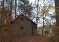
Years Gone Byby rayg544Comment: The old building seems almost incidental to this shot; try it: as you focus on it, your eye is constantly pulled toward the bright areas of sky toward the top of the image. There's little real detail either:I really want to be able to see the signs of ageing in the wood, but because of the flat light it's in all that texture just isn't visible. I'm not sure what one would do to fix it - a different light would be the obvious thing, but is that possible? Perhaps if there were a time of day when the light slanted in through that break in the trees to illuminate the old shed more than the surrounding trees? Either that, or consider tthe approach of a close-up on the broken down areas of the wood. The encroachment of the trees toward the shed is obviously a good point to make re the challenge, but I think you've sacrificed a properly communicative image just to get that element. |
 Photographer found comment helpful. Photographer found comment helpful. |
| 11/27/2004 10:25:58 AM |
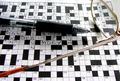
16 downby biggood53Comment: Aside from meeting the challenge by the straightforward expdient of putting the words in the shot - and the more genuine sense of the challenge by it being a shot of a crossword - I find this a slightly uncomfortable image. The differentiation between whites and greys seems overly definite, rather than progressive, and your composition places odd things in the strong areas of frame - the 'passing time' is releggated from visual interest by being so far toward the edge. I think many voters will simply see a crossword shot. |
| Photographer found comment helpful. |
| 11/27/2004 10:22:30 AM |
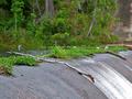
after the droughtby HeavyComment: Strong greens, and good detailing therein. As far as a challenge entry is concerned, I think it lacks a strong sense of definite subject - there are too many areas that might draw the eye for the quqickly passing voter. It has a sense of stillness, though, which is quite appealing. |
| Photographer found comment helpful. |
| 11/27/2004 10:17:08 AM |
3-Minute Eggby fisheyeComment: Intriguing effect - haven't a clue what you've done: my first impression is that it was a cold egg, but I guess it could be a lengthy exposure. I quite like those patterns in the fat, and your use of colour is strong ... but I think too much of the interest is about whay you've done in shooting, rather than in the final result of that. |
| Photographer found comment helpful. |
| 11/27/2004 10:13:00 AM |
Architecture Past And Presentby GolferDDSComment: Whilst I like the way you've fitted these into your frame, I eally do find the completely burrnt-out sky more of an annoyance than a useful contribution: the image becomes almost more about that white shape than about the architecture. |
| Photographer found comment helpful. |
| 11/27/2004 10:09:56 AM |
"Just Passing Time"by tfarrell23Comment: Carefully done, indeed. Feels a touch over-posed for me: there's little realistic about tthe placing of the pencil, nor the hyper-sharpness of it. I get what you were heading for, I think, but for me it turns it into a simply posed image, rather than anything particularly communicative. |
| Photographer found comment helpful. |
| 11/27/2004 10:08:06 AM |
Solid2Liquidby EddyGComment: Neat, careful, good use of colour. Taking the colour so very far away from black I think works to give the image that neon punch, though the obvious downside of it is to stifle any strong sense of depth. Not sure about it, in the end. |
| Photographer found comment helpful. |
| 11/27/2004 10:06:05 AM |
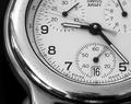
Three Secondsby mickwestComment: Quite apart from the sharpening artefacts around the numbers and face markings, it is the scratches and disorganised reflections in the face surround that most let this image down for me: they remove from the clean lines, the stylishness of the image, but yet there doesn't seem to be an age factor, a history, a story of use that you're communicating here. The composition of the circle of the face in the frame is strong - not an easy thing to get right - and the positions of the hands and movements of them are clear. |
| Photographer found comment helpful. |
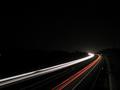
| 11/27/2004 09:58:52 AM |
Heading into the nightby orvaratliComment: Excellent composition, strong sense of dark, like the stars. A couple of things, which i think matter in such a simple composition: the break in the white trails, and the white spot extreme left: I would certainly have cloned them out myself. But an impressive go at a pretty common type of image, all the same. |
| Photographer found comment helpful. |
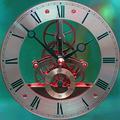
| 11/27/2004 09:55:59 AM |
Abstract Timeby MorganComment: I appreciate that this is as big a file as you could enter, but nevertheless I think the jpeg artefacts present - certainly around the smaller cogs and dials, and in the intense red and green colours - cause more sense of confucion than of anything else. Quite strange in all - just not, I'm afriad, in a way that particularly appeals here. |
| Photographer found comment helpful. |
Home -
Challenges -
Community -
League -
Photos -
Cameras -
Lenses -
Learn -
Help -
Terms of Use -
Privacy -
Top ^
DPChallenge, and website content and design, Copyright © 2001-2025 Challenging Technologies, LLC.
All digital photo copyrights belong to the photographers and may not be used without permission.
Current Server Time: 08/20/2025 10:20:51 PM EDT.