|
|
|
Showing 1571 - 1580 of ~2866 |
| Image |
Comment |
| 12/08/2004 10:12:05 AM | Pssst...It's Buried By The First Tree On The Rightby rmtm333Comment: refreshing to see something other than statues and buildings, anyway. Great light, good time of day for it. The clouds are good, but could be more striking, and I think the top right area's brightness ditracts the attention from the progression of road and that tree - and compositionally your lines take the eye to it more stongly than the tree. Good work though. |  Photographer found comment helpful. Photographer found comment helpful. |
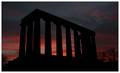
| 12/08/2004 10:09:20 AM | Scottish National Monument - Sunriseby agwrightComment: You know, I'm not certain that a white border is the way to go - has the inevitable consequence of making the image appear darker, and it seem to be to be pretty dark already. black, I think, would have given a greater sense of looming against a lightening sky. Still, whatever, as we must say these days.
Tonality is good, the hint of haloing from sharpening perhaps is an annoynace in such clean lines, and between a silhouette and a dark sky: I would guess the radius setting needs reducing, to something like 0.6 or 0.5, to get rid of that. A guess, though.
Perhaps I should critique the image itself now, hhaving done the technicalities and the border? Well, perhaps my priorities in terms of subject speak more eloquently than my words ... it doesn't do it for me, much, I fear. The size of the thing seems reduced, I'd want a sense of an enormous sky, and an enormous monument against it, and this feels jus too weak, too reduced. Wider angle lens, closer shot - just as much momument and more sky? Don't know, but I feel it cries out for something like that. | | Photographer found comment helpful. |
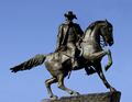
| 12/08/2004 10:02:01 AM | General J.E.B. Stuart, Richmond, VA, USAby LindaLeeComment: I'm put in mind of the estate agents mantra - I guess I should say Real Estate Agent, seeing as you are most likely american: location, location, location. For a competent and possibly quite tricky to take image, this tells me remarkably little I'm afraid. It's a cast bronze statue of some soldier, who doubtless had his moment of history (I could look him up, but I'm not going to). Beyond that ... I guess it just doesn't strike any chords for me. | | Photographer found comment helpful. |
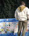
| 12/08/2004 09:48:12 AM | Berkeley Peace Wallby GeneralEComment: Well, it's neat enough in terms of focus, and the tonality seems accurate. I don't follow your thinking with this composition - the (partial) inclusion of the figure, who seems particularly uninterestingly posed. The arrangement of your major elements in frame - two bands of wall and bushes, and that figure a touch lower and heavily to the right side of frame. The detail of the wall is interesting, but this shot addds very little to that, and indeed I think removes from it with the inclusion of those other elements. What was it that interested you in this scene? Was there a specific thing you wre trying to communicate to us? I don't see it I fear, yet I'm sure there is a shot to be foundd at the location somehow. | | Photographer found comment helpful. |
| 12/07/2004 05:36:08 AM | | | Photographer found comment helpful. |
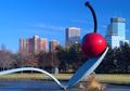
| 12/07/2004 05:31:20 AM | Spoon & Cherry - A Minneapolis Landmarkby GatorguyComment: This subject has been submitted before, yes? Whether by you or another resident I don't know. I like this version, this approach, better, definitely. The sculpture imposes itself in frame more effectively, making a stronger and happier parallel with the buildings. The whole thing feels a little blue - like it might just be the defaul sunlight white balance. Great sesne of plasticity on the spoon. | | Photographer found comment helpful. |
| 12/07/2004 05:28:47 AM | | | Photographer found comment helpful. |
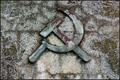
| 12/07/2004 05:15:17 AM | another brick in the wall...by frumoazniculComment: It stands out as a thumbnail - when it came up i remembered noticing it - but somehow it doesn't, not at least to the same extent, as full size. I think that may be a light thing - at that smaller size, the subject is plain and clear, and there's a strong sense of texture in the background - at full size, that texture is resolved into a heavy aptttern of blacks greys and whites but in the large elements of the stone, rather than the fine detail that reads as texture. There's a lot of good stuff here - i really like the faded and broken red on the hammer and sickle - and the tonality is strong, but I think perhaps a less general light would help the image - just allow some shadow to help the emblem stand out from it's background some. Strong work, with that reservation. | | Photographer found comment helpful. |
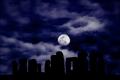
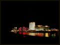
| 12/07/2004 05:02:13 AM | Pretty Placeby plumber711Comment: The darkness, the darkness ... I can see the point, i think. There's almost a suggestion of tthe underworld, of a darkness seeping into life. What bugs me though is that the foreground elements that are visible don't cohere with that impression - they too are dark, but there remains elements of detail there, and one's eye just tries to find that detail in the background areas. I wonder if you have only exposed for the statue, and this lost the background - and whether you might effectively have taken the exposure a stop or two further and been able to keep some of that background detail. | | Photographer found comment helpful. |
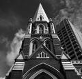
| 12/07/2004 04:58:24 AM | Cathedralby samtrundleComment: Strong image, certainly. The obvious comment is about the tower building - and I'm not sure your placing of it relative to the cathedral and the frame is going to go down well here. I like it though - there's a wackiness ot it, a non-obviousness, but I think it's pretty effective. The strength of the centred positioning of the cathedral, and the symmetry of this view that makes it such a strong subject for a central placement, amkes it almost possible for the eye completely to ignore the presence of the tower: and then it registers, and the dpc-brain goes 'what were you thinking?' - but it is that initial look, and then that sudden, shocking presence of tthe tower, that gives this a most wonderful impact. Genuinely surprising, genuinely effective, and genuinely communicative of the modern urban world. Great work, indeed. | | Photographer found comment helpful. |
|
Showing 1571 - 1580 of ~2866 |
Home -
Challenges -
Community -
League -
Photos -
Cameras -
Lenses -
Learn -
Help -
Terms of Use -
Privacy -
Top ^
DPChallenge, and website content and design, Copyright © 2001-2025 Challenging Technologies, LLC.
All digital photo copyrights belong to the photographers and may not be used without permission.
Current Server Time: 08/21/2025 02:19:19 AM EDT.
|