| Image |
Comment |
| 12/20/2004 08:32:47 PM |
Dang ...by GeneralEComment: Just doesn't have the clarity, and sense of composition, of the original. Great image to choose though. |
 Photographer found comment helpful. Photographer found comment helpful. |
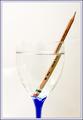
| 12/20/2004 08:32:08 PM |
Diagonal Multiplicity (Inspired by Mundane Challenge Blue)by FalcComment: dang, I never knew how this fitted into the 'mundane' challenge, in the first place - at least tis certainly fits here :-) I still find it an uncomfortable shape, compositionally, though this is a good approach. I personally think it needs to be set against the genuine mundanity of te Brum skyline to stand the best chance of working as a shot, but never got a chance in the week i spent there last August. Good work here though. |
| Photographer found comment helpful. |
| 12/20/2004 08:29:35 PM |
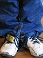
Communication - Vintage Mailboxesby TuckersmomComment: Good strong light, effectively caught. you placing of your depth of field in regard to your composition is also strong - quite a nice shot. Sufferes in comparison with Thamer's original, if only in sheer sense of scale, but I like what you gain in detail. |
| Photographer found comment helpful. |
| 12/20/2004 08:13:45 PM |
|
| Photographer found comment helpful. |
| 12/20/2004 08:08:08 PM |
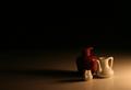
Three Little Jugs ~ Shadows 11by ladpupmoeComment: Not a bad go - the sininess of the jugs I don't like as much as the original, and it's also a shame to my eye that you couldn't have found a curved background, but otherwise it's a pretty solid copy. |
| Photographer found comment helpful. |
| 12/20/2004 08:04:29 PM |
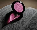
Tainted Loveby t_onlineComment: Validated? People don't understand refraction then, obviously. Stron shot - love the choice of words too. Pity it was so far up the page, actually, as the actual heart itself in your shot isn't a strong as the original; enough to make the impact though, all the same. |
| Photographer found comment helpful. |
| 12/20/2004 08:02:39 PM |
You think that's the Pride of London You're seeing ?by PeterCComment: Well, I suppose you must have been waiting for my comment. Rather an odd feeling for me, actually.
I like the confusion of this - it has made me look for a while; I like the mouse reference. I'm not convinced about your tonality, especially with the base shot so recently in our minds I think you print of Jon's shot lacks the blue punch. The blue/orange combination was a very important element of the success of my shot, I thought, and this would have benefitted from something more 'real world' i think. I like your approach though. |
| Photographer found comment helpful. |
| 12/20/2004 07:55:31 PM |
|
| Photographer found comment helpful. |
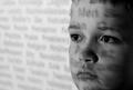
| 12/20/2004 07:53:32 PM |
"Words" 20 years earlierby StagoleeComment: Really excellent use of this light, and great detailing in the face. Strong crop. Hasn't quite the wild intensity of the original - though I can see how that might be considered an improvement, I think that shot had more emotion than this. Not to be doing down the sense of calm and a certain solemnity here. |
| Photographer found comment helpful. |
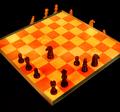
| 12/20/2004 07:48:01 PM |
Chessby BullpupComment: Pretty good attempt - although the yellow colour cast was surely not there in the original shot? Some partial sections of the bases of the white pieces are visible, which plays against the illusion. |
| Photographer found comment helpful. |
Home -
Challenges -
Community -
League -
Photos -
Cameras -
Lenses -
Learn -
Help -
Terms of Use -
Privacy -
Top ^
DPChallenge, and website content and design, Copyright © 2001-2025 Challenging Technologies, LLC.
All digital photo copyrights belong to the photographers and may not be used without permission.
Current Server Time: 06/27/2025 07:45:43 PM EDT.