| Image |
Comment |
| 03/16/2005 08:56:14 PM |
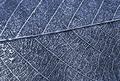
Leaf skeletonby om10Comment: There are a few of this type, it seems. I like the level of detail, the fractal nature of the subject well shown; your compositional approach to those major lines could have been stronger I think, could have made those shapes sit more happily in frame - perhaps a stronger diagonal for the biggest line, or perhaps less central? |
 Photographer found comment helpful. Photographer found comment helpful. |
| 03/16/2005 08:54:11 PM |
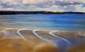
The bendsby AndelainComment: Love the gentleness of this image, and the restrained connection to the challenge - nevertheless, perfectly achieved. I would desire a touch more definition in that far coastline, for things to be really good - this way, it becomes a bit of a blocky 'thing' on the horizon, rather than a strong contricutor to your image. |
| Photographer found comment helpful. |
| 03/16/2005 08:52:06 PM |
Airlineby jjbeguinComment: There's something of the James Bond opening credits sequences about this - the faux-iris paerture effect of that circular opening, and the suggestion of a big blue sky and the glamour of jet travel. Enormous graphical strength, as ever; and as fascinating as ever. |
| Photographer found comment helpful. |
| 03/16/2005 04:50:04 PM |
|
| Photographer found comment helpful. |
| 03/16/2005 04:09:01 PM |
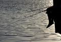
Lazy Afternoon Linesby Beach_melComment: The picking out of that reverse angled thread is quite impressive. The image as a whole is for me let down by the sudden shift in complexity of the water in the top third of frame, I think. For such a very simple and elegant composition, it really harms the gentle and reflective mood of the scene. |
| Photographer found comment helpful. |
| 03/16/2005 04:03:52 PM |
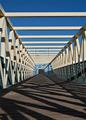
Foot Bridgeby GatorguyComment: To my eye, something doesn't work here: though it's quite difficult to say what, exactly. Compositionally, perhaps your vanishing point could be more strongly placed in frame, rather than this halfway house between central and privileged on a thirds line. I'm also not sure the colours work well - that beige colour of tthe metalwork is rather neutral and uninteresting, and the brown is quite lifeless too: did you think about making this a monochrome image? The structure itself is very regular, which usually works better with a perfectly regular view of it, compositionally. Your slightly off-centred point of view adds an almost subconscious sense of disturbance to that regularity, and I don't think that helps either. There is a conflict between the very simple elements of the bridge in the upper part of frame - simple geometrical structures, beams and uprights against a clear blue - and the boards and lower area, where the lines become more chaotic and complicated. It's like two diffrent ideas of an image together, and that also makes it a tricky picture to appreciate on any one level. I think perhaps the question is, 'which part of this structure was it that really interested you?' - enough to shoot it with the evident care you have put into this.
After all this, I think it is that tension between the simplicity of the upper part of frame, and the complexity of the lower that most hurts this image: I've tried looking at the upper third (or so) and the lower two thirds (or so) separately (just by framing with the window), and i think what you have is a joining of two quite strong images in such a way that the impact of either is somewhat taken away.
Technically, of course there are a lot of strong things here: focus, presentation (I mean compression, and colour rendition) are absolutely fine, and there is strong detail present - the smoothness of the metalwork comes out, and that kind of texture is an element many people struggle with. |
| Photographer found comment helpful. |
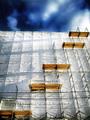
| 03/16/2005 01:50:15 PM |
Five steps nearer heavenby nico_blueComment: Ah, here it is. This was an eye catcher amongst all the thumbnails. Just a couple of things disturb: such a regular scene surely cries out for a more regular composition? Shoting from more directly in line with the scaffolding as a whole would have spread the lens/perspective distortion more evenly through the frame and made those effects less intrusive, perhaps. And the sky: I really don't like whatever has gone on there - it just seems so out of place, being so dark.
that's that out of the way. Apart from the above, this is an enormously likeable shot - the light is spectacular, and your capturing of it likewise marvellous. Detail, texture. visual interest, the lot. Great work. |
| Photographer found comment helpful. |
| 03/16/2005 01:34:09 PM |
All Directionsby PoobaComment: A strange optical crisis - I bet those inclined to epilepsy really get a buzz out of this! It almost does that thing of seming to move in the areas where you're not looking. Good clean work, well presented, but for me lackig in any great involvement. |
| Photographer found comment helpful. |
| 03/16/2005 01:32:04 PM |
The Sky's the Limitby kirtiebuComment: A great shae that you couldn't do anything about the very blotchy noise in the upper part of frame. There is a sense of grace here, but mostly for me it falls too much into the area of the abstract, and not particularly striking with it. The tones are fine though - well represented. One point - the tiny little bit of skyline(?) showing bottom right could surely have been dealt with. |
| Photographer found comment helpful. |
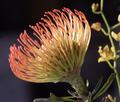
| 03/16/2005 01:29:00 PM |
Pincushion Proteaby CantiqueComment: The immediate reaction is that this could do without the stem to the right, and the lower part of its own stem, but then you'd be moving into stock photography world, and we'd all be crying out for different lighting. After some consideration of this, I think that to really emphasise the lines more contrast is needed - their translucency doesn't help with a sense of texture, a sense of really being able to touch the thing. |
| Photographer found comment helpful. |
Home -
Challenges -
Community -
League -
Photos -
Cameras -
Lenses -
Learn -
Help -
Terms of Use -
Privacy -
Top ^
DPChallenge, and website content and design, Copyright © 2001-2025 Challenging Technologies, LLC.
All digital photo copyrights belong to the photographers and may not be used without permission.
Current Server Time: 08/22/2025 02:48:47 PM EDT.