| Image |
Comment |
| 06/16/2003 11:09:37 PM |
Real Simpleby basia03Comment: Well done for a nice clean look. Perhaps the left could have been cropped less to include the tips of the flowers. |
 Photographer found comment helpful. Photographer found comment helpful. |
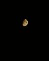
| 06/15/2003 11:08:07 PM |
omniby rogerspaulComment: Good photo. Gives the moon an excellent 'isolated' feeling. I think that I would have made the frame narrower. A bit too much space for use as a 'cover' though. |
| Photographer found comment helpful. |
| 06/15/2003 11:04:12 PM |
National Geographicby kyrielleComment: Using true colours would be more usable as a 'cover'. I do like the 'feel' you have given the photo. |
| Photographer found comment helpful. |
| 06/11/2003 11:48:09 PM |
|
| Photographer found comment helpful. |
| 06/11/2003 11:42:24 PM |
|
| Photographer found comment helpful. |
| 06/11/2003 11:41:23 PM |
Ranger Rickby vtruanComment: The background is rather distracting. I can see this being a mag cover. |
| Photographer found comment helpful. |
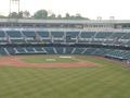
| 06/11/2003 11:31:11 PM |
BASEBALL DIGESTby purpletrollComment: Perhaps a more symetrical view would be more useable for a 'cover'. It might have helped with the (very) slight but (a little) distracting flaring in the top left. |
| Photographer found comment helpful. |
| 06/11/2003 11:28:54 PM |
Rubber Loverby ish36Comment: I like the softness of the edges, and the slight reflection. Gives a good 3d feel. |
| Photographer found comment helpful. |
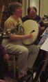
| 06/11/2003 11:25:52 PM |
Sing Out! ( http://www.singout.org/ )by eloiseComment: Seems a bit dark (even for my monitor). I am quite distracted by everything around the 'singing' subject. Perhaps a closer shot, at a different angle to remove the background guitarist would have been better and more usable as a cover. |
| Photographer found comment helpful. |
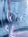
| 05/12/2003 11:39:41 PM |
Coca-Cola "Glassic" (get it? Coca-Cola Classic)by jdavisComment: Pity the glass wasn't clean...... I think a balance of how much rimm and base would have made a great improvement (we see a nice bit of curve of the rim, but the base is cut and very incomplete)
(no need to clutter a good title with the "nudge""nudge") |
| Photographer found comment helpful. |
Home -
Challenges -
Community -
League -
Photos -
Cameras -
Lenses -
Learn -
Help -
Terms of Use -
Privacy -
Top ^
DPChallenge, and website content and design, Copyright © 2001-2025 Challenging Technologies, LLC.
All digital photo copyrights belong to the photographers and may not be used without permission.
Current Server Time: 08/01/2025 11:43:32 PM EDT.