| Image |
Comment |
| 03/28/2007 01:44:13 PM |
Coooool!by wetlandComment: This would have been better if it were centered horizontally. |
 Photographer found comment helpful. Photographer found comment helpful. |
| 03/22/2007 07:07:44 AM |
|
| Photographer found comment helpful. |
| 03/20/2007 11:25:16 PM |
Tomato diveby eliniasComment: Critique Club Comment:
I really like this photograph and think you picked a good name for it. I like that you used your reflector as the backdrop. That was a good idea.
The few things that I think could be better are as follows:
1 - I don't like the extra lines and specs in the vase towards the bottom of the image. It looks like some of them might be reflections while others might be particles in the water or on the outside of the vase.
2 - The water droplets in the air towards the very top of the image are enough out of focus that they are not interesting. I would like to see the camera lowered a couple inches to show more of the vase and less of the air and then scooted forward a bit more to show more detail. Just don't get that camera and lens wet.
3 - I wish the Tomato was larger. This however is not really possible with your choice of vase.
Congratulations on placing 102 out of 428 entries. Keep up the good work!
Thank you,
Skyler Call |
| Photographer found comment helpful. |
| 03/06/2007 06:09:26 AM |
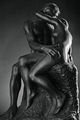
Rodin's Kissby cloudsmeComment: Critique Club Comment
I really like the lighting used here. It helps show dimension which is sometimes hard to see in black and white images.
I don't find the image all that interesting because it is just a single statue. I think it could have been better had you positioned the statue a little differently. I don't like that you can't see either of the two faces.
The focus seems a little soft but I don't mind that with this type of image. However, I do think you should have dropped your ISO setting down to 100 for even better quality. There is no reason to worry about a faster shutter speed when working with objects that aren't moving. Your file size could've been a little bigger as well. |
| Photographer found comment helpful. |
| 03/02/2007 04:17:48 AM |
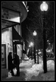
That's Amoreby JawnyRicoComment: Critique Club Comment
In my opinion your photo meets the challenge very well. I like that you converted it to Black and White. I should mention that I would not have seen that the sign said Romeo and Juliet had you not pointed it out in your comment. Although, I am happy with the composition of your shot. Why is it still posted on February 16th if the show ended on the 4th?
I can't find any part of the photograph that is really crisp in focus. I am sure this was hard to do given the circumstances (self portrait and low light). You probably could have saved your file at a higher quality. Your file size as submitted is 119.16 KB but you are allowed up to 150 KB.
I don't know where you used dodge and burn but there seems to be an unusual glow coming from the snow bank just behind the first light post.
Congratulations on your score! Keep at it! |
| Photographer found comment helpful. |
| 02/26/2007 01:15:48 AM |
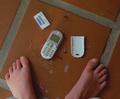
NFSby krglComment: At first I thought, Not For Sale? ...then I realized it was Need For Speed. |
| Photographer found comment helpful. |
| 02/21/2007 03:14:53 AM |
Redeliciousby UbersteinyComment: Critique Club Comment
To start off I want to say that I love the way you composed this shot.
I do not like that you can see her finger poke out underneath the pepper. I would prefer that it be better lit or removed completely.
It looks like your white sheet has a few wrinkles in the bottom right corner. This could be fixed.
Her head needs to be lit a little better so that there is not such a large area of lost detail where it gets too dark.
I am not sure what your title means. Until I recently looked at it more carefully I thought it said "Ridiculous". It thought it was great because it is ridiculous for someone to eat a red pepper like that. Are you joining the words "Red" and "Delicious"? |
| Photographer found comment helpful. |
| 02/21/2007 12:53:35 AM |
|
| Photographer found comment helpful. |
| 02/21/2007 12:23:34 AM |
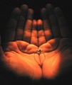
The Proposalby srijan55Comment: This photo is too blurry. It would also look nicer if the ring filled the frame more. |
| Photographer found comment helpful. |
| 02/21/2007 12:22:27 AM |
Paper Heartby JulieGComment: This would be better without the little mark on the paper heart. |
| Photographer found comment helpful. |
Home -
Challenges -
Community -
League -
Photos -
Cameras -
Lenses -
Learn -
Help -
Terms of Use -
Privacy -
Top ^
DPChallenge, and website content and design, Copyright © 2001-2025 Challenging Technologies, LLC.
All digital photo copyrights belong to the photographers and may not be used without permission.
Current Server Time: 08/24/2025 03:22:00 AM EDT.