| Image |
Comment |
| 03/08/2007 12:54:48 PM |
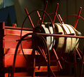
American Firetruck - circa 1910by weiszComment: good composition. the natural light is nice, but it appears as if the shot is overexposed on the upper right of the hoses. whatever is going on in the background in the upper left is distracting also. |
 Photographer found comment helpful. Photographer found comment helpful. |
| 03/08/2007 12:53:37 PM |
|
| Photographer found comment helpful. |
| 03/08/2007 12:53:08 PM |
Royal Flushby ladpupmoeComment: the lines of the cards, combined with the composition gives the impression that the frame is skewed to the right, making it seem unbalanced. |
| Photographer found comment helpful. |
| 03/08/2007 12:52:04 PM |
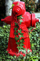
The Red Clones are sleepingby fmejia01Comment: the dark area in the upper left is very distracting and takes away from what is otherwise an interesting perspective and image. the weight of that area, combined with the dead center framing of the in focus subject makes the right/upper-right negative space feel very unbalanced. |
| Photographer found comment helpful. |
| 03/08/2007 12:50:12 PM |
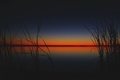
Deep Twilightby MelonMusketeerComment: really more orange than red (at least on my monitor, but a cool sunset nonetheless. nice composition and like the sillouettes of the marshgrass. has the feel of a japanese print. - 6 |
| Photographer found comment helpful. |
| 03/08/2007 12:49:09 PM |
|
| Photographer found comment helpful. |
| 03/08/2007 12:48:11 PM |
Modern Redcoatsby mistchild2008Comment: most of the people, including your stated central subjects are facing away, and you seem to be too far away. no one is really interacting with the camera or each other. there is very little energy in the photo, making it not very interesting. - 4 |
| Photographer found comment helpful. |
| 03/08/2007 12:46:00 PM |
MMM MMM Goodby atupdateComment: nice, painterly effect. would be interested how you got it like this in basic. |
| Photographer found comment helpful. |
| 03/08/2007 12:45:20 PM |
Innocentby CuchuflaComment: disturbing. the (non-red) wetness around the middle of the tear track doesn't really seem to fit the rest of the shot, and I wish there was a little more light on the eye. |
| Photographer found comment helpful. |
| 03/08/2007 12:43:56 PM |
|
| Photographer found comment helpful. |
Home -
Challenges -
Community -
League -
Photos -
Cameras -
Lenses -
Learn -
Help -
Terms of Use -
Privacy -
Top ^
DPChallenge, and website content and design, Copyright © 2001-2025 Challenging Technologies, LLC.
All digital photo copyrights belong to the photographers and may not be used without permission.
Current Server Time: 08/09/2025 09:27:20 PM EDT.