| Image |
Comment |
| 04/02/2007 12:05:36 PM |
Disconnectedby ZoomdakComment: Cool shot. I wish the guy was a little more seprated from the background. His arm and the hill behind sort of blend together. Moving him a little right (or the camera a little left), might have solved this. |
 Photographer found comment helpful. Photographer found comment helpful. |
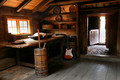
| 04/02/2007 12:00:25 PM |
1939 Tea Potby BrianRComment: The pot is certainly out of time to the present, but it isn't apparent that it is out of time to any of the other elements in the environment of the shot. As to the picture, I wish there had been a little deeper DOF to keep the cups in focus, the lighting on the pot is too harsh, and (while they may have been intentional) the reflections on the background above and behind the pot don't work for me. |
| Photographer found comment helpful. |
| 04/02/2007 11:56:14 AM |
circa 1583by Dr.ConfuserComment: Couple of things that aren't working for me in this shot: First, the composition seems really off and out of balance. The statue and building elements in the right and lower right are really heavy and the negative space in the upper left doesn't offset them. If you could have managed an angle that would have placed the tower further to the left of the frame, that might have helped. Second, it looks as if you have either desaturated the statue or it is being lit differently from the background buildings. This gives the effect of the statue not being a true part of the composition, but rather something that was cut and paste in. (Note, I'm not saying that you did PS the statue in, just that the color and light on the statue give that impression.) This detracts from the impressiveness of the angles used to achieve this natural composition. One other thing, while the subjects do seem out of time to the present, I don't know that they are readily out of time to each other. Seems like there is a lot of potential here, but the execution needs work. |
| Photographer found comment helpful. |
| 04/02/2007 11:47:43 AM |
|
| Photographer found comment helpful. |
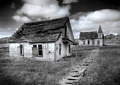
| 04/02/2007 11:46:46 AM |
Once upon a time....by birkinComment: Great shot. The slight counter clockwise tilt doesn't work for me. I don't think it adds to the shot and its distracting. Besides that, I really like it. |
| Photographer found comment helpful. |
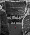
| 04/02/2007 11:43:26 AM |
Goal!!!!by Rino63Comment: I get the idea that you were going for here, but the photograph itself is not very pleasing. The lighting is harsh and the placement of the shadows is distracting. The red ball isn't prominent enough in the frame to stand as a strong enough subject on its own, but the surrounding ruin is too much of a jumble to give the eye somewhere to rest. A different time of day or a different angle might have made this much better. |
| Photographer found comment helpful. |
| 04/02/2007 11:41:03 AM |
|
| Photographer found comment helpful. |
| 04/02/2007 01:24:09 AM |
Day SIXby TCGuruComment: Is this perhaps Burning Man related? Waaaaay funky! ;) |
| Photographer found comment helpful. |
| 04/02/2007 12:24:10 AM |
Kah Nee Taby JeffDayComment: Very nice composition and subject choice. Like the subtle vignette. Excellent shot! |
| Photographer found comment helpful. |
| 04/02/2007 12:23:26 AM |
|
| Photographer found comment helpful. |
Home -
Challenges -
Community -
League -
Photos -
Cameras -
Lenses -
Learn -
Help -
Terms of Use -
Privacy -
Top ^
DPChallenge, and website content and design, Copyright © 2001-2025 Challenging Technologies, LLC.
All digital photo copyrights belong to the photographers and may not be used without permission.
Current Server Time: 08/12/2025 04:56:11 PM EDT.