|
|
|
Showing 301 - 310 of ~1699 |
| Image |
Comment |
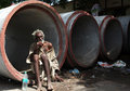
| 08/12/2009 12:30:06 PM | Living in a Circleby aporagenComment: Critique Club
First impressions
Something a bit different for a DPC entry, good title for the challenge.
After a bit
This is a lovely environmental portrait, I disagree that you should have got closer, we need to see the man and his world for us to engage properly with him. It is a shame that a few of his toes missed being caught in the shot, and the (unavoidably) harsh light means we've lost some of his face to shadow, but this isn't a studio portrait - what you saw is what we got and I like it.
Overall
A bold shot for this challenge, I like the composition and I'm glad to see it scored reasonably well.
Well done :) |  Photographer found comment helpful. Photographer found comment helpful. |
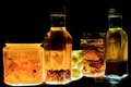
| 08/12/2009 08:54:14 AM | Culinary Condiments by PaulComment: Critique Club
Hi Paul from the Critique Club
First impressions
Intrigue - what was I going to find in those bottles and jars....
After spending time with the image
No, it's not too dark - but it is a dark image and as such creates a feeling in the viewer. I was sure I was going to find hideously deformed medical specimens or coiled parasitic worms in there, the atmosphere had sort of been set with the blackness (culinary condiments being more associated with sunny kitchens). So I wonder if 'too dark' is a feeling rather than a technical observation?
The set up is effective at providing the unidirectional lighting you'd planned and you've created a striking image out of ordinary objects. The most appealing object is the bottle on the right which has caught some extra illumination on the lid, I wonder if a touch of lighting to the top of the jars and bottles would have given a better definition to the scene?
Overall
Technically fine, and an interesting approach has given a good image. I think it's appeal is limited because of the possible mismatch between subject and setting/atmosphere.
Hope that helps :) | | Photographer found comment helpful. |
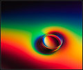
| 08/12/2009 04:54:30 AM | Circularityby snafflesComment: Critique Club
Hi Susan, I love the thought of critiquing an image that was created in the Closet of Doom!
First impressions
A bright, graphic image.
After some time with the picture
I started to feel a little as though your glass was trapped in a box, the composition gave it no room to wriggle or roll, I felt uncomfortable for it. However the tight crop did fill the image with the circles created by the glass and so it was fulfilling its brief. I puzzled over the dark lines above the glass and wondered if they were folds in a cloth and you'd gone high key to lose them within the basic editing rule. Then I realised the image has gone through 180 degrees and those are shadows on the ground/surface. I think without these the image would float better, but basic editing leaves you a bit stuck on that one!
Overall
A good idea and the high key creates drama and provides a graphic image. The tightness of the composition hurts the image and the rotation with the shadows still evident is disorientating. Keep going with this set up and plenty of experimentation!
:) | | Photographer found comment helpful. |
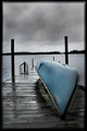
| 08/11/2009 06:03:23 PM | The Interludeby JacksonGarietyComment: Critique Club
Hi Coleman, my first impressions of your image were of serenity, a pause in the day as your title suggests. I was unfortunately equally grabbed by the tilted horizon!
I was interested to see that you didn't use any fancy software to acheive your grungy look, so kudos to you for that :) The look works well for this image, it's a bad weather stops play kind of a day, and you've enhanced that feeling nicely with your editing.
Now then, why didn't you spot that tilted horizon??! Do you sit crooked in your chair? I do and sometimes I get my horizons wrong because of it, so I use the grid in photoshop to check for straightness. I wonder if your score would have been different if the horizon was straight.
Watch out as well for halos coming in with the USM (especially visible on the left jetty post) I understand you were trying to combat the fogginess so a high radius but low, low amount would be a good technique to try.
Overall a good image given some real moodiness by your editing, just a few technical details to address.
:) | | Photographer found comment helpful. |
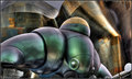
| 08/11/2009 03:46:48 AM | The Sentinelby Dr.ConfuserComment: Critique Club
Greetings Doctor (trying to keep in with the theme here ;) )
Initial thoughts
Wow!
On reflection
An amazing piece of architecture you've captured there and the post processing works very well to bring out all of it's otherworldliness. The more I look, the more aware I become that I'm only seeing a part of the whole. Not necessarily a problem, I like detail, but with undeniable anthropomorphism, I feel you've cut it's 'nose' (proboscis?) in half and chopped it's legs at an awkward point. (Looking at the link you supplied I can see what appears to be a plexiglass structure in front of the creature, maybe that limited you with the legs.) The point of engagement, the 'eye', is maybe placed less than ideally, verging on being bottom centre.
In conclusion
A striking image and well handled with the technicals, a subject worthy of further compositional exploration.
Farewell Earthling........... | | Photographer found comment helpful. |
| 08/10/2009 05:00:24 PM | Catching some rays…by Edward MainComment: Critique Club
Hi Edward, a beauty indeed, although to a non car person I don't really understand why it has a hole in it? Anyway - on to the photo itself.... ;)
First impressions
A colourful image with well controlled highlights and shadows and good focus.
After some consideration
Two of your commenters rightly mentioned the composition of your image. About a third of the image is taken up with tarmac, try some different crops to see how it works with less of it. The trouble will probably be that a crop like that will leave you with a long, not so high image that might not be that pleasing. Did you have a chance to get up close to the car, and did you have your 17-40mm lens with you? Lying on the ground with a 17mm lens with that lovely blue sky could get you some other cracking shots.
Still on composition, the car is 'looking' away from us which makes it seem a little unfriendly, you may have had limited access but including one or both head (or rear) lights gives you more of a 'face' to engage with. (It could well be that you captured the best view of this vehicle for a car lover, I'm just commenting as someone who isn't that into cars ;) )
Enough 'criticism', there's plenty that's good here, you've got a good focus, some great colours and you've used your post processing to tackle what I imagine was quite a contrasty image to give a nicely controlled balance, as I mentioned earlier.
Overall
A well executed image only let down by the composition.
Thank you for allowing me to spend more time with a car image than I normally would, maybe you could explain that hole to me :) | | Photographer found comment helpful. |
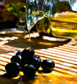
| 08/10/2009 02:12:20 PM | Simply Simpleby JulietNNComment: Critique Club
Hi Juliet, Here's my take on your oil challenge image :)
First impressions
A sunny image with a Mediterranean feel
A little bit later
I still had a warm feeling from the image but I was starting to struggle. I'm not sure where the focus of the image is - I think probably the cleverly caught drop of oil, but that doesn't appear to be sharp, my eye moves on - maybe the drop of oil on the top olive, again not sharp enough. The olives themselves are dark, and a bit off-putting because of it. The glass carafe however has caught some wonderful colours and the hint of a glass bowl in the background is delightful. And then, back down at the olives, the lone olive on the right next to a pool of luscious oil is what I think you were trying to capture in it's simplicity - better focus and lighting here, a lovely tasty, sunny moment :)
A summing up
The idea behind the image is good and meets the challenge well. The composition works well and you've timed the shot perfectly. The image is let down by a lack of focus in the important areas and the need for more light falling onto the olives. I see you were in your kitchen, maybe there's a bit of tin foil/aluminum foil lying around that you could use to redirect some of that sunlight!
I note you were disappointed by your score, but you were a fraction above the average score which is not a bad place to be :) Thank you for allowing me to linger in your sunny kitchen, I promise I didn't eat any of the props ;) | | Photographer found comment helpful. |
| 08/10/2009 05:03:51 AM | | | Photographer found comment helpful. |
| 08/10/2009 05:03:03 AM | | | Photographer found comment helpful. |
| 08/10/2009 05:00:38 AM | Rainbow Vinaigrette by bspurgeonComment: Beautifully done, and whilst I'm more often a b&w fan I prefer this luscious colour version of your image :) | | Photographer found comment helpful. |
|
Showing 301 - 310 of ~1699 |
Home -
Challenges -
Community -
League -
Photos -
Cameras -
Lenses -
Learn -
Help -
Terms of Use -
Privacy -
Top ^
DPChallenge, and website content and design, Copyright © 2001-2025 Challenging Technologies, LLC.
All digital photo copyrights belong to the photographers and may not be used without permission.
Current Server Time: 08/20/2025 07:30:58 PM EDT.
|