| Image |
Comment |
| 03/19/2003 04:14:45 PM |
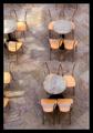
No customers!by kiwinessComment: There were a few shots of chairs and tables from above, but this, I feel, is the best. I love how the tiles are at a diagonal while the tables/chairs are horiz and vertical, and the roundness of the tables contrasts well with the other lines. This is simply a well composed image. I hope it does well. |
 Photographer found comment helpful. Photographer found comment helpful. |
| 03/19/2003 04:13:01 PM |
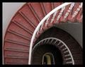
Round and Roundby agwrightComment: Lines, focus, patterns: simply wonderful. My eyes find lots of interest in this "simple" image. 10 from me (one of 3 10s in my book). |
| Photographer found comment helpful. |
| 03/18/2003 11:25:33 PM |
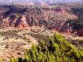
"Down in the Valley"by Frank BeckmanComment: Wow! I love the perspective here. I also like how you contrasted the tones of the bush nearest you with those in the background. Too bad you weren\'t here at sunrise or sunset, or when there was more interesting light. I'm not really an expert, but years of running around in the desert did give me a few hints: First, get a polarizing filter. Then try using your smallest aperture, and in this light, don't correct for reciprocity failure. In fact, if you bracket your shots, you might even take a shot or two even more underexposed. This will give you a darker image, and it often takes out the washed out look. You can lighten the image in Photoshop easily. The result will often be an image that has a bit more \"magic\" in the light. Sorry to babble on, but your nice photo reminded me of earlier days from my photographic youth! Good luck! |
| Photographer found comment helpful. |
| 03/17/2003 02:01:36 AM |
|
| Photographer found comment helpful. |
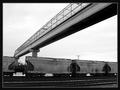
| 03/16/2003 07:57:04 PM |
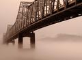
Doyle Rd. Bridgeby STEINRComment: Nice vantage point and perspective on an interesting bridge. The photo as a whole, though, seems washed out, having so many of the same tones. Try fiddling with the contrast levels to provide more dynamic tones. |
| Photographer found comment helpful. |
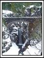
| 03/16/2003 07:52:51 PM |
Christine Falls Bridgeby SwashbucklerComment: I like the idea of this image with the waterfall unde the bridge. The tones of the photo, however are either similar or contrasting, so it is difficult to see what's going on. This shot may look better at sunset or sunrise, when the light is less harsh. |
| Photographer found comment helpful. |
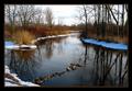
| 03/16/2003 07:51:18 PM |
The Incomplete Bridgeby buzzrockComment: Clever idea and a nice landscape. I enjoy how the rocks (too bad they are out of focus) go out at a certain angle which is then taken over by the curve of the river. Very soothing colors. |
| Photographer found comment helpful. |
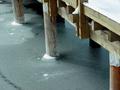
| 03/16/2003 07:49:33 PM |
Small and Narrowby clues56Comment: I like your interesting perspective here and how the bridge creates a line for our eyes to follow and enjoy the picture. Too bad its out of focus. |
| Photographer found comment helpful. |
| 03/16/2003 07:47:18 PM |
|
| Photographer found comment helpful. |
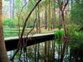
| 03/16/2003 07:46:30 PM |
Walk way for Kidsby T-boneComment: Nice lines and tones here. Simple and direct, it is well composed. I find it somehow not very exciting, though. It has kind of a textbook feel to it. Perhaps some different light or cropping would help. |
| Photographer found comment helpful. |
Home -
Challenges -
Community -
League -
Photos -
Cameras -
Lenses -
Learn -
Help -
Terms of Use -
Privacy -
Top ^
DPChallenge, and website content and design, Copyright © 2001-2025 Challenging Technologies, LLC.
All digital photo copyrights belong to the photographers and may not be used without permission.
Current Server Time: 08/06/2025 11:55:22 AM EDT.