| Image |
Comment |
| 06/18/2003 11:17:40 PM |
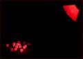
Dyslexiaby friscaComment: Interesting shot. The red lamp and letter dice juxtapose each other quite nicely. I'm not sure of the significance of the title, but I find the photo intriquing. |
 Photographer found comment helpful. Photographer found comment helpful. |
| 06/18/2003 02:17:17 PM |
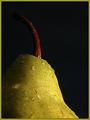
Your Healthby kosmikkreeperComment: Greetings from the Critique Club!
I concur with all of the positive statements below--even my own!
This is a marvelous image, and I feel lucky to have gotten it to critique. The positive things that pop out are the wonderful lighting, that illuminates the pear very clearly, but which also adds drama to the photo and depth to the fruit. The black background isolates the fruit, so it gets the focus. It adds a sense of mystique, too.
The composition is marvelous. Your Health can be seen in this pear as it is positioned; the off center composition implies that this is only a part of the whole picture, and health is a big picture! The water on the fruit aids in making it look inviting and refreshing, and I'm glad you chose a healthy looking pear!
To improve the shot I would . . . Hmmm. I can't think of anything to improve the shot. it is clear, refreshing, inviting, and makes me want to open the magazine. Some below have mentioned the black background being "doom" filled. I disagree, but you may want to think about having a white background or some other color and experiment to see what moods and feelings they evoke.
Again, wonderful shot; I'm glad it did well. Best of luck to you in future challenges!
David |
| Photographer found comment helpful. |
| 06/18/2003 10:05:45 AM |
Beachedby indigo997Comment: Intriguing abstract. It looks like sand and something else that is somewhat transparent with cracks in it? Hmmm. I like abstracts, but this has clues that indicate that you might be communicating more, so I'm just a tad confused. Still, I enjoy the colors and textures of this photo very much, as well as its dark, brooding mood. |
| Photographer found comment helpful. |
| 06/18/2003 10:03:48 AM |
Rock and Roll Hall of Fameby STEINRComment: INteresting architecture! You've captured the lines and shadows of this unique building quite well, though the light is somewhat harsh, blowing out your whites and causing harsh shadows in your darks. It seems that this building is almost centered, but I can see it does occupy more space to the right, though I'm sure others will complain.... Nice use of line and point of view here. |
| Photographer found comment helpful. |
| 06/18/2003 10:00:58 AM |
Learning To Flyby DiversqComment: Cute little bird! Placement works very well here, suggesting the bird can "go" somewhere in the frame, while also suggesting that this is just part of a larger picture or environment. Depth of field may be just a little narrow, as it appears its head is just out of focus. |
| Photographer found comment helpful. |
| 06/18/2003 09:59:15 AM |
Cloud fanby ewebComment: Intriguing idea, especially the direction of the propellers! I like this shot a lot. I think it would improve with more tonal range. It all seems gray now; I'd like to see whites in the clouds and darker grays in the sky, etc. to add some more interest and drama. |
| Photographer found comment helpful. |
| 06/18/2003 09:57:31 AM |
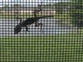
I'm Still Hereby togtogComment: The grid pattern works well to set off the lizard, though I wish there were just a bit more detail on the lizard itself. As a sillouette, however, it has interest. |
| Photographer found comment helpful. |
| 06/18/2003 09:56:11 AM |
off-center is easier to move aboutby kenboComment: Clever idea for an interesting perspective. Depth of field works well, and lighting is pretty good, too. I think that technically, this is a pretty good shot. I don't find the subject all that engaging, though. Still, some interesting work here, and well done. |
| Photographer found comment helpful. |
| 06/18/2003 09:54:37 AM |
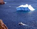
The Race Homeby kharperComment: Fun shot! The ice berg is certainly an incredible feature here, and the composition makes a split focus between the berg and the boat, which I find okay. The lighting is a bit harsh and uninteresting, though, and the whole would be improved just a tad at a different time of day perhaps. |
| Photographer found comment helpful. |
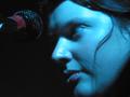
| 06/18/2003 09:52:24 AM |
Rachelleby anggComment: Looks like this was a good concert? NIce lighting on the face. The harsh shadows and highlights increase the "in the moment" feel. Too bad she's not quite in focus. Nice composition, too. |
| Photographer found comment helpful. |
Home -
Challenges -
Community -
League -
Photos -
Cameras -
Lenses -
Learn -
Help -
Terms of Use -
Privacy -
Top ^
DPChallenge, and website content and design, Copyright © 2001-2025 Challenging Technologies, LLC.
All digital photo copyrights belong to the photographers and may not be used without permission.
Current Server Time: 08/20/2025 01:59:56 AM EDT.