| Image |
Comment |
| 07/12/2013 09:51:55 AM |
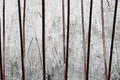
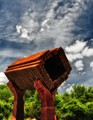
a prison of perceptionby posthumousComment: Ok this one is probably one of the odd ones out which lacks any style of his portfolio due to the lack of color and vibrancy, but with that said it does capture some of the great textures that I think he would have found interesting. The shadows appear very interesting as though two different light sources are being used. |
 Photographer found comment helpful. Photographer found comment helpful. |
| 07/12/2013 09:48:34 AM |
Welcomeby Jackson_HComment: This shot has some great potential but I think you missed the mark a little IMO. Looking at his port I would think this shot could have worked better maybe in one of two ways. The first would have been to just crop in on the brick wall leaving the doors and shutters out of the shot or second to pull back from the shot and include more of the wall and building and maybe include some people. Obviously not knowing what you had to work with I really cant say but I do like the feel of this wall, nice take on the challenge. |
| Photographer found comment helpful. |
| 07/12/2013 09:44:25 AM |
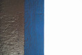
Sea Breezeby IAmEliKatzComment: ok so looking at this I can see him maybe taking a shot like this but not with the grey/silver texture in it. His subjects were bright and colorful and this is a little more on the darker side I believe. I personally like the colors because grey and blue are my favorite and well white goes with anything :) still a nice take on the challenge and a great pattern. |
| Photographer found comment helpful. |
| 07/12/2013 09:41:28 AM |
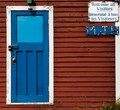
Welcome...!by mariahdcComment: I think the door and frame are spot on with the color but the siding is lacking that pop, i think this may have done better if the saturation was increased on the siding but none the less a great take on the challenge and I really like the sign. |
| Photographer found comment helpful. |
| 07/12/2013 09:39:43 AM |
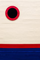
Portlight & Loadline by Bear_MusicComment: The colors are a little different than his style but I like the flow and they are vibrant. I would have liked it better without the porthole just because he has no ships in his portfolio that I could see. Nice take on the challenge! |
| Photographer found comment helpful. |
| 07/12/2013 09:37:28 AM |
Happy Doorby GeneralEComment: I think the colors fit the challenge well the only odd texture is the wood but Im sure you may have been limited by your environment like many. Nice Job |
| Photographer found comment helpful. |
| 07/11/2013 10:28:05 PM |
|
| Photographer found comment helpful. |
| 07/10/2013 10:59:23 PM |
|
| Photographer found comment helpful. |
| 07/10/2013 10:59:11 PM |
|
| Photographer found comment helpful. |
| 07/10/2013 10:58:50 PM |
|
| Photographer found comment helpful. |
Home -
Challenges -
Community -
League -
Photos -
Cameras -
Lenses -
Learn -
Help -
Terms of Use -
Privacy -
Top ^
DPChallenge, and website content and design, Copyright © 2001-2025 Challenging Technologies, LLC.
All digital photo copyrights belong to the photographers and may not be used without permission.
Current Server Time: 08/27/2025 08:04:16 AM EDT.