| Image |
Comment |
| 08/09/2007 10:40:09 PM |
|
 Photographer found comment helpful. Photographer found comment helpful. |
| 08/09/2007 10:36:38 PM |
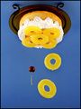
what's up or down....??by philupComment: Cute subject & nice composition. B&W is good here, but maybe a boost in sharpness or contrast would brought some punch to the image. << 6 >> |
| Photographer found comment helpful. |
| 08/09/2007 10:35:10 PM |
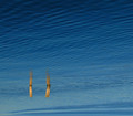
untitledby tnunComment: Nice & simple concepts & subject. Pleasing composition, but could have used a little extra something to help bring it further. High contrast b&w would have been nice or, since you didn't get smooth-as-glass water, perhaps a long exposure to smooth out the surface would have been a nice touch. << 7 >> |
| Photographer found comment helpful. |
| 08/09/2007 10:31:10 PM |
|
| Photographer found comment helpful. |
| 08/09/2007 10:25:34 PM |
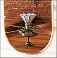
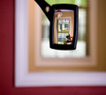
Flower ( no macro)by HeiSchComment: Ha ha - nicely titled. The mirror is a nice touch, but that point is countered by the fact that it is surrounded by blown out white wall, so my gut tells me it would have been better if it were excluded from the composition. |
| Photographer found comment helpful. |
| 08/09/2007 10:23:01 PM |
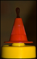
Sauce Goes Down Out of the Bottle Not Up........Right??by SomeamateurComment: Fabulous idea, but god-awful lighting! All your light is coming from the same direction as your view (on camera flash?) which flattens the image. You end up with no texture, no depth to the image. Side lighting would have been preferable here, IMO, with a less centered composition. << 5 >> |
| Photographer found comment helpful. |
| 08/09/2007 10:20:25 PM |
|
| Photographer found comment helpful. |
| 08/09/2007 10:12:08 PM |
|
| Photographer found comment helpful. |
| 08/09/2007 10:09:42 PM |
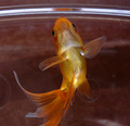
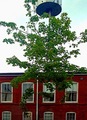
Treeby CEJComment: Confusing - makes one question whether this is authentic. Lacks oomph both technically & artistically, IMHO, as the blown sky & the centered composition are both unappealing. I do give you points for stumping me here, tho'! |
| Photographer found comment helpful. |
| 08/09/2007 10:04:07 PM |
|
| Photographer found comment helpful. |
Home -
Challenges -
Community -
League -
Photos -
Cameras -
Lenses -
Learn -
Help -
Terms of Use -
Privacy -
Top ^
DPChallenge, and website content and design, Copyright © 2001-2025 Challenging Technologies, LLC.
All digital photo copyrights belong to the photographers and may not be used without permission.
Current Server Time: 08/23/2025 01:50:57 AM EDT.