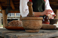
DPChallenge: A Digital Photography Contest You are not logged in. (log in or register
 
Browse Settings
Currently viewing:
Registered Userdewdodesign

Show comments:

Per page:

Order:

Comments:


Comments Made by dewdodesign
Pages:   ... ...
Showing 201 - 210 of ~258
Image Comment
study of a broken home
05/02/2007 08:38:49 AM
study of a broken home
by Gnarf

Comment:
I can kinda see where you are coming from with this one but it's just not quite interesting enough for me
Photographer found comment helpful.
Waldo's House
05/02/2007 08:36:45 AM
Waldo's House
by bbright

Comment:
wow, this is very nice.
I like everything about it apart from the artifact to the right of the house low down, I can't work out what it is and it's bugging me! Looks too dark to be sky?
Photographer found comment helpful.
Look to the Skies
05/02/2007 08:34:24 AM
Look to the Skies
by menele

Comment:
great silhouette, nice colours for the sky although it looks rather unnatural, especially as the bottom right corner is really orange compared to the rest.
Nice compositon and good placement of the dish.
Photographer found comment helpful.
"B Movie"
05/02/2007 08:31:52 AM
"B Movie"
by smcc

Comment:
hmmmm this is a pretty unusual perspective and I can't decided whether I like it or not.
One thing I noticed straight away was the amount of "noise" normally caused by using a high ISO setting but as this image is very artistic and unusual i'm not sure if it was intentional or not.
The ground looks too blown out IMO especially on the right hand side at the front but again i'm not sure if this is intentional or not?
The crop is kinda strange too and you've definitely got me wanting to see more, and I guess that can only be a good thing....
Photographer found comment helpful.
Watching My Corn Pop Up In Rows
05/02/2007 07:53:52 AM
Watching My Corn Pop Up In Rows
by jasonlprice

Comment:
haha i like the comical side to this image and the great contrast between the sky and the green of the corn shoots really makes this stand out.
However, the fact the sky fades out to white makes it look rather unnatural and makes me wonder if this sky has been added on and blended in photoshop? So for that alone I can't score this as highly as I may have done had it looked more natural.

Great composition and IMO the positioning of the tractor is spot on. The straw in the mouth shows you have thought about attention to detail and is a nice touch.
Photographer found comment helpful.
Colonial Kitchenware
05/02/2007 07:12:03 AM
Colonial Kitchenware
by pipersd

Comment:
Greetings from the Critique Club

This is my very first Critique so go easy on me :o)

The first thing that strikes me about this image is the natural material which really helps to give this the "old" cosy feel you say you like so much.

Lighting
You have made very good use of the natural light available to bring out the detail in the wood, making the grain in the wood stand out which results in a very sharp looking image.
The exposure is pretty much spot on and helps to capture a natural looking photograph with great contrast between the different material types.

Depth of Field
The depth of field is sufficient to blur the background and helps to keep my eye focussed on the main attraction in the foreground which is definitely a good thing in this case.

Composition
In my opinion the only thing that lets this down is the composition and arrangement of the utensils. It almost feels a bit too cluttered and I really think the bowl would have been better positioned away from the person as the fact they both cross detracts from the bowl itself and also from the interesting perspective of the beef mixing man, which could have been a focal point in its own right.
That said, I do like the fact this has been taken from a low angle as it gives this a rather unusual perspective

My Opinion
Personally I think this is a nice idea which has been captured well by good use of lighting and exposure, however in my opinion it is slightly let down by a "cluttered" feel and may have been improved by better spacing of some of the utensils.

If you've got any questions about this critique, please feel free to contact me via the PM system.
Photographer found comment helpful.
Single Pink Tulip
05/01/2007 10:54:06 PM
Single Pink Tulip
by ssodell

Comment:
I like the grey background but this is not sharp enough IMHO to be a great image and stand out from the others I have seen
Photographer found comment helpful.
Un Jour Froid au Printemps
05/01/2007 10:53:14 PM
Un Jour Froid au Printemps
by Elemmennope

Comment:
this is nice, I just wish you had adjusted the angle of horizon so that it was straight! Attention to detail makes the difference between a good image and a great one. (and now I must go back and practice what i preach!)
Photographer found comment helpful.
Pear Blossoms
05/01/2007 10:50:59 PM
Pear Blossoms
by Shea927

Comment:
nowhere near sharp enough in my opinion and black and white does not do this justice. While B+W works well with some subjects I believe nature has been given colour for a reason and you should always make the most of it.
That said, I respect the fact you have tried to do something a little different, especially as this is a very popular subject.
Photographer found comment helpful.
Ignoring the Moooon
05/01/2007 10:47:13 PM
Ignoring the Moooon
by seriocomic

Comment:
REALLY nice, no need to comment on technicalities as this is pretty much spot on!
Photographer found comment helpful.
Pages:   ... ...
Showing 201 - 210 of ~258


Home - Challenges - Community - League - Photos - Cameras - Lenses - Learn - Help - Terms of Use - Privacy - Top ^
DPChallenge, and website content and design, Copyright © 2001-2025 Challenging Technologies, LLC.
All digital photo copyrights belong to the photographers and may not be used without permission.
Current Server Time: 08/20/2025 03:20:54 PM EDT.