| Image |
Comment |
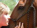
| 03/11/2009 03:19:39 AM |
Trustby LynnSComment: tough scene to expose for. Unfortunately you've blown out the highlights on her face which is one area that needs to be exposed properly. |
 Photographer found comment helpful. Photographer found comment helpful. |
| 03/10/2009 06:28:18 PM |
Untitled by JudiComment: I'd really like to see a tutorial of the steps you took for post processing. It would be a terrific opportunity to learn how to take a shot from good to great.
By the way: brilliant work as always Judi :) |
| Photographer found comment helpful. |
| 02/09/2009 01:03:16 PM |
Grey Shadingby bobonacusComment: I don't know what it is with pencils but they always seem to have appeal. Especially when they are well captured like this scene is. Well done and congrats! |
| Photographer found comment helpful. |
| 01/23/2009 02:43:09 AM |
Zip, Tuckby fotofanComment: Really cool idea and well executed. Congrats on the red. It will probably be your first of many! |
| Photographer found comment helpful. |
| 01/23/2009 02:30:49 AM |
|
| Photographer found comment helpful. |
| 01/21/2009 03:28:39 AM |
What are you lookin' at?by hajekaComment: Not really sure about the selective desaturation here. Its typically used to draw the viewers attention to a subject. In this case there are two subjects one of which is black and white already. |
| Photographer found comment helpful. |
| 01/16/2009 09:12:51 PM |
The Ringby justamistereComment: Right on! I was hoping to see an entry from the Calgary workshop. Great image and I like subtle interaction between the models. |
| Photographer found comment helpful. |
| 01/16/2009 09:11:55 PM |
FLIGHTby thekfactorComment: Normally I like the birds in the flight shots to be flying into the frame. However this one works well I think. The line of the bird and the downward flap of the wings definitely give a sense of motion and the lines of the bird make your eye look to see where he came from rather than where he is going to. |
| Photographer found comment helpful. |
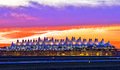
| 01/16/2009 09:09:44 PM |
Peaksby wetlandComment: Interesting but the processing really kills this for me. The colors are far too saturated in my opinion. |
| Photographer found comment helpful. |
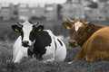
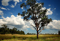
| 01/16/2009 09:09:05 PM |
Rural Countryby CraftyComment: Great sharpness in the central tree. Nice colors that are saturated well without being overdone. I'd like to see the whole tree however. That aside this is a pretty good image. |
| Photographer found comment helpful. |
Home -
Challenges -
Community -
League -
Photos -
Cameras -
Lenses -
Learn -
Help -
Terms of Use -
Privacy -
Top ^
DPChallenge, and website content and design, Copyright © 2001-2025 Challenging Technologies, LLC.
All digital photo copyrights belong to the photographers and may not be used without permission.
Current Server Time: 08/19/2025 11:21:24 PM EDT.