| Image |
Comment |
| 02/08/2007 07:38:53 PM |
Something good...by failedguidedogComment: Hmm...good bokeh too! This would go from good to great had you used a bit more depth of field for the subject to get the whole dandelion head in focus. One or two stops would probably be all it would take I think. |
 Photographer found comment helpful. Photographer found comment helpful. |
| 02/08/2007 07:37:07 PM |
Seberityby actnoutComment: This has a tilted feeling to it but I like how you used the branches to frame the shot. |
| Photographer found comment helpful. |
| 02/08/2007 07:34:48 PM |
Christby sarsonukComment: I like the idea here. Compositionally a little static. Had you placed Him higher or lower in the scene would have been more visually appealing. I would say higher so that the horizontal portion of the cross is right smack dab on the one the thirds lines. It wouldn't take much either. A step forward and you'd probably would have it. |
| Photographer found comment helpful. |
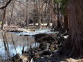
| 02/08/2007 07:31:13 PM |
|
| Photographer found comment helpful. |
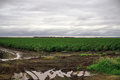
| 02/08/2007 07:27:11 PM |
Good crops, good rain, good seasonby CraftyComment: I would like to see how this would be if the horizon line were raised up about an inch higher. (Either by pointing camera lower or getting down lower for the shot). As it is you've cut your shot in half. The subject of your picture is the crops whereas the sky is just a complimentary element. By showing more of the field you place higher emphasis on it and therefore make the viewer KNOW that its the subject rather than having them visually debate which is the subject: sky or field. Intellectually they know what the subject is but you have to tell their eyes what to see.
I do like the colors you captured and the sky is quite nice and does actually work well here despite what I said above. More of the puddles in the foreground would tie this with the title a bit more.
In terms of it relativity to the challenge I like it a lot. Its creative and is sort of a "salt of the earth" approach. Really great idea!
Overall, I would give this a 7. |
| Photographer found comment helpful. |
| 02/08/2007 07:21:55 PM |
House of Worshipby dahvedComment: The sky appears a bit dark to me at the top. I do like the composition though. The shadows draw your eyes upwards towards the top of the roof. Had the sky been less dark, the roof would have stood out more making the subject pop more. |
| Photographer found comment helpful. |
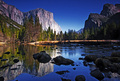
| 02/08/2007 07:10:17 PM |
Preserving parks for future generations (Yosemite) by bryanbrazilComment: A bit oversaturated. Taking it back a bit would make this more effective and reduce some of the haloing that came out of the sharpening process. Nevertheless, I do like this image for the composition and subject matter presented. It also ties creatively with the challenge which is a bonus. 6 |
| Photographer found comment helpful. |
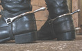
| 02/08/2007 06:28:42 PM |
Use spurs with care!by snafflesComment: Spurs? Good? Huh? Sorry. This doesn't meet the challenge to me. And I am REALLY trying to stretch to find a connection. |
| Photographer found comment helpful. |
| 02/08/2007 06:23:01 PM |
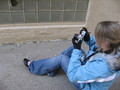
Sometimes Broken is Beautifulby siexhasxADDComment: The subject appears to be either the person or the camera that she is holding. The hole in the glass is only apparent because of the title. Getting a tighter shot of just the hole would make this stronger. |
| Photographer found comment helpful. |
| 02/08/2007 06:21:52 PM |
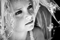
Confirmationby njsabsComment: A bigger version would be better. I like the concept however. |
| Photographer found comment helpful. |
Home -
Challenges -
Community -
League -
Photos -
Cameras -
Lenses -
Learn -
Help -
Terms of Use -
Privacy -
Top ^
DPChallenge, and website content and design, Copyright © 2001-2025 Challenging Technologies, LLC.
All digital photo copyrights belong to the photographers and may not be used without permission.
Current Server Time: 08/14/2025 09:17:39 AM EDT.