| Image |
Comment |
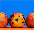
| 04/14/2009 06:05:36 PM |
How do you like them applesby GiorgioComment: The thumbnail doesn't do this one justice. I thought they were oranges. Technicals are very good! Love the complimentary color for the bg. Only thing I can think of is maybe having that middle one (just as it is) next to a ripe good one with a bite out of it. It would give a comparison texture and variety of texture including the smoothness of the ripe apple and the grainy texture of the inside as well as the wrinkled old look of the rotting one. Just a thought. I like this one like it is too though. |
 Photographer found comment helpful. Photographer found comment helpful. |
| 04/14/2009 04:36:00 PM |
Celestialby androgeusComment: It must have been a team concept to have all of you make a moon out of a cantaloupe. I think maybe this is a little underexposed though. |
| Photographer found comment helpful. |
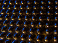
| 04/14/2009 04:33:43 PM |
Hexagon by orvaratliComment: Great example of how to use a fisheye well to your advantage. Texture with an interesting photo. |
| Photographer found comment helpful. |
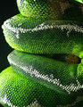
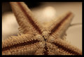
| 04/14/2009 04:32:36 PM |
scalesby rodgers_leComment: Looks like he's playing peek a boo. Well done. Great technicals, love the lighting, PP is done well and great texture. |
| Photographer found comment helpful. |
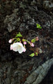
| 04/14/2009 04:30:14 PM |
Blossomby mcrochipComment: Nice job. This is what I've been commenting about on some other images. Having the texture as the largest part of the image but breaking up the monotony with something interesting to look at. You've done that well. |
| Photographer found comment helpful. |
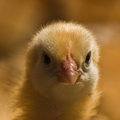
| 04/14/2009 04:28:19 PM |
10 day old fluffballby SoulMan1978Comment: What a cutie. Good job overall. Maybe a little bump in curves? Or maybe not as that might interfere with the softness that works well here. |
| Photographer found comment helpful. |
| 04/14/2009 04:27:07 PM |
|
| Photographer found comment helpful. |
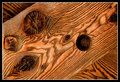
| 04/14/2009 04:26:05 PM |
Roughby radioeffectComment: technically this could be improved with a bump up in exposure and some curves. Shallow dof is okay but just a little more depth would be better I think. |
| Photographer found comment helpful. |
| 04/14/2009 04:22:59 PM |
Truss & Treenailsby DJWoodwardComment: Great job. You've broken up the monotony with the opposing lines in the corners. A little on the warm side but maybe you intended it that way. Try making it just a tad cooler and see what you think though. |
| Photographer found comment helpful. |
| 04/14/2009 04:21:18 PM |
|
| Photographer found comment helpful. |
Home -
Challenges -
Community -
League -
Photos -
Cameras -
Lenses -
Learn -
Help -
Terms of Use -
Privacy -
Top ^
DPChallenge, and website content and design, Copyright © 2001-2025 Challenging Technologies, LLC.
All digital photo copyrights belong to the photographers and may not be used without permission.
Current Server Time: 08/06/2025 11:54:26 AM EDT.