| Image |
Comment |
| 11/13/2006 04:49:41 PM |
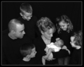
The Morse's New Babyby militarygirl10Comment: Well composed, good lighting and contrast.
I'd like to see a sharper focus, mostly on the Baby, no cropping his/ leg (as well as the right girl's hair) |
 Photographer found comment helpful. Photographer found comment helpful. |
| 11/13/2006 10:32:14 AM |
|
| Photographer found comment helpful. |
| 11/13/2006 12:55:49 AM |
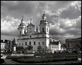
Catedral da Séby BudComment: There seems to be some areas that were not totally de-saturated (like the reddish fence board around the church). Or my eyes are tricking me?
A nice urban landscape nevertheless. Me faz lembrar da minha cidade natal... |
| Photographer found comment helpful. |
| 11/13/2006 12:47:35 AM |
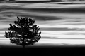
Lonerby qmdiComment: Nice silhouete and induces the viewer to a deep comtemplation. Also, it makes me think on what colors are in that sky... Good capture! |
| Photographer found comment helpful. |
| 11/13/2006 12:27:15 AM |
Not Yellow?by stare_at_the_sunComment: Funny, creative and well composed, wiht a very appropriate title! Ah, and nice hair too... lol. 8 |
| Photographer found comment helpful. |
| 11/11/2006 09:05:24 PM |
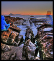
Precisionby BakerBugComment: I am trying to understand this... it doesn't seem a reflection but's kind of interesting anyway. |
| Photographer found comment helpful. |
| 11/11/2006 08:50:07 PM |
|
| Photographer found comment helpful. |
| 11/11/2006 08:47:17 PM |
|
| Photographer found comment helpful. |
| 11/11/2006 08:40:57 PM |
Gone Fishingby lkn4truthComment: Great focus on the reflected clouds. I like the deep blue color and the symetry. Very well composed. |
| Photographer found comment helpful. |
| 11/10/2006 10:08:40 PM |
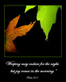
Psalm 30by jpochardComment: Beautiful poster!
I think the Bible verse is just right!
I also like the thinner green line you used in the border. Maybe even the (black) border could be thinner too, but that's not an issue at all.
This font is much better. I would make 1 point smaller, though, and/or not use bold - I think it will make the whole poster "lighter" and more balanced, by driving the viewer's attention a little bit more on the image.
These are just my personal observations, which I don't consider indispensible.
This is a fine work of yours just as is. Congratulations!
|
| Photographer found comment helpful. |
Home -
Challenges -
Community -
League -
Photos -
Cameras -
Lenses -
Learn -
Help -
Terms of Use -
Privacy -
Top ^
DPChallenge, and website content and design, Copyright © 2001-2025 Challenging Technologies, LLC.
All digital photo copyrights belong to the photographers and may not be used without permission.
Current Server Time: 08/05/2025 10:59:49 PM EDT.