| Image |
Comment |
| 01/29/2003 11:34:29 PM |
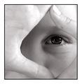
Eyes Sq Onby redfigComment: Nice image. I like your idea. The image also has a good clearity. The detail of the eye really stands out. I like this image, good job. |
 Photographer found comment helpful. Photographer found comment helpful. |
| 01/29/2003 11:30:52 PM |
The Three Sides of Squareby AnnidaComment: This is an interesting image. I like your use of mirrors to achieve this image. I may have tried to make it more clear, or chose a different type of lighting to get a different affect. Nice image. |
| Photographer found comment helpful. |
| 01/29/2003 11:21:23 PM |
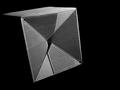
dimensionby jurasComment: Good image. I like the texture that you achieved with this image. The black backround really brings out the box's shape. This is a good image. |
| Photographer found comment helpful. |
| 01/29/2003 11:17:47 PM |
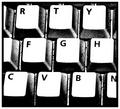
Keysby nathaliedooComment: The letter appear clear. It was a good idea for squares. What type of tone did you shoot in or is it black and white? I might have tried sepia to see what that might look like, otherwise this was a good image. |
| Photographer found comment helpful. |
| 01/29/2003 11:09:37 PM |
Shadow of a squareby dimitriiComment: I like this image. The shadow really looks good with the lighting. I like how the light is more bright inside on the shadow. Good image. |
| Photographer found comment helpful. |
| 01/29/2003 10:53:45 PM |
Fifteen?by steinarknutsenComment: Good idea. The reflection was a good touch. It gives the image good depth. I also like the lighting and the clearity. Nice job. |
| Photographer found comment helpful. |
| 01/29/2003 02:43:42 PM |
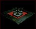
Meet Spot, my pet square.by SonifoComment: This is interesting. How did you achieve this image. I like the colors the clearity of the block. The black backround makes the block stand out in a nice mannor. Nice image. |
| Photographer found comment helpful. |
| 01/29/2003 02:37:35 PM |
Reflectionsby imagesloyolaComment: Wow. This is a good image. I really enjoy how you captured this. You may have tried a better tone for this image , maybe sepia, to get a different look other than black and white. |
| Photographer found comment helpful. |
| 01/29/2003 02:32:21 PM |
Gvmt Building - Bunch of squares...by kosmikkreeperComment: Good idea. The way that the sunlight bounces off the glass gives this image a good overall look. I think that the windows are a little more rectangular then square shaped. NIce image. |
| Photographer found comment helpful. |
| 01/29/2003 02:29:54 PM |
Clark Parkby JPRComment: Good image. I like how this image looks overall. Good use of your surrounding environment. NIce work. |
| Photographer found comment helpful. |
Home -
Challenges -
Community -
League -
Photos -
Cameras -
Lenses -
Learn -
Help -
Terms of Use -
Privacy -
Top ^
DPChallenge, and website content and design, Copyright © 2001-2025 Challenging Technologies, LLC.
All digital photo copyrights belong to the photographers and may not be used without permission.
Current Server Time: 12/21/2025 10:59:53 AM EST.