| Image |
Comment |
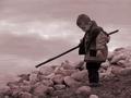
| 02/03/2003 07:43:58 PM |
Gone Fishin'by PedroComment: Splendid shot! One of 4 of my 10's this week. I love the composition -- the way the straightness of the stick comes nicely out of the bottom of the curved line of rocks. I like that the boy is looking down at something on the muddy ground (for small wildlife perhaps) and not at you or out at the water as would be the case in a typical shot. The one thing I don't like is the color you chose for what I assume was a duotone process. However, I can't decide on what color would have been better. Perhaps something a little less red but still similar. Maybe a tritone. I would play with some variations. It is, of course, still quite excellent how it is and one of my favorites. I have a feeling that you'll be receiving a ribbon this week. |
 Photographer found comment helpful. Photographer found comment helpful. |
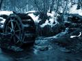
| 02/03/2003 07:39:44 PM |
The Cold Wheelby YomiComment: very beautiful photo. One of 4 of my 10's this week. Composition is excellent. The slow shutter speed is excellent in catching the blurred motion of the water in the stream. I like the blue tone. Was this done in duotone or tritone? |
| Photographer found comment helpful. |
| 01/27/2003 03:20:26 AM |
Shadow of a squareby dimitriiComment: Nice. I almost submitted a similar photo in black and white. Floor color and grains look excellent. I wouldn't change a thing. |
| Photographer found comment helpful. |
| 01/27/2003 03:19:11 AM |
|
| Photographer found comment helpful. |
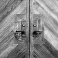
| 01/27/2003 03:18:20 AM |
Church Doorby goodtempoComment: this is better than the other door that looks exactly the same but is in color. The black and white picks up the wood grain well and it is an interesting square. In my top 10 |
| Photographer found comment helpful. |
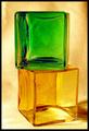
| 01/27/2003 03:15:24 AM |
2 Squaredby boyte1Comment: i really like the tone of this photo. in my top 10. |
| Photographer found comment helpful. |
| 01/27/2003 03:14:08 AM |
ArchiSquaresby Dallas_TXComment: perfect foto, it just seems a little too easy and a little uninteresting. a lovely shot you should be proud of. You could use it for some sort of business design work. |
| Photographer found comment helpful. |
| 01/27/2003 03:07:25 AM |
|
| Photographer found comment helpful. |
| 01/27/2003 03:06:45 AM |
Pikaboo!by ParentxComment: super. whimsical. excelllent. i would have either lowered or increased the saturation, but thats just me. This stood out from all the boring food, keyboards, buildings, and games. |
| Photographer found comment helpful. |
| 01/27/2003 03:03:48 AM |
"thro'golden squares"by FreebieComment: very interesting structure. i would have composed this slightly differently i think (although I have no idea what you had to work with). Nice foto. I would have tried to increase the gold tone. |
| Photographer found comment helpful. |
Home -
Challenges -
Community -
League -
Photos -
Cameras -
Lenses -
Learn -
Help -
Terms of Use -
Privacy -
Top ^
DPChallenge, and website content and design, Copyright © 2001-2025 Challenging Technologies, LLC.
All digital photo copyrights belong to the photographers and may not be used without permission.
Current Server Time: 08/30/2025 12:41:36 AM EDT.