|
|
| Image |
Comment |
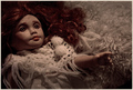
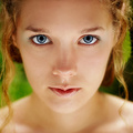
| 02/05/2008 04:50:42 PM | Rebeccaby skewsmeComment: Rebecca looks sort of possessed... Hmm, scary childhood :)
Very pretty pic btw. |  Photographer found comment helpful. Photographer found comment helpful. |
| 02/05/2008 04:48:13 PM | Poxby xianartComment: Eek. Extremely striking image! Beautifully composed, in a sort of rather freaky way... :)
Gah, can't stop staring... | | Photographer found comment helpful. |
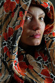
| 02/04/2008 04:44:27 PM | Luciaby osuarezComment: Greetings from the Critique Club!
Wow, your first challenge entry? Amazing capture! And great score too. Congratulations, and welcome to DPC!
I think the picture is great - creative, effective take on the challenge, extremely engaging portraiture, with some very interesting colours and patterns. I love the lady's steady gaze, and that slightly mysterious facial expression. And the interplay of light and shadow gives the picture a wonderful feeling of depth - the direction of the light works very well.
Not entirely sure about the composition. While I think it adds to the picture to have the folds of the scarf included as they are, that lovely engaging gaze seems rather awkwardly positioned at the top of the picture. I would've ideally maybe wanted to see it on one of the thirds lines, so it's possible that a tighter crop would work better? Not sure how well it would fit the challenge in that case though...
As has already been mentioned, the lighting is harsh. While I love the direction of the light you used, the harshness of it seems to result in some uncomfortable glare on the eyes, nose and chin, and also seems to make the model's every pore stand out. Maybe bouncing the light off a white piece of cardboard or a circular reflector could have accomplished a similar, but more gentle, flattering picture.
I think the focus works reasonably well. It might be nice if both the eyes were perfectly in focus, but I do think the picture works as it is. Advanced editing rules provide much more maneuvering space for post-processing modifications, which would've worked well for the image, but wouldn't have been allowed in this challenge, so I guess there's not much point in commenting on them... In terms of what you could've done in basic: I think the image would benefit from being a bit more contrasty, and maybe a warming filter to get rid of that bluish tint on her skin (if you were shooting in RAW, you could fix this by tweaking with the white balance).
Anyway, hope that helps. But well done, I think it's an excellent shot, and I look forward to seeing more entries from you in the future!
Any questions - just message me!
Jelena | | Photographer found comment helpful. |
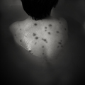
| 02/04/2008 05:29:37 AM | White Balance by yakatmeComment: This picture makes me happy :D Must be because of those lovely fluffy tufts of feathers.
Congratulations! | | Photographer found comment helpful. |
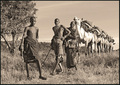
| 02/01/2008 08:57:48 PM | Africaby scooter88Comment: Greetings from the Critique Club.
Wow, that's a fantastic image actually. And I appear to have given it a 4 during voting. Sorry, on second look, that was actually very unfair of me.
To explain why - it was something about the post-processing. I think I briefly thought: "Oh, interesting image, but it's all a bit too monotone/sepia for me". And I barely even noticed that wonderful line of camels! (god, I feel bad now!)
So, yeah. Overall, I think the image is fantastic. Interesting subject matter, you've got spot on focus with pretty much a vanishing point of camels emerging from it, it's wonderful really.
Post-processingwise, however, I think maybe the picture could do with a bit more contrast, and maybe some dodging and burning, or soft light layers, to bring out bits of it. I'd also consider chopping off a bit of the tree on the left, to make the viewer focus more immediately on the first boy in the line. And the sepia... Maybe it's a personal preference, I'm just not too keen on it. I'd be interested to see it in colour - Africa has such lovely tones... Or even plain B&W I think works. It's just, sepia sort of makes me think old 1920s shots, whereas this shot could be a lot more alive than that.
And on a finishing note - I love that first camel's smile!!!
Anyway, great pic, congratulations on your new top score, and I hope to see more amazing work from you in the future!
Jelena | | Photographer found comment helpful. |
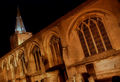
| 02/01/2008 08:43:23 PM | Six Arched Windowsby SoulMan1978Comment: Greetings from the Critique Club.
First reaction: "Oh. A squint picture of a church."
You've met the challenge, you've gone for a slightly unusual composition, that's all good, but there's something about this image that doesn't quite work for me. I'll try and explain why, and I hope you consider it constructive...
I think partly it's to do with the subject matter. Churches are already ornate things in themselves, they get photographed a lot, and the picture needs to be pretty damn striking to really get a positive reaction. So just average ones tend to get an extra negative reaction of "Hmm, wow, another church. How exciting.", which the quality of the picture in itself may not entirely justify.
Composition... I like the positioning of the steeple, but I don't like the angle of the church, it makes me feel dizzy. And those gravestones poking out of the bottom right of the picture seem a bit out of place. So maybe the first thing to suggest would be to experiment with different amounts of zooming, positions and angles, and try and find one that really works.
Since the editing rules now allow it, you could also try playing with tonemapping multiple exposures. I know you couldn't have done it handheld, but if you do decide to go back with a tripod...
Another problem I had with the image was that I find the light and the colours a bit unappealing. The light is mainly flat, except for those awkward tombstone shadows. And the colour comes across as either too warm (the church) or too cold (the steeple). Might be an idea to tweak with those separately in post-processing, and try and get the colour temperatures to work.
Maybe some dodging and burning or soft light layers would make the light more interesting, but there's only so much you can do. Instead, a more fun way to do it might be to do a long exposure and selectively light up bits of the church with a flashlight, or set off your flash manually a couple of times in different places. Just something to experiment with.
Anyway, sorry, I don't find this image works for me, but I'd be intrigued to see if you could make it work... So a little personal challenge could be to go back and reshoot the same church, play with it, and see what else you could come up with :)
Good luck and hope this helps.
Jelena | | Photographer found comment helpful. |
| 01/31/2008 04:51:01 PM | Stareby lovethelightComment: I gave this a 10 during voting. Heh, and I thought it was by  Larus Larus :)
Stunning portrait work - absolutely beautiful. | | Photographer found comment helpful. |
| 01/28/2008 10:59:24 PM | | | Photographer found comment helpful. |
| 01/28/2008 10:59:03 PM | | | Photographer found comment helpful. |
| 01/28/2008 10:57:28 PM | | | Photographer found comment helpful. |
Home -
Challenges -
Community -
League -
Photos -
Cameras -
Lenses -
Learn -
Help -
Terms of Use -
Privacy -
Top ^
DPChallenge, and website content and design, Copyright © 2001-2025 Challenging Technologies, LLC.
All digital photo copyrights belong to the photographers and may not be used without permission.
Current Server Time: 07/31/2025 11:14:58 AM EDT.
|