|
|
|
Showing 571 - 580 of ~721 |
| Image |
Comment |
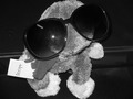
| 04/08/2007 03:19:28 PM | Popstarby kellyrc01Comment: Greetings from the Critique Club.
Welcome to DPC!
Subject matter: is that Barney? I think the idea isn't bad, but:
-Would've been better if it was obviously a famous cuddly toy
-The sunglasses should at least roughly stay on properly
-As someone commented on already, cuddly toys don't really tend to do well on DPC. It's just one of those things.
Composition: I think the crop is too tight, and the central composition isn't great either. I would've gone for a slightly to the right side positioning, leaving a bit of space above the head and to the left. The line in the background is also distracting - try and use a plain one colour background with no distractions for shots like these.
Lighting: flash is too strong. If you don't have the equipment (I don't), you can arrange table lamps and make them bounce off white pieces of cardboard (diffusing the light gets rid of the rough glare). That way you get a bit too much red in the pictures (because it's only normal yellowy lightbulbs rather than white flash light), but you can get rid of that in post-processing.
Post-processing: use a cloning tool to get rid of the flash. Also, I'm not sure black and white actually works well for this picture - B&W tends to be good for simulating an old feel, or for pictures where there's lots of grays and nice shadows, it kind of looks pretty and elegant. In this case, I don't think the subject matter justifies it. At least in colour, there would have been the bright colour of the toy to indicate pop-stardom, whereas this way that gets lots.
Anyway, that's all I can think of. Hope that helps. Any questions, just message me.
Don't get discouraged, keep on shooting, and I look forward to seeing your score climb higher and higher :)
Jelena |  Photographer found comment helpful. Photographer found comment helpful. |
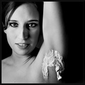
| 04/08/2007 02:10:37 PM | The Ladyshaveby HauxonComment: Greetings from the Critique Club.
To go over the technical bits first:
Very good picture. Very nice lighting - the softbox is obviously working well. I think the black and white works very well, and the dead space on the right does seem to balance the picture nicely. The eyes are beautifully brought out too. So that's all good. Slightly noisy, but I assume that's intentional - I don't really like the portraits with plastic skin Neat Imaged to death.
As for the subject matter, the picture is actually very interesting. I thought about it, and my interpretation would be as follows:
I would say that the image definitely captures an element of pop culture. Those same magazine covers that are telling us girls should be thin are also telling us that they should be perfectly shaved. Which interestingly doesn't necessarily hold across times and cultures, but it seems to be a strong current western phenomenon, in fact so strong that any hint of inappropriate body hair causes revulsion (see comments for examples).
I think the photo captures and highlights this phenomenon - my first reaction was to look away from the armpit, and it really took me a while to be able to look at the photo without looking away. At the same time, the photo seems to say "In your face" to that aspect of pop culture - it's capturing something that we've been taught should be hidden and done in private, whereas the lady in the picture seems happy to show it to the general public.
The number of people going "aggh" should be a sign you've stumbled across a genuine social taboo. Well done. Be proud.
And hope you have lots of fun with the new softbox :)
Jelena
| | Photographer found comment helpful. |
| 04/08/2007 12:35:55 PM | Entre Nousby posthumousComment: Greetings from the Critique Club.
This is underappreciated, if you ask me :)
Fantastic photo, with a lovely archaic feel to it.
I love the textures, that's the first thing that jumps out at you when you look at the photo. The composition is unusual, and therefore interesting (imo). The black and white works well.
Objections:
I don't like the fact the top of the door is in shadow, and that the branches in shadow seem to blur into one another. I think some subtle dodging and burning could've done miracles to fix that (eg. the plant climbing up the wall on the lower right seems to get lost in the shadow. Even very slight dodging of highlights totally brings it out)
Once you've used Neat Image, unsharp mask (40%, 4.3px) gets rid of the blurriness. However, I'm not sure that applying the two makes much difference to the image - I really can't see much noise to start off with.
Anyway, hope this helps. PM me if you have any questions.
Jelena | | Photographer found comment helpful. |
| 04/08/2007 10:51:29 AM | Cactus Flatsby BAMartinComment: Greetings from the Critique Club.
During the voting, I gave this image an 8 - I liked the warm colour of the wood, the nice texture, and I thought the sign and the middle of nowhere feel to it were interesting (I live in Scotland. I haven't seen a cactus in years. This is very exotic for me.)
Now here are the comments having had a second, more in-depth look at it.
While the subject matter is interesting, a different composition and POV might have done it more justice. The hut is interesting, but somewhat unnecessarily dominates the picture - I think a shot from a bit further away, capturing a bit more of the background scenery, would have worked better. (as it stands, the beautiful mountains seem like a bit of an afterthought, I think they should be made a bit more integral to the composition)
The post-processing looks pretty good - the colours are brought out nicely without overdoing it. The one objection (which has been commented on already) is that the sky is noisy. I can understand you not wanting to apply Neat Image to the entire photo, so as not to lose the texture of the wood, but it could have been selectively applied to the sky. Also, there seem to be a couple of pink lines in the sky at the top of the picture, which seem slightly out of place and could have been removed in post-processing.
As I said, I gave this image a high vote, and I do still really like it. However, maybe it could have been improved.
Hope that helps. PM me if you have any questions.
Jelena | | Photographer found comment helpful. |
| 04/08/2007 09:09:56 AM | Standing Tall by NuzzerComment: Greetings from the Critique Club.
Since it ribboned, this shouldn't be a hard one to critique :)
The first reaction I had looking at this image was: "Wow, that's some beautiful post-processing."
The original image looks pretty, but unexceptional. The new crop makes it a lot more interesting - the picture turns into a portrait, with the personified flower reaching out towards you at the centre of it.
The tonemapping makes the image a lot more dramatic, and I like the effect of the gradient fills. The border works well too -brings out the image without dominating it.
I don't think I really have any objections. It's difficult to take interesting pictures of flowers, but you've really succeeded - the flower looks alive, vibrant, and surprisingly person-like.
Well done!
Jelena | | Photographer found comment helpful. |
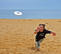
| 04/08/2007 06:03:52 AM | Catch Itby JonathanJComment: Cool shot! I love the facial expression, and the sand flying around by the person's feet. | | Photographer found comment helpful. |
| 04/06/2007 06:21:10 PM | | | Photographer found comment helpful. |
| 04/06/2007 06:20:15 PM | | | Photographer found comment helpful. |
| 04/06/2007 06:19:58 PM | | | Photographer found comment helpful. |
| 04/06/2007 06:19:32 PM | | | Photographer found comment helpful. |
|
Showing 571 - 580 of ~721 |
Home -
Challenges -
Community -
League -
Photos -
Cameras -
Lenses -
Learn -
Help -
Terms of Use -
Privacy -
Top ^
DPChallenge, and website content and design, Copyright © 2001-2025 Challenging Technologies, LLC.
All digital photo copyrights belong to the photographers and may not be used without permission.
Current Server Time: 08/05/2025 01:10:21 AM EDT.
|