|
|
|
Showing 561 - 570 of ~721 |
| Image |
Comment |
| 04/11/2007 05:45:49 AM | |  Photographer found comment helpful. Photographer found comment helpful. |
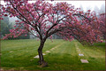
| 04/09/2007 06:35:13 PM | Still. Life.by cogeroxComment: Greetings from the Critique Club.
So, is it a graveyard? That didn't occur to me at all at first glance, it was only after I read through the comments that I started paying a bit more attention to the regular white tiles... (I really thought the tree was the focus of it, and the background was coincidental).
If it is a graveyard, then the subject matter is interesting, and the title works on several levels. And the tree seems to be dancing, there's a nice contrast between actual life which is moving and dancing (despite trees normally being still), and the symbols of absence of life in the background.
The composition is nice, although I would've liked to see the entire tree - it seems a shame that some of the branches are cut off. The colours are beautiful.
All in all - a very good shot, although I think it would have scored even more highly had the subject matter been more obvious.
Hope this helps. PM me if you have any questions.
Jelena | | Photographer found comment helpful. |
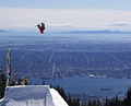
| 04/09/2007 05:47:28 PM | J E Tby hotpastaComment: Greetings from the Critique Club.
Ah, we meet again :)
As can be pieced together from the comments and score: good image, but a lot of people didn't feel it met the challenge. Yes, there is an engine spinning, but it's small and dark, and you can't really see the spin.
Technical stuff:
I think the image is very well composed. All the important lines seem to be just off the mystical thirds, and the right wing nicely leads your eye in towards the rest of the image. The gentle blue and orange nicely complement each other, and their relative quantity seems nicely balanced.
Interesting POV, I like the off-center subject, the fact that the plane is angled, and the trace of the tail at the bottom (rounds the image off nicely). I think the close-up works well.
As has been commented on, bits of the image seem oversharpened - it's something to watch out for. Also, there are bits of distracting glare shining off the airplane - I wonder if a polarizing filter might have helped?
Anyway. Good image - sorry it didn't score higher. I'm sure your score prediction would have been accurate for a different challenge theme.
PM me if you have any questions.
Jelena | | Photographer found comment helpful. |
| 04/09/2007 12:37:55 PM | | | Photographer found comment helpful. |
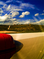
| 04/09/2007 11:45:40 AM | Turbopropby e301Comment: I was dead certain this was gonna ribbon. Shows what I know about DPC voters. Great image, well done :) | | Photographer found comment helpful. |
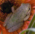
| 04/09/2007 11:36:58 AM | Still a Frogby briandsdComment: Greetings from the Critique Club.
Aww, what a cute image! I think it fulfills the challenge in two different ways - the frog is obviously very still (especially since you managed to get that picture with a 1.3 sec exposure), and there's also the sweet fairytale take on it - the little guy looks sort of sad, and longing, and he's staring into the distance as if waiting for someone to turn him back into a prince... So if any of the low votes are dnmcs, I think they don't know what they're talking about.
Technical stuff:
-The lighting isn't great. Most of the image appears to be in shadow, which doesn't work well. Understandably, you didn't actually have control over this, but it would've brought the mark down. (where's a flash with a softbox when you need one...)
-I think the composition works well. I like how the frog forms the diagonal of a square crop. As has been commented on, the OOF leaf at the bottom does act as a distraction. Also, I think it might have worked better without the big second leaf which covers up the flower petals at the bottom right. Also, as someone commented, it would have been nice to see the frog's face, but I do think the image works well as it is.
-Not sure about the aperture. In a way it's nice to keep the entire image sharp, but a part of me thinks this might work pretty well as a bokeh. No idea really (just a thought).
Anyway, hope this helps, and well done on a great capture!
Jelena
| | Photographer found comment helpful. |
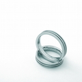
| 04/08/2007 06:49:01 PM | Allen & Estherby gwsallenComment: Greetings from the Critique Club.
I really like this image - good idea, well executed.
The composition is perfect - the white space around the rings just makes the shot. Simple and effective, with good lighting and a good background. I like the slight blue/greenish tinge, and the level of sharpening seems just right - the shapes are clear, but still have a nice soft focus fitting for the subject.
There seems to be a bit of noise in the lower right corner, maybe running it through Neat Image would have helped?
Anyway, very good image. The only thing is - the topic has a great emotional potential, which I'm not sure this really taps into... It looks perfect and stylised, but maybe a bit cold, I'm not sure anything genuinely draws the viewer into the idea.
That's about all I can think of. PM me if you have any questions.
Jelena | | Photographer found comment helpful. |
| 04/08/2007 06:31:28 PM | "Steel" Lifeby jeroweComment: Greetings from the Critique Club.
Wow, what a dramatic image. Fits the challenge well. And god, that's a terrible pun in the title :p
The subject matter is interesting, the POV is good, the movement of the sky nicely contrasts with the stillness of the tower. So in terms of the way the picture was taken, I wouldn't change anything.
In terms of the post-processing:
-The tower isn't quite perfectly centred. If you wanted it to be, it should have been rotated very slightly (1.65 degrees clockwise) before being cropped.
-The image looks a bit oversaturated, particularly some of the clouds. This is a bit difficult to deal with in basic editing, but it might have been worth playing around with 'selective colour' and 'shadows/highlights' adjustments.
But anyway, those are minor points. Well done on a great image!
Jelena | | Photographer found comment helpful. |
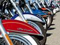
| 04/08/2007 06:11:20 PM | Planet Harleyby neophyteComment: Greetings from the Critique Club.
A well executed image which fits the challenge well.
The light is just right. The POV is perfect - it fittingly shows an element of pop culture in multitudes, and the row of motorbikes makes a lovely curvy diagonal. The composition is lovely and simple - nothing distracts from the focus of the image. The depth of field works well.
Can't really think of anything you could've done better, to be honest.
During voting, I gave this image a 6. It probably deserved a higher mark, but the mark I gave was partly based on personal aesthetic preference (I'm not a big fan of just machinery on its own, even if it's well photographed). I don't really see any other reason why someone would give it a low mark though.
Well done on a good image. Any questions - just PM me.
Jelena | | Photographer found comment helpful. |
| 04/08/2007 05:52:10 PM | IPOPby vincentMComment: Greetings from the Critique Club.
A very good entry, and a perfect tribute.
The entry is definitely spot on for the challenge. An iPod is very pop culture, and the bright green, and the image repetition and extreme hue shifts in the middle are distinctly reminiscent of pop art a la Andy Warhol. The composition works well for this too.
At first the image struck me as oversharpened, but I think that's just due to the slightly uneven, scratched edges, which at first look a bit like the white halo you get from oversharpening. I think these could definitely do with a fix. They wouldn't take too long to burn or clone out, and I think the improvement would be drastic - pop art is meant to be perfect and posterised, the items used within it shouldn't really be showing signs of wear.
Anyway, that's about all I can think of. Great image, well done!
Jelena | | Photographer found comment helpful. |
|
Showing 561 - 570 of ~721 |
Home -
Challenges -
Community -
League -
Photos -
Cameras -
Lenses -
Learn -
Help -
Terms of Use -
Privacy -
Top ^
DPChallenge, and website content and design, Copyright © 2001-2025 Challenging Technologies, LLC.
All digital photo copyrights belong to the photographers and may not be used without permission.
Current Server Time: 08/05/2025 03:04:02 AM EDT.
|