Time After Timeby
GreetmirComment: Greetings from the Critique Club.
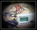
First impression: ooh, clever idea, and I like the old-fashioned sun dial. It definitely does fit the challenge, and there's even a nice play with concepts, with clocks being misplaced in time. Good title too.
However, as has been commented on, there are ways in which this shot could have been improved. The gray clock is good conceptually - it's very modern, and even has the little satellite symbol, etc., but in practise it's sort of ugly and unseemly and takes up a lot of the picture. I think ideally I would've liked to have seen a modern-looking wristwatch on someone's wrist going along the bottom of the picture instead of the big clock, or maybe even someone looking at the time on a mobile phone. Otherwise, at least moving the clock to the back would have helped.
I'm not sure the composition is ideal. The crop seems slightly too tight - I think having it even very slightly wider would have helped convey the sun dial as integrated into its environment, whereas this way the shot seems kind of isolated and staged.
On the other hand, I do like the difference in textures present - the smooth plastic of the modern contrasts nicely with the rough, archaic feel of the sun dial. I particularly like that fallen lead/flower in the top right.
The post-processing seems very good. I'd be intrigued to see what you started with.
Well done on an interesting shot. Feel free to PM me if you have any questions.
Jelena