| Image |
Comment |
| 07/07/2006 09:26:03 AM |
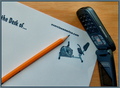
Stationary Bike Stationeryby tfarrell23Comment: This image has a stock photo quality to it. I would have liked to have seen the paper a little whiter and the phone rotated 180 degrees. |
 Photographer found comment helpful. Photographer found comment helpful. |
| 07/07/2006 09:25:56 AM |
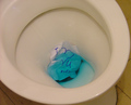
Goodbye, my Love...by pikwolComment: The stationery appears to be taking a back seat (Pun intended) in this photo. Technically the photo is well executed butt (intended also) there isn't much there that appeals emotionally or to the eye. |
| Photographer found comment helpful. |
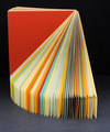
| 07/07/2006 09:25:37 AM |
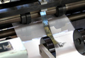
Stationery in Motionby GeneralEComment: Great title and solid execution of the concept. The out of focus section in the front left corner is very distracting and takes away from the overall appeal of the photo. |
| Photographer found comment helpful. |
| 07/07/2006 09:25:29 AM |
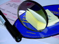
Syntaxby rubienneComment: The transition from the white base to the dark background gives the impression that the photo is not level. Cropping the transtion out might help. The colors, textures, and shadows work well together. |
| Photographer found comment helpful. |
| 07/07/2006 09:25:24 AM |
Twinkle Twinkle Little...Pushpin?by BeeCeeComment: The lighting is very effective and I like your usage of the subject matter. I would like to have seen less overlap of the two pushpins on the left and the red reflection in the center pushpin competes with the pushpins that are in focus as a focal point. |
| Photographer found comment helpful. |
| 07/07/2006 09:24:50 AM |
STATIONERY.........TRADITIONAL & MODERNby jpannuComment: I like this image a lot. I think the interplay between the post-its and the CD would be stonger if the bill in the background was removed. I would also rotate the pen a bit to show space between the body and the clip. |
| Photographer found comment helpful. |
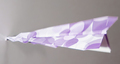
| 07/07/2006 09:24:24 AM |
Crash!by freakin_hilariousComment: I like your take on this challenge; however, I would have liked the whole airplane in focus. The composition draws my eye to the tip of the plane, which is in focus but the colors on the wings draws my eyes back to the out of focus area. |
| Photographer found comment helpful. |
| 07/07/2006 09:24:16 AM |
wear it!by annasenseComment: Nice job under difficult lighting conditions. The blown highlights will hurt your score a bit I'm afraid but it doesn't distract from the focal point greatly in my opinon. The image has a stock photo type look to it and overall deserves an above average score. Message edited by author 2006-07-12 06:28:34. |
| Photographer found comment helpful. |
| 07/07/2006 09:24:08 AM |
Sampler Revolvedby rioloboComment: The colors and arrangment is very nice. The lighting leaves the image looking flat. Moving the lighting to one side or the other would increase the shadows and help to provide some depth to the photo. |
| Photographer found comment helpful. |
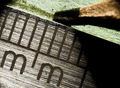
| 07/07/2006 09:23:56 AM |
Metric Metalby jimnessComment: A nice edgy feel to this image. It would be nice if you could have eliminated the dark corner on the top left somehow. |
| Photographer found comment helpful. |
Home -
Challenges -
Community -
League -
Photos -
Cameras -
Lenses -
Learn -
Help -
Terms of Use -
Privacy -
Top ^
DPChallenge, and website content and design, Copyright © 2001-2025 Challenging Technologies, LLC.
All digital photo copyrights belong to the photographers and may not be used without permission.
Current Server Time: 06/15/2025 04:27:20 PM EDT.