| Image |
Comment |
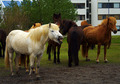
| 07/10/2006 07:27:53 AM |
Laughing horse.by marvinComment: You have captured a very fun image to look at. Obviously the horse moving somewhat to produce the facial expression you captured. On the technical side, you might want to try a square crop on this image to eliminate the building in the background and to really bring the focal point back to the main subject. As presented, my eyes wondered around a bit trying to find what is so funny. |
 Photographer found comment helpful. Photographer found comment helpful. |
| 07/10/2006 07:23:45 AM |
!^^by LimboComment: Not a hint of a breeze. This image suffers from the limitation of the basic editing rules. The background really needs to be darken a little bit to help bring out the wonderful detail you captured in the flag. |
| Photographer found comment helpful. |
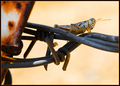
| 07/10/2006 07:20:54 AM |
A Grasshopper Restsby cutlassdude70Comment: I love the detail you captured in the grasshopper. You may want to try a square crop on this image to eliminate the distraction of the fencepost. |
| Photographer found comment helpful. |
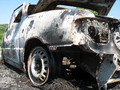
| 07/10/2006 07:19:23 AM |
Stationary Carby littlebigmanComment: This car has definitely not moved for a some time. My only suggestion is that you might try shooting this from a little lower angle to elimnate the sky and tree showing through the gap in the hood. I've looked at this image a couple of times before commenting and each time those items draw my eyes away from the wonderful detail of the engine area visible through the headlight opening. |
| Photographer found comment helpful. |
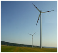
| 07/10/2006 07:11:34 AM |
Windfieldsby XShadowComment: This image definitely conveys a windless day. You might want to consider using a vertical crop instead of a square crop for this image, as the negative space on the left draws attention away from the windmills more than complementing the windmills. The image also has a flat look overall and could use a little post processing help. |
| Photographer found comment helpful. |
| 07/10/2006 07:04:47 AM |
A Moments Restby HornOUBetComment: The use of negative space in this image is very effective. I would have like to have seen a bit more saturation in the butterfly. |
| Photographer found comment helpful. |
| 07/09/2006 07:19:03 AM |
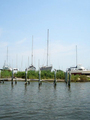
Boat Docksby asmithphotosComment: I like the subject you choose for this challenge very much. I have a few suggestions you might want to try to improve the strenth of the composition and the overall quality of the image. First, you may want to remove the boats on the right hand edge and some of the sky by cropping. The direction of the boats tends to lead my eyes out of the picture and away from the stonger positioned boats. The top of the sky has very little detail and removing would make the relationship between the dry docked boats and the water stronger. Second, the waterline and dock make this image appear slanted to the right. A slight rotation to the left to bring these features horizontal would help the visual impact. Third, the colors in the sky are a bit washed out. I think these could be improved using saturation, curves, and levels in post processing. |
| Photographer found comment helpful. |
| 07/09/2006 07:05:30 AM |
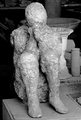
Man from Pompeiby tjmuellerComment: I like the lighting and the B&W conversion of this image very much. The background is kind of busy and actually blends into the left shoulder of the statue. Although the statue itself protrays something that does move, statues in themselves are stationary objects and aren't the stronges subject choice for this challenge. |
| Photographer found comment helpful. |
| 07/09/2006 06:59:06 AM |
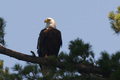
Independent Stayby jjstager2Comment: The soft focus of this image suggest that you may be experiencing a little bit of camera shake or that you need to sharpen the image after reducing the size. I like the subject matter of this image and the title even made me smile, as it is a play on words for the recent US holiday, Independance Day. The lighting makes it hard to see detail in the eagle but this could be improved using levels or curves. I also suggest that you might want to use a square crop, removing as much of the right side of the image as possible to reduce the negative space. My eyes want to look in the direction that the eagle is looking; however the negative space and the slant of the tree brach draw my eyes to the right side of the image. |
| Photographer found comment helpful. |
| 07/09/2006 06:49:04 AM |
....cease fire.by kundimansabuwanComment: To be honest, I really don't know what this object is. The fact that it looks like it was designed to be stationary doesn't make it a very strong subject for a stationary challenge. The technical aspects of the image appear to be pretty good; however, the composition of the image and placing of the object makes it look like the mondane, everyday object it is. |
| Photographer found comment helpful. |
Home -
Challenges -
Community -
League -
Photos -
Cameras -
Lenses -
Learn -
Help -
Terms of Use -
Privacy -
Top ^
DPChallenge, and website content and design, Copyright © 2001-2025 Challenging Technologies, LLC.
All digital photo copyrights belong to the photographers and may not be used without permission.
Current Server Time: 06/17/2025 11:43:06 AM EDT.