|
|
|
Showing 441 - 450 of ~986 |
| Image |
Comment |
| 09/11/2006 01:35:34 PM | loss of chaosby igameraComment: Back to comment: Although this subject fits the challenge well, there are several technical issues that hurt your score. First, the horizon is not level. Second, the image has a lot of noise (looks grainy in film jargon). There are free programs available to reduce noise if you do an Internet search. Third, it appears that the image is out of focus. This could be a result of not sharpening the image after resizing, camera shake (Not using a tripod in low light conditions), or not taking full use of the allowable file (Your file 29 kb - Allowable file size 150 kb). |  Photographer found comment helpful. Photographer found comment helpful. |
| 09/11/2006 07:10:26 AM | A mountaintop clicheby luckycharmComment: Hello from the Critique Club.
First, let me congratulate you scoring a personal best. Technically, your image has been captured and processed extremely well. The silhouette is sharp and solid black and the sky has wonderful coloration. You could have made the sky look more dramatic by increasing the saturation just a bit but to me, that might have looked over processed. However, over processed skies do score well at DPC. Overall, your score reflects more on how the voters related emotionally than on the technical merits of the image. The mountain top does look a bit like piled rocks, which makes the image look a bit staged. I also think the pose of the climber weakens the image a little bit. If he had been standing upright, he would have projected a stronger feeling of being on top of the mountain. Plus, it would have been nice had he been facing towards the negative space. All in all, an image most people at DPC would be proud to have in their portfolio. Nice job!!!
Feel free to PM me if you have any questions regarding this critique.
Tim Message edited by author 2006-09-11 14:34:09. | | Photographer found comment helpful. |
| 09/11/2006 06:58:49 AM | Windmills at duskby ajschelComment: Hello from the Critique Club.
First, let me congratulate you on placing in the top twenty. Technically, your image has been captured and processed to perfection for my vote. I love how the composition with the two windmills gives this image so much depth. In my opinion, the only thing keeping this from winning a ribbon is that the clouds are a little low in the sky (Which was not something you could not control). If they were higher, the sky would have been much more dramatic. You could have also made the sky look more dramatic by increasing the saturation just a bit but to me, that would have looked over processed. However, over processed skies do score well at DPC.
Feel free to PM me if you have any questions regarding this critique.
Tim
| | Photographer found comment helpful. |
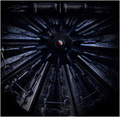
| 09/10/2006 07:08:52 PM | The Machineby nheilweilComment: Hello from the Critique Club:
I think the comments you received during the challenge sum up your entry pretty well, �Cool, Sci-Fi�, �Lighting is great�, �Detail captured is excellent�. I must confess that I�ve never seen an image of a black object with so much detail and dramatic looking to boot. Having 20/20 hindsight commenting after the challenge, your image could just as easily have been in the top ten as any of the others. Thus, with no technical flaws and by meeting the challenge no questions asked, your score merely reflects the tastes of the voters and in particular, the small number that happened to vote on your image. You have a stunning entry here that anyone at DPC would be proud to have in their portfolio.
Tim
| | Photographer found comment helpful. |
| 09/10/2006 06:58:04 PM | Golden Glowby sherpetComment: Hello from the Critique Club:
I think the comments you received during the challenge sum up your entry pretty well, �Wow�, �Perfect for this challenge�, �Beautiful�. The colors are well saturated and the whole image is very dramatic looking. Having 20/20 hindsight commenting after the challenge, your image could just as easily have been in the top ten as any of the others. Thus, with no technical flaws and by meeting the challenge no questions asked, your score merely reflects the tastes of the voters and in particular, the small number that happened to vote on your image. You have a stunning entry here that anyone at DPC would be proud to have in their portfolio.
Tim
| | Photographer found comment helpful. |
| 09/10/2006 03:56:54 PM | fluid puzzleby IreneMComment: Hello from the Critique Club:
I think the comments you received during the challenge sum up the strong points about your entry pretty well. The colors are well saturated and the pattern is very dramatic looking. Having 20/20 hindsight commenting after the challenge, your image could just as easily have been in the top ten as any of the others. When I compare your image to the one that placed 8th, I see nothing in your image indicating yours should be scored lower. I have a feeling that you are the victim of the random order the voters receive the images to vote on, as some people that love abstracts may not have gotten to your image during voting. You have a very creative entry here that anyone at DPC would be proud to have in their portfolio.
Tim
| | Photographer found comment helpful. |
| 09/10/2006 03:47:14 PM | The skyby marvinComment: Hello from the Critique Club:
I think the comments you received during the challenge sum up the strong points and weak points about your entry pretty well. The colors are well saturated and the clouds are very dramatic looking. But like two of the comments you received, I am also of the opinion that your score would have been higher if the clouds were in better focus. You have a good eye for composition and I look forward to seeing more of your images in future challenges.
Tim
| | Photographer found comment helpful. |
| 09/10/2006 03:40:04 PM | looking throughby gocComment: Hello from the Critique Club:
I think the comments you received during the challenge sum up the strong points and weak points about your entry pretty well. The green background compliments the twigs very nicely and colors are well saturated. I also like the horizontal composition you choose very much. But like two of the comments you received, I am also of the opinion that your score would have been higher if all of the twigs were in focus. This could have been achieved by closing up your aperture 3 or 4 stops. You have a good eye for composition and I look forward to seeing more of your images in future challenges.
Tim Message edited by author 2006-09-10 15:44:40. | | Photographer found comment helpful. |
| 09/10/2006 03:29:56 PM | shhhhhhh..by holdingtimeComment: Hello from the Critique Club:
I think the comments you received during the challenge sum up the strong points about your entry pretty well, dynamic lines, sharp, vivid color. Looking at the top ten scores from this challenge, six were close-ups/macros (Abstracts) and the other four were landscapes. Your image falls somewhere in between these two categories. Your image fits the challenge well but the subject you chose was a little busy, with lines going everywhere, shady and sunny areas, and what ever that is in the bottom left corner. The only suggestion I might have to improve your score would be to zoom in on one the elemental groups in your image to simplify the composition. My choice would have been the tightly grouped bunch of reeds in the upper right corner, the ones that have the strong sun light. I think this image is done about a well technically as you could have done and I look forward to seeing more of your work in future challenges.
Tim
| | Photographer found comment helpful. |
| 09/10/2006 12:46:11 PM | Treesby optionComment: Hello from the Critique Club:
First, I love the composition and the subject you choose for this challenge. Your score suffered a bit because the image looks flat. The colors and contrast both need a little more work than what you achieved with levels. From reading your comments on this image, I realize you are not a great fan of advance editing in your post processing work. However, this picture has so much potential and could be improved tremendously with just the basic editing tools of Contrast, Curves, and Saturation. I would be happy to PP this image for you and post it to this critique if you would like.
Tim
Andrew,
Per your PM I gave your image a quick go over. My editing steps (Paint Shop Pro X) were as follows:
1) Curves adjustment per the following thumbnail

2) Levels adjustment: Input 0 ... 1.05 ... 237 Output 0 ... 226
3)Saturation + 20
4)Contrast +5
5)Resize
6)USM Radius 1 - Strength 100 - Clipping 5

Hope this helps - let me know if you have any questions.
Tim Message edited by author 2006-09-13 19:45:18. | | Photographer found comment helpful. |
|
Showing 441 - 450 of ~986 |
Home -
Challenges -
Community -
League -
Photos -
Cameras -
Lenses -
Learn -
Help -
Terms of Use -
Privacy -
Top ^
DPChallenge, and website content and design, Copyright © 2001-2025 Challenging Technologies, LLC.
All digital photo copyrights belong to the photographers and may not be used without permission.
Current Server Time: 06/20/2025 08:12:24 AM EDT.
|