|
|
|
Showing 401 - 410 of ~986 |
| Image |
Comment |
| 10/03/2006 07:56:16 AM | Tetheredby kawesttexComment: Hello from the Critique Club,
There is no doubt that this image meets the challenge and your rotation and crop to put the strings leading from the corner made for a stronger leading line impact and helped this image break into the 6 scoring range. However, there is considerable pixelation in the strings and some movement visible as well (as you noted yourself in your comments). I think the image could have used just a bit more saturation for the sky (bump the blue color saturation only).
Your score probably suffered some from the standpoint that your leading lines were basically horizontal and didn't have a lot of depth to them. If you look at the top 10 images for this challenge, the voters seemed to like the images where the leading lines went deep into the image the most. All in all, the colors of the kite gave this image a different look to it and helped you achieve that coveted 6+ score. Congratulations!
Feel free to PM me if you have any questions regarding this critique.
Tim
|  Photographer found comment helpful. Photographer found comment helpful. |
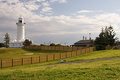
| 10/03/2006 07:37:31 AM | Macquarie Lighthouseby niallgComment: Hello from the Critique Club,
The exposure of this image looks pretty good. The image could use a bit more post processing work to give it more pop. Two suggestions for post processing, first, play around with levels or curves to increase the dynamic range of the image (give the image more contrast and color saturation). After that, boost the color saturation a bit more using Hue/Saturation.
You might also consider cropping just a little off the right side of the image, up to the trees on the right. This will remove the part of the fence that leads to the right edge of the image, thus forcing the viewer's eyes back to the main subject. As is, the fence leads both to the lighthouse and away from the lighthouse and forces the viewer to choose which way to look, which weakens the leading lines aspect of the image.
My final suggestion would be to sharpen the image a little bit more than you did after resizing. It is hard to find a sharply focused area in the image and that generally means that the sharpness was lost during resizing.
I think you found a very strong subject for the leading lines challenge. I really like how the fence takes your eyes to one side of the image then back to the other side to the main subject. A bit more post processing work and this image could have scored in the sixes.
Feel free to PM me if you have any questions regarding this critique.
Tim
| | Photographer found comment helpful. |
| 10/03/2006 07:19:23 AM | Fire Hazardby EssAreDubyaComment: Hello from the Critique Club,
Technicals: The exposure of this image is exceptional. I would have never guessed that so much detail could be captured shooting straight into a light bulb. Although the cropping of this image puts the main subject dead center, I think it works for this image. The reason being is that my eye knows there is more to the lamp then what is visible and it automatically draws in an outline of what might be there. Sort of like an implied leading line for the lamp.
Voter Appeal: The humor here is very good but just a bit subtle for the general DPC voter. I think your score suffered just a bit as any voter that didn't take the time to read everything in this image would have scored it as average or lower for being just a lamp. To be truthful, my eye was first drawn to the 120 V part of the light bulb and I had to search quite a bit to find the 75 W part of the image.
This image connects with me humor wise and I thank you for bringing a smile to my face.
Feel free to PM me if you have any questions regarding this critique.
Tim
| | Photographer found comment helpful. |
| 09/28/2006 08:22:11 AM | Smileby bvoiComment: Bump to a 10. Perfect lighting and got to love the smile. | | Photographer found comment helpful. |
| 09/28/2006 08:21:40 AM | --by Dave GordonComment: Bump to a 10. Perfect focus and lighting. | | Photographer found comment helpful. |
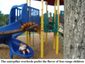
| 09/27/2006 02:15:11 PM | Caterpiller Overlordsby chazyorickComment: Hello from the Critique Club,
For your first challenge entry, you achieved a very commendable score. I knew the competition for this challenge would be tough as soon as it was announced and you were up to the challenge. My first impression of this entry is that the image itself does not cry Gary Larson on its own. However, you came up with a very strong caption that was easy to relate to Gary Larson. Nice job.
On the technical side, the tree trunk on the right side of the image adds nothing to the composition and could have been cropped out. This would have made your image close to square, which is a trait of Gary Larson cartoons as well. I also agree with the commenter that the focus on the caterpillar looks a little soft (not sharply focused). This could be a result of camera movement, using the macro mode on your camera (which produces a very shallow depth of focus), or forgetting to sharpen the image after resizing for the challenge. If you did use macro mode, you might want to try a different mode next time (like portrait) to get some extra depth of focus. However, you probably won't be able to focus as closely and will need to crop more. If it is related to camera movement, it a tripod would help.
You might want to play around with levels and saturation to see if you can give the colors a bit more pop. All in all, you made me laugh, which was the intent of your entry.
Feel free to PM me if you have any questions regarding this critique.
Tim
| | Photographer found comment helpful. |
| 09/27/2006 01:56:16 PM | Napoli Chiesa di Capodimonteby Rino63Comment: Hello from the Critique Club,
One would think from the comments that your received during the challenge that your score should be much higher than it is. However, the leading lines in your image (the building columns) are part of the main subject (the building) and therefore, cannot lead the viewer's eyes to the main subject. In this challenge the voter expected the leading lines to draw their eyes to a main focus point in the image. Your photo really doesn't have that element and your score suffered because of that.
On the technical side, your image is wonderful to look at and I love the delicacy of the colors. It almost looks like it was desaturated, which accentuates the stone in the building very nicely.
Feel free to PM me if you have any questions regarding this critique.
Tim
| | Photographer found comment helpful. |
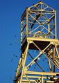
| 09/26/2006 08:01:14 AM | Geometry: The Basis Of All Constructionsby AlainComment: Hello from the Critique Club,
I really thought this image would score a little higher than it did. I like the implied negative space of this image achieved by the off center cropping. I also like how the birds add movement to a static main subject. Overall, I have no suggestions for improvement, as I think the technical aspects of this image are well done. Thus, the score you received must reflect how well the voters connected with the image. Sorry to say but they did not connect as well as I did. I like this image a lot and I wish you good luck on future challenges.
Feel free to PM me if you have any questions regarding this critique.
Tim
| | Photographer found comment helpful. |
| 09/26/2006 07:52:48 AM | Natural isosceles...by brianzComment: Hello from the Critique Club,
Welcome to DPC and I hope you enjoyed entering your first challenge. I remember this image very well from voting on this challenge. My initial reaction was that I thought the subject was a little weak for the challenge. Without the title, it would be very hard to associate this image with geometry. However, I personally did not score you down for that, as it does meet the challenge.
As for the photo itself, the focus on the man's legs looks a little soft to me yet the man has an overall over processed look to him. I suspect that the reason it looks this way is that your image is highly compressed (Images are allowed to be up to 150 kb for DPC challenges and yours is only 22kb). Also, I agree with the comments you received during the challenge that the amount of negative space above the man is a bit excessive. Although the colors of the sky are really nice, they actually compete with your main subject for attention. I look forward to seeing more of your images in future challenges and you will find that you will improve over time. Good luck.
Feel free to PM me if you have any questions regarding this critique.
Tim
| | Photographer found comment helpful. |
| 09/26/2006 07:38:34 AM | School Days: Chemistryby WildcardComment: Hello from the Critique Club,
Welcome to DPC and I hope you enjoyed entering your first challenge. I remember this image very well from voting on this challenge. My initial reaction was that I liked the out of the box thinking on this subject but it is going to get killed by the DNMC (Does not meet challenge) crowd. Sorry to say but the high number of 1's definitely shows that out of the box thinking is not always rewarded. Just think, for every 1 you receive, it takes two 10's to average out to a 7. Hard to win a ribbon with more than one or two 1's on your scorecard.
As for the photo itself, the focus looks a little soft to me. I suspect that you didn't sharpen the image after resizing. Almost all images look a little fuzzy after down sizing and need some USM (Unsharp mask) or other sharpening processes to bring the image back into sharp focus. Good luck on future challenges.
Feel free to PM me if you have any questions regarding this critique.
Tim
| | Photographer found comment helpful. |
|
Showing 401 - 410 of ~986 |
Home -
Challenges -
Community -
League -
Photos -
Cameras -
Lenses -
Learn -
Help -
Terms of Use -
Privacy -
Top ^
DPChallenge, and website content and design, Copyright © 2001-2025 Challenging Technologies, LLC.
All digital photo copyrights belong to the photographers and may not be used without permission.
Current Server Time: 06/20/2025 02:03:06 AM EDT.
|