| Image |
Comment |
| 11/02/2006 07:48:54 AM |
Mikeby rdesaiComment: Hi Mike. A great environmental portrait. Bumping to a 10. |
 Photographer found comment helpful. Photographer found comment helpful. |
| 11/02/2006 07:48:29 AM |
Size Mattersby alifeinexileComment: The pose looks really awkward and her feet aren't fully in the frame. But that is the point. Great job. Bumping to a 9. |
| Photographer found comment helpful. |
| 11/02/2006 07:45:14 AM |
Leapfrogby WildcardComment: Not a traditional portrait but I really speaks to me. Maybe a tad over sharpened for my taste but bumping to a 9 none the less. |
| Photographer found comment helpful. |
| 11/02/2006 07:23:00 AM |
Waitingby JeniYComment: Back to comment: I really love the composition of this shot but it is over sharpened for my taste. Nice job. 6 |
| Photographer found comment helpful. |
| 11/02/2006 06:25:14 AM |
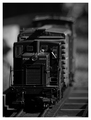
PRR ¤ 0055by BradComment: Hello from the Critique Club,
Not much to critique on this image. The focus, shallow DoF, and B&W conversion are all exceptional. So why didn't this score higher? As the great DrAchoo kindly mentioned on one of my images "Shots of trinkets rarely do well on DPC" and I'm afraid that also applies to toys. You nailed this one technically but the voters were looking for something with a subject that was a magnitude or two larger. But I think you knew that when you submitted this image.
Tim
|
| Photographer found comment helpful. |
| 11/02/2006 06:13:26 AM |
Broken track going nowhereby mclComment: Hello from the Critique Club,
My first impressions when viewing your image was that it meets the challenge that the composition is pretty well done. However, I also had to ask myself where's the broken track. After much searching I could finally see that the track does indeed end suddenly. There are a couple of things that could have been done differently to help show the broken track better. First, you could have focused on the broken end of the track and let the front part act as a leading line to the main subject of the image. Or you could have shot with a smaller aperture (larger f-stop number) to increase the amount track in focus. The other thing that makes it tough to see that the track ends suddenly is that side detail of the track is almost totally black. If you could have kept some of the detail in the side of the rail, it would have provided a stronger 3-D effect and helped the rail stand out more. I highly recommend that you look at the DPC B&W Tutorial and see how the different post processing methods shown can change your image.
Tim
|
| Photographer found comment helpful. |
| 10/31/2006 07:38:31 AM |
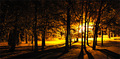
woods on fireby tojlewisComment: Hello from the Critique Club,
Congratulations on a very solid entry for the Lighting III challenge. The above average score shows that the voters believed this image met the challenge and that the lighting played a major role in the image. When I voted on this image, my first impression was that it looked over processed, as the trees on the right side have a lot of haloing around them and lack detail along the edges of the trunks. After reading your comments on the processing steps you used, I can see this was not the case. So why does it look over processed? Since I haven't taken any shoots similar to this one, I can only guess. My guess is that it is slightly overexposed for the trees on the right. It would have been interesting to bracket the exposure on this set up and see if a slightly underexposed image might have produced sharper edges on the trees and yet retain the wonderful coloring of this image. Sorry I can't be of more help.
Feel free to PM me if you have any questions regarding this critique.
Tim
|
| Photographer found comment helpful. |
| 10/31/2006 07:26:09 AM |
Column Detailby dahvedComment: Hello from the Critique Club,
You did a nice job of maintaining the detail in the column under harsh lighting conditions. The shadow running the length of the column on the left side was probably a love or hate type feature, as it help provide visual depth to the image but it also breaks up the continuity of the column. With 39% of your votes being a 5 that indicates that the voters looked for literally 2-3 seconds and concluded, "this picture isn't bad but it doesn't have a lot of wow". And in this challenge, the wow had to be provided by the light. The large number or 3 & 4 votes you received indicate that the light in your image did not wow the voters. My image in this challenge suffered the same fate.
Feel free to PM me if you have any questions regarding this critique.
Tim
|
| Photographer found comment helpful. |
| 10/31/2006 07:14:16 AM |
Transfixedby madhatterComment: Hello from the Critique Club,
I must say that I really like this image and felt it was a creative take on the challenge topic. I have no real suggestions on how to improve this image. The exposure, set-up, and all of the other technicals are done extremely well. This is reflected in the voting histogram, as you received nearly as many 6's as 5's. So why didn't this image score better? IMHO, it is related to the DPC Wow factor. At first glance this image doesn't have a lot of wow. However, the more you look at it the more details there are to discover, like the rose. Since most voters don't look that long at an image, your Wow factor didn't get recognized. This is an image I would be proud to have in my portfolio and one that I hope you are proud of.
BTW, did you intentionally make the screen all static or is this a result of the long exposure wiping out any detail of an actual program?
Feel free to PM me if you have any questions regarding this critique.
Tim
|
| Photographer found comment helpful. |
| 10/27/2006 01:26:29 PM |
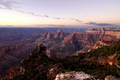
Solitude: The Grand Canyon at Dawnby sailracer_98Comment: Hello from the Critique Club,
Congratulations on a very solid score in the Morning challenge. My first impression of this image is that the colors look very real life and not over processed. I appreciate that very much in an image and generally rate these types higher than the over saturated ones the normally win the challenges. However, this image does have a lot of potential if you want to play the DPC game. Since this was an advanced editing challenge, there are a few things you could have done to make this image a bit more "DPC friendly". When I look at this image I see three very distinct layers, the layer of mountains in the front with the vegetation, a middle mountain range layer, and the far off mountain range. These three layers could have been masked and processed to bring out the best in the front and middle layers. A bit more color/saturation in the front section, a bit more contrast in the middle section would have given this image a lot more depth without sacrificing the natural look of the image. These would be relatively simple changes and I can't even begin to imagine what someone like Bear_Music could do with this image.
Feel free to PM me if you have any questions regarding this critique.
Tim
|
| Photographer found comment helpful. |
Home -
Challenges -
Community -
League -
Photos -
Cameras -
Lenses -
Learn -
Help -
Terms of Use -
Privacy -
Top ^
DPChallenge, and website content and design, Copyright © 2001-2025 Challenging Technologies, LLC.
All digital photo copyrights belong to the photographers and may not be used without permission.
Current Server Time: 06/19/2025 08:33:20 PM EDT.