| Image |
Comment |
| 04/22/2007 04:40:46 PM |
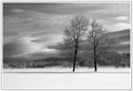
After The Storm by DJWoodwardComment: Back to comment: I've bumped this three times as I've sorted through the entries and composition and B&W conversion of this image earns one of the three 10's I'm giving out in this challenge. Wonderful image and I hope to see it with a ribbon.
Tim |
 Photographer found comment helpful. Photographer found comment helpful. |
| 04/19/2007 07:37:41 AM |
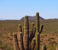
Welcome To The Desertby JSAYBComment: Back to comment: You did a nice job with the exposure and post processing of this image but the composition baffles me. You have a primary subject and a secondary subject in the image and you hide the secondary one behind the primary subject and both are dead center in the compostion. Plus, you cropped the primary subject off at its virtual waistline. Please revisit this location if you can and play around a bit with the composition. Shoot from some different angles (Example: Put the catus in the front left third of the image and the hill in the back right third of the image). |
| Photographer found comment helpful. |
| 04/12/2007 02:02:03 PM |
El Guapoby alfrescoComment: Go Tech!
Edit: I type like an engineer. Message edited by author 2007-04-12 14:02:44. |
| Photographer found comment helpful. |
| 04/11/2007 03:54:54 PM |
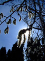
Nourished By The Sunby SquishyBComment: In responce to your forum thread, here is what I see in your challenge submittal.
This image meets the challenge and you've handled the tough lighting conditions very well. However, the main subject is dead center in the picture and the trees in the background are a distraction. I would have also tried to isolate the main subject a bit more to remove the branches in the background and the trunk from the birch tree. Overall, this image has the feel of "I could have shot that" instead of "How did they do that" or "I wish I had thought of that".
Tim |
| Photographer found comment helpful. |
| 03/15/2007 08:07:11 AM |
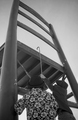
Little Borrowers in the kitchen...by notesinstonesComment: Hello from the Critique Club,
A very creative take on this challenge. This is the first image I've critiqued where the number of 6 votes was higher than the number of 5 votes and the final score was below a 6. I think there are two primary reasons this image didn't score higher. First, the image lacks contrast and looks a little flat. With advanced editing, it would have been relatively easy to process the boys separately from the chair to bring out the best of both. Second, the perspective of this image, in combination with the low contrast, provides very little separation between the boys and the chair, making the image look very two-dimensional. I think you found the perfect prop for this challenge but needed to play around a bit more compositionally to find "the" image.
Feel free to PM me if you have any questions regarding this critique.
Tim
|
| Photographer found comment helpful. |
| 03/15/2007 07:46:57 AM |
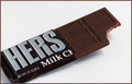
Her Medicine for a Broken Heartby daisypaigeComment: Hello from the Critique Club,
The technical aspects of this image are very good. The background is evenly light. The focus is sharp and the post processing brought out the detail very nicely. So why didn't this score in the sixes? I think there are a couple of reasons. First, the creativeness of this image is a little subtle, as the relationship between where the wrapper was cut and the title was probably lost by those voters that only looked for a couple of seconds then clicked on the 5. Second, the composition of the image is pretty good but the cropping of the left end of the candy bar falls into the personal preference category and is reason enough to vote 5 instead of 6 for many voters. I also agree with the comments regarding the cutting of the wrapper instead of tearing it. It just doesn't look natural. Overall, a good image that scored well, creative idea that could have scored higher with a different execution.
Feel free to PM me if you have any questions regarding this critique.
Tim |
| Photographer found comment helpful. |
| 03/15/2007 07:27:48 AM |
Dandelion Teaby NuzzerComment: Hello from the Critique Club,
First, let me start off by offering my congratulations on your 6th place finish. This is one of the easiest critiques I've been assigned in a long time, as your comments mentions all of the tripping points this image has regarding scores at DPC, over exposed, blue pickup in the background, and the food color green of the tea. Overall, the image offered a good visual tie to the challenge and was well received, as you can tell by the score. My opinion is that when an image makes it into the top ten, the placement within the challenge no longer rides on the image quality or the technical aspects but the mood of the voters and the personal taste of those that actually votes that challenge. Nicely done and it looks good on the front page of your profile.
Feel free to PM me if you have any questions regarding this critique.
Tim
Edit: typo Message edited by author 2007-03-15 07:29:29. |
| Photographer found comment helpful. |
| 03/15/2007 07:16:22 AM |
Explosivesby BAMartinComment: Hello from the Critique Club,
The technical aspects of this image are very good. The placement of the sign and the angles of the two other pieces of wood make for a strong composition. The focus is sharp and the post processing brought out the detail in the wood very nicely. So why didn't this score in the sixes? Probably the biggest reason is that this image has the feel of "I could have shot that" instead of "How did they do that" or "I wish I had thought of that". This becomes even more of a factor when there are a large number of entries in the challenge like this one had.
Feel free to PM me if you have any questions regarding this critique.
Tim
|
| Photographer found comment helpful. |
| 03/07/2007 06:01:38 PM |
www.red.....by MikeOComment: Back to comment: Good sharp looking details and the colors look really nice. However, the subject isn't interesting enough to hold my attention for very long and cropping off part of the "d" makes the image look off blanced. |
| Photographer found comment helpful. |
| 03/07/2007 05:59:23 PM |
Candle Glowing on Redby Ice-Tea-1983Comment: Back to comment: You choose a tough subject to photograph for this challenge. The flame looks a bit over exposed and the post processing makes the dark areas of the background look like they were spray painted. I would also suggest you read up on the rule of thirds, as the centering of the flame in the image is one of the least interesting locations you could have put it. |
| Photographer found comment helpful. |
Home -
Challenges -
Community -
League -
Photos -
Cameras -
Lenses -
Learn -
Help -
Terms of Use -
Privacy -
Top ^
DPChallenge, and website content and design, Copyright © 2001-2025 Challenging Technologies, LLC.
All digital photo copyrights belong to the photographers and may not be used without permission.
Current Server Time: 06/18/2025 07:42:53 PM EDT.